
5 Secrets to Mixing Wood Tones, From an Interior Design Expert
Variation in color, pattern, texture, and style is essential to decorating—it keeps things interesting. But wooden furniture and finishes can pose a challenge. Is mixing wood tones a problem? Ideally, you want your space to flow nicely with a cohesive, intentional look. But that isn’t always possible for those of us who don’t buy all of our furniture at the same time and from the same place. If you’re the type who’d rather cobble together a room over the years, bringing together a mix of inherited, purchased, and found items with a variety of finishes, chances are you’ll be mixing wood tones at one point or another. How to do it right?
Susann Goerg, Art-Centric Interior Designer, CEO & Creative Director says, “A good rule of thumb is to choose clearly differentiated wood tones, such as a warm white oak and a charcoal – creating a bit of contrast with intention. Nothing is worse than when two wood tones are almost identical but not quite the same, and it ends up looking like a matching mistake.”
Here are five secrets to making it all mesh…
Watch the undertones.
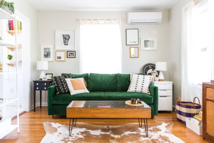
While wood finishes don’t need to match, they should complement each other, Goerg says. Look at the color bias of each wood to see if it is warm or cool, then make sure their undertones match, regardless of finish. For example, the coffee table is darker than the floors in Kay’s Curated Somerville Nest, but their similar warm natures make them a good fit regardless.
Go with the grain.
If your many different woods all have a prominent grain, try keeping the patterns similar and retain the “mood” of the room. “While a larger or open grain is more expressive and can create a unique look full of character — often desired for more ‘rustic’ rooms,” says Goerg. “With that in mind, I wouldn’t recommend mixing an open grain with another open one — it would feel like two bold personalities competing for attention within the same space.”
Use a buffer.
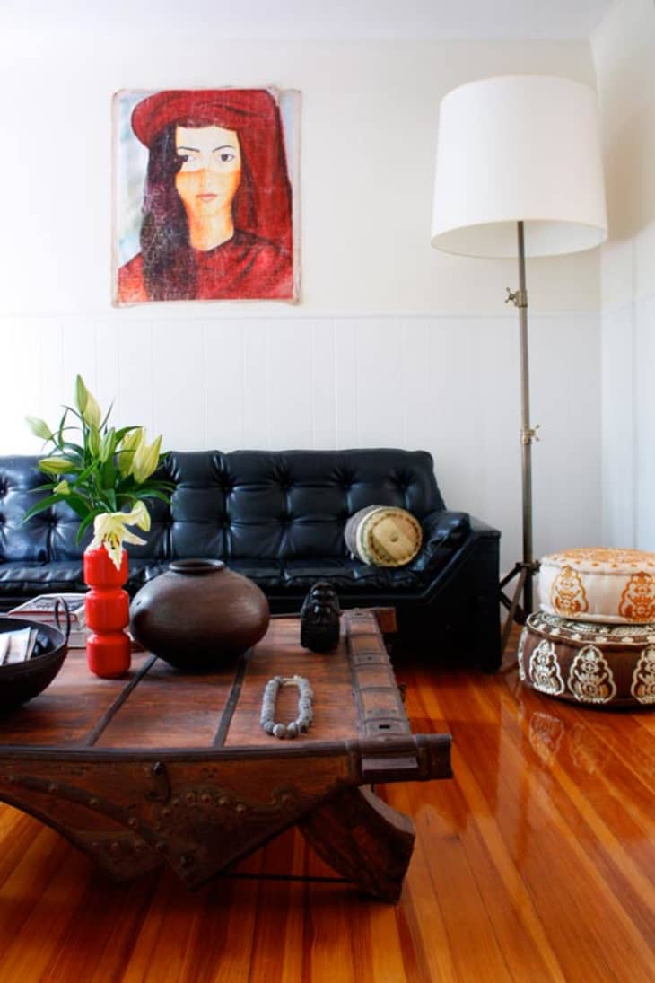
Placing a wood table directly on top of a different wood floor draws attention to their dissimilarity. “The easiest and least effort-required solution is to use a rug as a visual barrier and transition piece so that the disputing wood tones aren’t visually perceived right next to each other,” says Goerg. Here, the weathered gray table in Mulu’s Creative + Vintage Collective Den is separated from the warmer wood of the floor by a traditional style carpet.
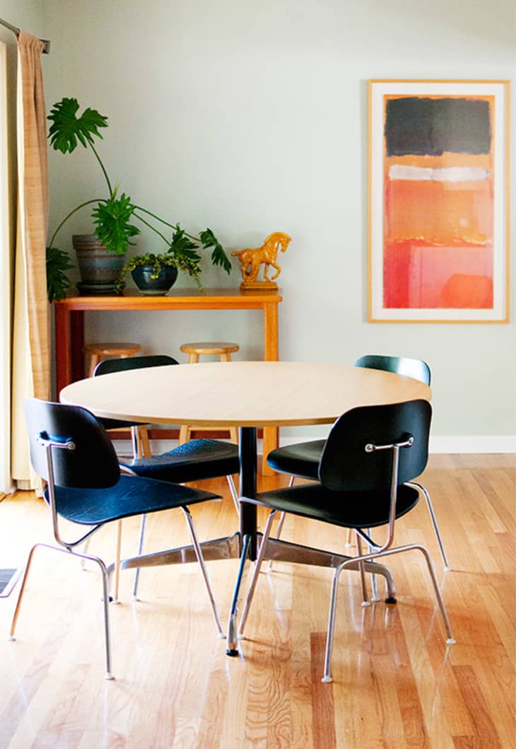
Don’t go too nuts
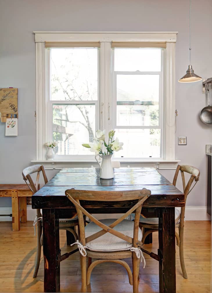
Keep your choices to just a few types of finishes to start, and repeat each finish a couple of times throughout the room. Goerg says, “My personal rule is two maximum three wood tones within a given space; otherwise, it creates a disarranged feeling, and nothing else gets a chance to shine.” Above, the dining room from Marsi & Robert’s Bright and Tidy Southern Ranch has light floors and dark wood chairs. Each color and/or tone can also be seen at least once elsewhere in the room.
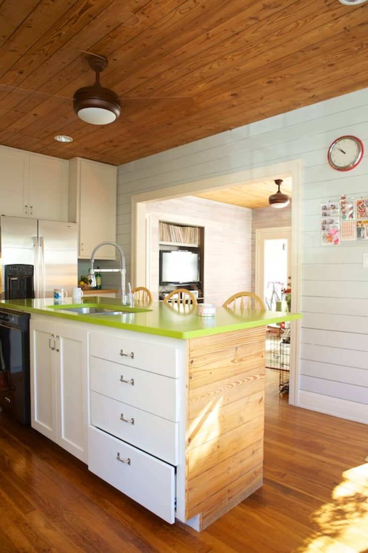
When in doubt, white it out.
White and wood is one of those magical combinations, like basil and tomatoes. They just work. When you have a variety of wood tones that would otherwise look nutty, intersperse some white sections (with paint, furnishings, etc..) to break it up and calm down the potential crazy. Here, the kitchen Laurel & Margot’s Celebration of Craft features a lot of white on the walls and island.
These aren’t hard and fast rules to decorate by, but rather different ways to think about wood as it applies to your home. If you’ve found other strategies that work for you, please share them in the comments!