
The Golden Rule to Follow For Sizing Your Art Just Right
What is the 2/3 Rule for Hanging Art?
The two-thirds rule of hanging art states that your art piece should be two-thirds the size of the sofa, headboard, or furniture piece under it. This helps visual balance and keeps the art piece from overwhelming the room.
There are some rooms you see that look pretty good, that make you think “oh, I can totally do that.” Then there are the rooms that look so put together that you write them off as being too “pro” and unattainable. Well, I’m here to tell you that’s a load of pish posh, and you can do anything as long as you know some simple rules. Namely, making sure that the art above a sofa or bed is two-thirds the size of the sofa or headboard.
I was recently deep in the archives of designer/blogger Emily Henderson’s site and came across a how-to video on creating a focal wall with Orlando Soria of Hommemaker. The video has some great tips on setting up a gallery wall, but one of my biggest takeaways was Emily’s 2/3 rule she brought up with regards to the sizing of large-scale art over a sofa (FYI, art placement is a big part of those nearly perfect rooms).
“A good rule of thumb is to make sure that your piece of art is two-thirds the size of your sofa [or headboard],” she says in her clip, noting that this makes it interesting enough to engage a whole wall.
She also goes on to note this same sizing guideline would apply to multiple pieces of art or a gallery wall (i.e. treat them, in terms of scale, like one piece of art and make sure the whole arrangement is at least two-thirds of the size of the furnishing it’s above).
The Art Sizing Rule—Examples
This isn’t to say it has to be exactly 66.67%, but it’s a great rule of thumb if you aren’t sure how big or how small to go with your art (and by all means, go larger than that should you feel brave enough). To show you what this looks like, I rounded up a handful of great examples:
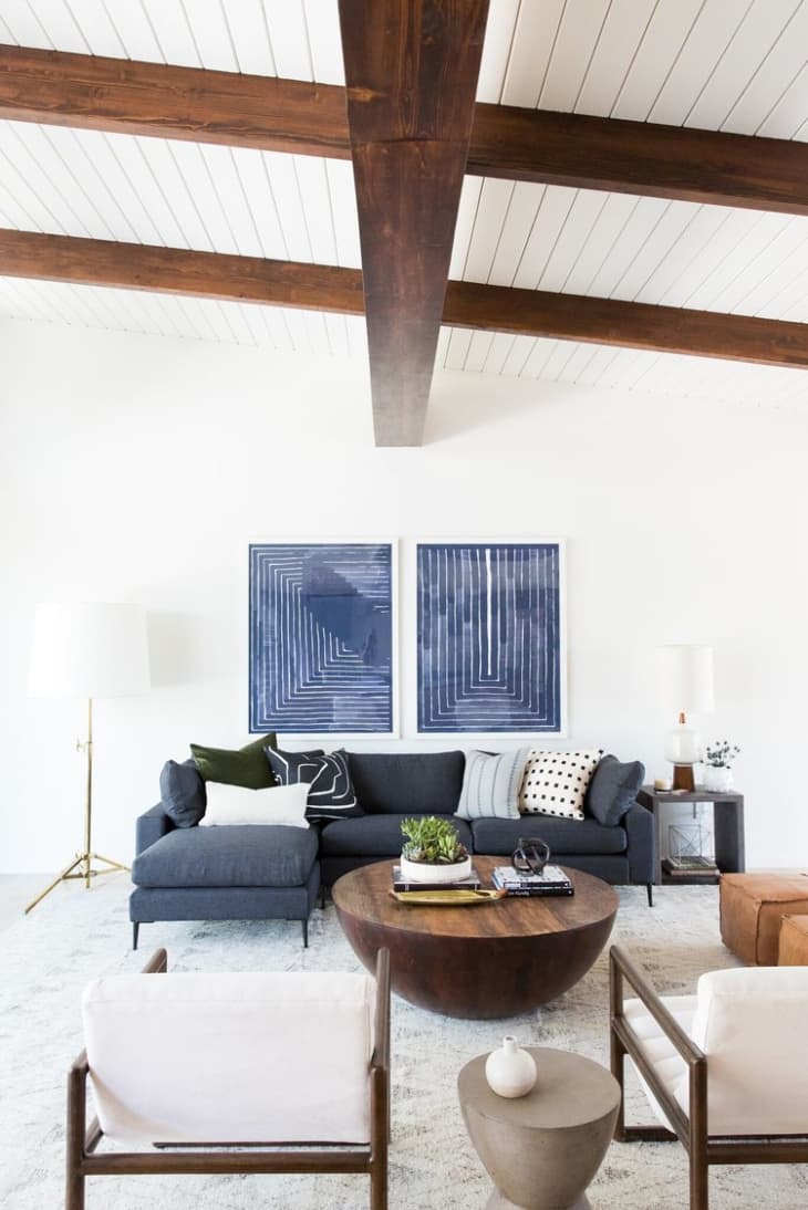
You can use more than one piece of art.
Here’s an example from Studio McGee that uses two pieces of large art that, together, measure about two-thirds the length of the sofa.
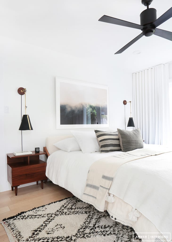
If you’re trying to reduce clutter, one piece might be better.
Using just one piece of large scale art works so beautifully in this bedroom from Amber Interiors. With a simple black-and-white palette and streamlined furnishings, anything else would have created a bit of visual clutter in an otherwise quiet and serene room.
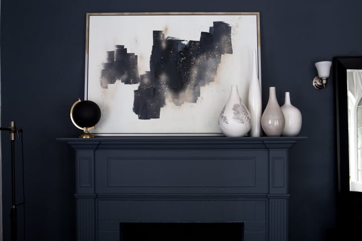
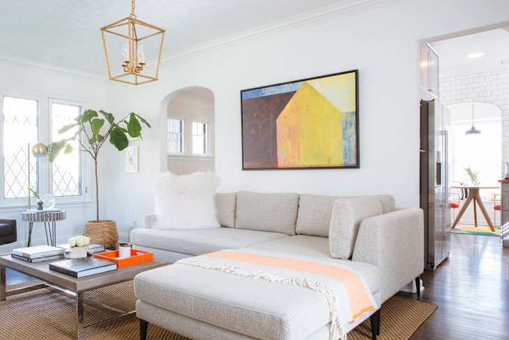
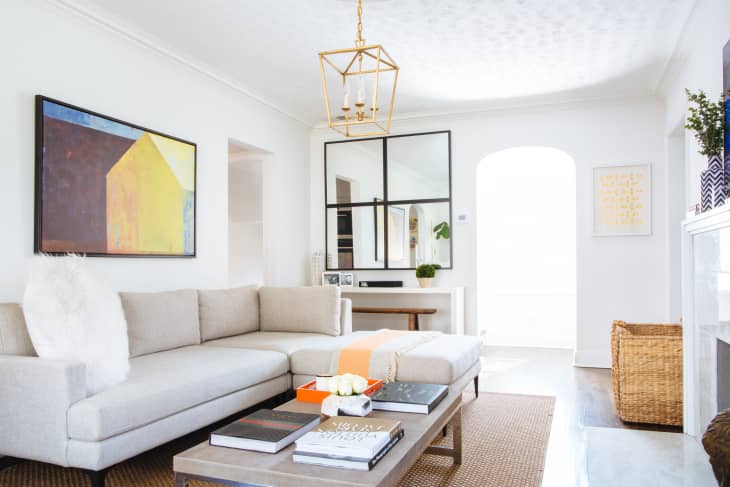
You can apply this rule to fireplaces, too.
While Emily only mentioned the bed and headboard, I think this same two-thirds rule can apply to areas like the space above a fireplace mantel and a console table.
Styling your art correctly allows you to add more accessories to a room.
While the styling in this Michigan house tour is super pristine and unfussy, it would easily look just as elegant with more knick-knacks because of the right-on art.
More Tips for Hanging Art
- If you’re wondering how to hang your pictures at the perfect height, the 57″ rule is a great place to start. This rule states that you should hang your pictures 57″-60″ above the ground on center, which is the average human eye height.
- Keeping these other measurements for hanging artwork in mind is also helpful: Pictures should be 3″-6″ inches apart and 6″-8″ above furniture if your artwork isn’t on an empty wall.
- Consider hanging your art piece off-center for a more dramatic effect.
- Make sure you skip common art hanging mistakes, like using cheap glass, hanging pieces with reflective glass near a major light source, using the wrong hardware, or not keeping your pictures level.
Now that you’re equipped with that easy-to-follow golden rule and a few more, go forth and hang some art like a pro stylist!