
This Kitchen Was a Total Layout Disaster — Then a Designer Pulled Off a Julia Child–Inspired Fix
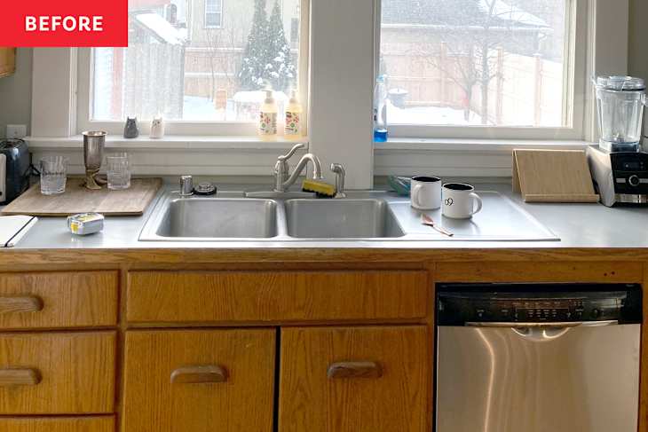
Sometimes great chefs’ kitchens can be the best inspiration for a cook space renovation. Just ask designer Dijana Savic-Jambert, co-founder and studio principal of Maredi Design, who transformed a wonky Milwaukee kitchen with bleak storage, dated appliances, and a less-than-ideal layout into something fit for legendary chef and cookbook author Julia Child. “Julia Child was famously known for her pegboard systems for organizing pots and pans in her kitchen,” says Savic-Jambert of the vision behind this vintage-meets-modern redo. “Plus, the clients are French-lovers and big cooks, so it was an ode to Julia’s brilliance in a lot of ways.”
But first, back to the former kitchen, which was suffering from an identity crisis. A screened-in porch had been annexed to the original kitchen for more space, but that created issues of cohesion and flow. “That piece-y and patchwork construction was very obvious and a primary pain point for our clients,” says Savic-Jambert. “There were cabinets blocking part of the exterior sliding patio door, a stand-alone makeshift island in the center, a gas stove with burners that did not always work, no upper cabinetry storage, and lighting that made the space feel dark and dreary.”


They Made the Kitchen Feel Bigger Without Adding Any Square Feet
Functionally, the room was suffering from poor design choices, too. “It was difficult to circulate around, and there was very little counter space to create meaningful work stations,” says Savic-Jambert. “It was complicated to cook with more than one person in the space, and storage was a challenge to say the least.”
When Savic-Jambert and her team began the project, the first order of business, though, wasn’t to add any more square footage. “The goal was to create a space where people could gather throughout various activities from cooking to sharing meals to properly enjoying morning coffee in the light-filled space,” she says. That work would entail maxing out cabinetry and counter space, picking handsome but airy finishes and hard-working built-ins, and rejiggering the layout so you couldn’t tell part of the kitchen was once a porch.

A U-Shaped Layout Gave the Kitchen More Room to Work and Gather
In terms of the layout, a U-shaped kitchen with a peninsula gave the room all it needed and more — both visually and functionally. “It created a centralized point of focus, while capitalizing on storage, work surface, and gathering space,” says Savic-Jambert. “This also meant that we did not have to put upper cabinetry everywhere in the kitchen, and by freeing up this wall space, the room felt larger.” One of the clients, a coffee buff, also got a fully integrated coffee niche installed on the peninsula. “Behind two simple doors, a dream barista station is ready to be put into action,” says Savic-Jambert.
This floor plan also left the back wall of the kitchen free. “This compelled us to add a customized shelving system that framed the door to the basement and the original radiator, providing the ideal space to put objects and books on display,” says Savic-Jambert. Inspired by the vintage green in a nearby original stained glass window and tiled fireplace surround, they chose green paint to highlight this stunning new feature.


The Kitchen Now Doubles as a Mudroom, Too
The last big challenge to solve? “At the onset, the clients flagged a primary issue, and that was the fact that the kitchen also happened to be the primary entrance and exit of the house rather than through the front door,” says Savic-Jambert. “And there was no existing mudroom or reception area. Since we were not expanding the footprint of the space, we needed to be smart on how we could integrate mudroom-like features in a very discreet way.”
The team got creative here, building a pantry/mudroom cabinet into a niche near the exterior door. Again, although the kitchen was essentially gutted, and the layout reconfigured, they didn’t significantly alter the footprint of the space. “We actually only changed two openings in the entire space: the exterior door, converting it from a sliding patio door to an exterior door, and closing off an interior passageway next to that door into the dining room,” says Savic-Jambert. “No other walls or openings were modified.”

Knotty Pine Floors Added Character and Saved Money
Unfortunately, the original oak floors had been refinished so much, the nails were starting to show through. So to ground the space and keep the older home vibes going, they landed on knotty pine floors to keep some extra character and soul in the area. “It just so happens that it is a more reasonably-priced wood species, especially compared to the trendy white oak floors that we are seeing everywhere,” says Savic-Jambert.
The cabinetry was more budget-friendly than you might expect, too. “We were so lucky to work with an incredible contractor who happens to be a carpenter and has a very special connection with an Amish community in Wisconsin,” says Savic-Jambert. “They do a really limited amount of projects and keep their costs very reasonable, especially compared to typical custom cabinetry and millwork prices that our industry is used to. They brought these flat-panel profile cabinets to life in this space.”


This Family Actually Wanted a Smaller Refrigerator
In terms of appliances, the family wanted to be a little more intentional there, too. The original fridge was a very wide French-door style with a bottom freezer, and Savic-Jambert’s clients actually asked her to replace it with something smaller. “It was big, and it was bulky, and the clients really disliked it,” says Savic-Jambert. “They very adamantly requested a fridge downsize, and this was because they really wanted to be more conscious of food storage and waste.” In came a slim SMEG fridge, which gave them the clearance they needed for the peninsula, the workhorse of the kitchen.
Every finish in the space was well-considered and chosen to honor the home’s heritage but interpreted through a modern lens. They kept and restored the original sash chain windows, casings, and baseboards. Savic-Jambert went with Cosentino Silestone countertops, Blanco Composite Sink, and a Brizo Solna faucet. “We decided to lean into black finishes for a slightly elevated look and to take a departure from re-creating a 1910s kitchen; we love to preserve the history but also add a layer of reinterpretation for a contemporary feel,” says Savic-Jambert. “Black hardware, black plumbing fixtures and sink, and black lighting fixtures really dressed up the kitchen.”

The Backsplash Was Kept Minimal on Purpose
The backsplash came from a favorite brand, Fireclay Tile, which makes its product sustainably. “The glazed brick finish felt like it echoed a vintage touch while still providing durability,” says Savic-Jambert. “We opted out of full backsplash throughout, leaning more into our French philosophy and only applying it where absolutely necessary, which was behind the range and just a small lip coming up from the countertops.”
For the lighting selection, we once again leaned into our French philosophy in opting out of recessed lighting. Generally speaking, that is not a selection we see often in French design. For our French-based projects, we use flush mounted lights to accomplish the same goal, plus, they are more aesthetically pleasing and dress up the ceiling a bit.”


The Secret Mudroom Is Hidden Inside a Floor-to-Ceiling Cabinet
And as for that Julia Child-inspired, chef’s kiss touch? “We came up with the idea of creating a floor-to-ceiling pantry cabinet with the custom pegboard system to provide the benefit of mudroom features in a compact and efficient way,” says Savic-Jambert. “The pegboard system allowed for the flexibility of storage required with the changing seasons in the Midwest. The placement was strategic, as this is the very first thing next to the exterior door.”
In the end, Savic-Jambert says the project was all about reintegrating the kitchen back into the home thoughtfully — both in terms of how it looks and functions. And the family using the space couldn’t be happier with the outcome. “Our clients told us that everything about how they used their home changed after this renovation,” says Savic-Jambert. “It rewired the flow of the ground floor and inspired them to rearrange other rooms so that they could spend more time in the kitchen.”
Design Defined
Never miss the style inspo and recommendations you crave with Design Defined. Follow along each week as our Home Director Danielle shares the best style advice, latest trends, and popular decor finds you just can't miss.