
A Designer Removed a Window — And Somehow Made the Kitchen Feel Bigger and Brighter
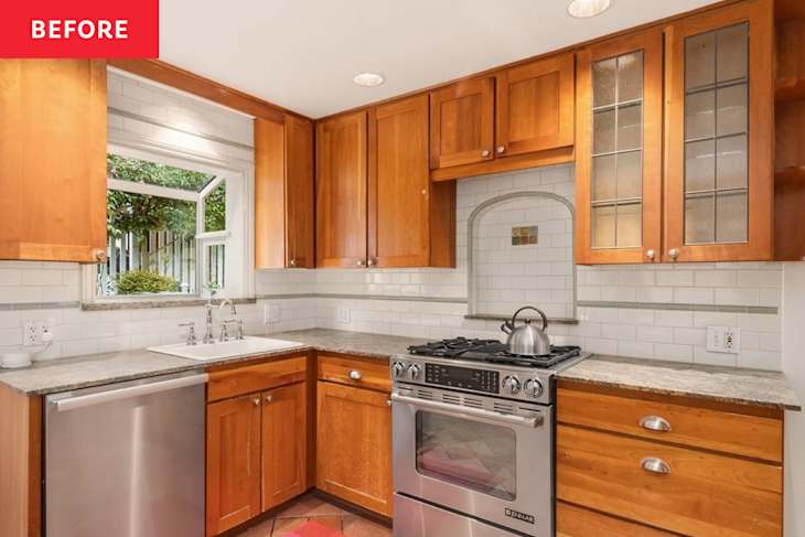
Sometimes you have to break a few design rules to create a space that sings. For designer Maghara DePaoli, founder of Seven Studio Interiors, that was the risk worth taking in her clients’ Seattle kitchen, which, despite being right on Lake Washington, had a wonky floor plan and lackluster finishes. “The layout of the original kitchen was very closed off from the rest of the home, and the flow was clunky — it felt very disjointed,” says DePaoli. “There was an empty wall with no cabinetry that felt awkward, and the fridge jutted out into the center of the kitchen. The overall aesthetic felt very dated, so we wanted to give it a facelift to feel current and connected to other areas of the home that had already been updated.”
Although improving flow and creating the ultimate setup for entertaining remained the primary goals, DePaoli also wanted to modernize the space and play up its proximity to the lake, too. “This home has an incredible view of Lake Washington, so opening up the kitchen allowed us to create a beautiful sightline from the kitchen through the dining room and into the living space where grand windows overlook the Seattle Tennis Club and the shores of Lake Washington,” she says. “It also allowed so much more natural light to pour into the kitchen, which was another goal.”


She Removed a Window to Make Room for More Light
DePaoli’s clients came to her with a proposed layout for the small space, but it was her expert eye — and not being afraid to break the rules — that really made the difference. To arrive at a lighter, brighter kitchen that looks much larger than its 200-square-feet, DePaoli strategically reconfigured the space by making two daring decorating decisions. First, she suggested removing (yes, removing!) a window. “Don’t get me wrong — capitalizing on and even adding natural light sources is always part of my design approach,” says DePaoli. “However, there are exceptions to every ‘design rule.’ Removing a window allowed us to add an entire wall of cabinetry and utilize the footprint of the kitchen much more efficiently.”
Not only did taking out that window (and opening up the adjacent wall connecting the dining room and kitchen) help the team access that gorgeous view, but it also gave them a better place to put the pantry and refrigerator, the latter of which is now in an unexpected but super-functional spot. “I rearranged things so that the refrigerator was not stuck in a corner,” says DePaoli. “Because it is such a big appliance, people often don’t know where to put it, and it ends up in a corner. Functionally, I don’t love this because it limits how far you can open the doors.”


The Refrigerator Found a Surprisingly Smart New Home
Instead, she suggested a location in the middle of one wall of cabinetry in the now U-shaped cook space, which is packed with both cabinetry and counter space for prep. “It feels more integrated, and it allowed for a coffee bar on the left and a pantry on the right,” she says. “This solution felt much more custom.”
DePaoil also doubled down on a gorgeous neutral palette. Not only did that fit with her clients’ aesthetic, but “it also allowed the space to feel bright and open,” she says. Quartz counters with a bit of polish reflect the sun streaming through the window and door, while light-colored cabinetry feels visually quiet and visually weightless. A stone backsplash ties the cabinetry and flooring together while adding an element of luxury to the space. A gorgeous peninsula creates the illusion (and eat-in functionality) of an island without sacrificing the square footage it takes to completely float this kind of feature.


A Dark Dutch Door Adds Character to the Neutral Kitchen
A few small details also shine in the space, from splurge-worthy Top Knobs hardware and a Signature Hardware pull-down faucet to the gorgeous dark green Dutch door. “The entrance into the home is located in the kitchen via a Dutch door, which we loved and really wanted to highlight,” says DePaoli. “Instead of replacing the front door during the renovation, we decided to paint it dark to highlight it as a charming design element. This was a very cost-effective design update that had a huge impact. The contrast is beautiful in an otherwise neutral kitchen. For the door, we used Sherwin-Williams’ “Rock Bottom (SW 7062).”
The work took about two months, and now her clients couldn’t be happier with the results. Ultimately, though, this kitchen now proves DePaoli’s original point: that design rules are sometimes meant to broken. “Every space is unique, and sometimes the best solution is one that breaks conventional rules,” says DePaoli. “It is important not to let the rules get in your way, especially in small spaces.”
Design Defined
Never miss the style inspo and recommendations you crave with Design Defined. Follow along each week as our Home Director Danielle shares the best style advice, latest trends, and popular decor finds you just can't miss.