
A Designer Took This Tiny 1920s Attic from “Dingy and Dark” to a Fabulous Bonus Room
Amy and Thomas were thrilled with their new home — a stunning 1925 Tudor in New Jersey — but some of the spaces felt downright “dingy and dark.” So the couple brought in interior designer Kristina Phillips, who is known for her bright and airy designs, to help update their space. “It had all the traditional Tudor elements they loved — dark wood, beams, and archways,” says Philips. But one thing it was missing was an office for Amy.
While Thomas had an office downstairs, Amy desired a quiet retreat of her own “away from the noise and chaos for the days she worked from home,” Phillips says. “She has a lot of Zoom calls and wanted her home office to feel feminine, light, and airy, and just beautiful — her sanctuary.” That’s when Phillips remembered the one room that wasn’t being used for anything just yet: the attic!
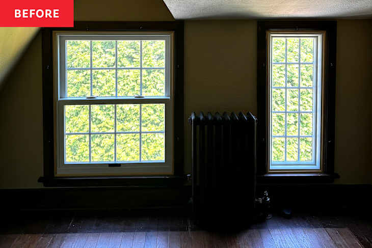
On the very top floor of the home, the tiny attic wasn’t much to look at — and it certainly wasn’t “light and airy,” as Amy had wanted. “It was sort of depressing,” says Phillips. “The floors were creaky, and the room had all kinds of [awkward] angles.” It was, essentially, a wasted space.


“The attic walls were textured and painted a brownish green, sort of like a dirty bathwater color,” says Phillips. Patches of peeling paint and “dingy beige finishes” certainly didn’t help. The ceiling’s traditional stucco finish and deep slope, combined with the room’s low windows and discolored floors, also posed a challenge. But the designer had a vision.
So Phillips began the design process, keeping in mind Amy’s vision of a bright, feminine sanctuary. Two details that guided the design scheme were the client’s love of the color lavender, and her affinity for prints — so when Phillips first discovered this gorgeous floral wallpaper, she knew it would set the tone for the rest of the room.

“Pattern Drenching” Helps Lessen Awkward Angles and Soften the Space
“The wallpaper really was the driving force behind the whole design,” says Phillips. In a clever move, the designer chose to “pattern drench” the space — applying the wallpaper across both the walls and the ceiling — in order to lessen the impact of all of the harsh angles. Plus, due to the lack of a flat ceiling, “there was no logical place to stop” anyway, Phillips explains.
This bold design move gave the room the sense of harmony and continuity it had been sorely lacking. “It blends everything together — very cohesive, no disconnect,” the designer tells me. For the trim, Phillips pulled a light lavender shade from the wallpaper and matched it to keep things cohesive. They landed on Benjamin Moore Orleans Violet, a pinkish-lavender tone, and applied it to the window surrounds, baseboards, and even the radiator.

To keep the palette light and airy (and to keep the budget lower), they painted the hardwood floors white instead of refinishing them. A dark wooden tone would have made the space (which measures just 100 square feet) feel smaller and bottom-heavy.
Finally, the designer added Roman shades in a lilac linen fabric to help make the room feel even softer. The Roman shades, especially in a light, drapey fabric, feel “so much more feminine than a woven shade,” Phillips says. To bring in more daylight, they keep the shades open most of the time, as there is no privacy concern with neighbors on that side of the home — but the window treatments make the space feel much more polished.
Finally, Furniture! A Glass Desk Helps Keep Things Light and Bright
What’s a home office without a desk? The designer selected one with a glass top and Lucite legs so that the workspace wouldn’t feel “visually heavy.” “Having a solid piece in there would have taken up so much space visually,” Phillip notes. “[The desk] kind of floats in the room.”

A builder-grade “boob light” above the desk was swapped out for a flush-mount fixture from Visual Comfort in burnished silver leaf and clear, swirled glass, which again helps keep the room feeling airy and open by avoiding adding visual “weight” to the ceiling.
Finally, the once-unused attic is now a bright, open, floral-filled workspace, designed for Zoom calls and quiet focus. Phillips calls the project a success: “[The client] absolutely loves having this space all to her own … and it works well for her many video calls. She gets so many compliments on her backdrop!”
Design Defined
Never miss the style inspo and recommendations you crave with Design Defined. Follow along each week as our Home Director Danielle shares the best style advice, latest trends, and popular decor finds you just can't miss.