
A Designer Made Her Bland, “Sad Beige” Guest Bedroom into a Luxe, Layered Retreat
Guest bedrooms, while always nice to have, can pose an interesting challenge when it comes to actually decorating. You want your guests to be comfortable, but you also probably don’t want to pour a ton of time and money into a space you won’t actually be using most of the time.
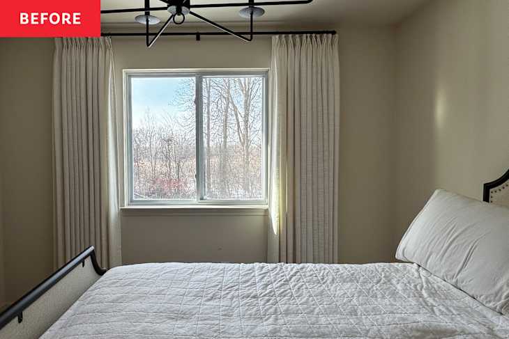
Such was the case for Tonia Hobbs, a Realtor and interior designer based in Detroit. While her guest room wasn’t bad by any means, the color palette was bland, and the furnishings were somewhat boring. ”The room mainly consisted of a bed with very minimal decor and paper Roman shades on the windows,” Hobbs explains. She said it lacked the “warmth, personality, and the inviting atmosphere [she] wanted guests to experience.” So 11 years after moving into her place, she decided to give her guest room a boutique hotel-inspired makeover by shopping her own home as much as possible — and without any real renovations!

She Chose Simple Swaps Over Major DIY Projects
“I had originally considered incorporating crown molding and picture molding,” Hobbs explains. “But [I] decided to simplify the approach and focus on styling rather than structural updates.”
In the end, she didn’t even need to pick up a paint brush to transform the room into the warm, welcoming retreat of her dreams. The designer decided to work with the room’s original bed and console table, and, in her own words, just “focus on layering in new pieces that would enhance what was already there.” She’d branch out with colors, and layer in texture through textiles and accessories.

Defining a Color Palette Helped Hobbs Stay On Track (and Under Budget)
While looking for inspiration to craft this boutique hotel feel, Hobbs predictably found herself drawn to the higher-priced decor that goes hand in hand with the luxury hotel look. To help keep herself on track, she decided to start with one key piece she already owned to help define the color palette and inspiration for the rest of the space: an abstract print. “I used wall art from Target as the foundation for the room’s palette and pulled colors directly from it to guide [my choice of] bedding, accents, and decor,” Hobbs explains.
The artwork features mostly neutral colors to pull from, which helped keep the overall vibe of the space calm and hotel-like. “I leaned into soft, cool-toned neutrals, layered textures, and subtle contrast to bring depth and comfort to the space without overwhelming it,” the designer explains.

Thoughtful Layering Took the Space from Blank Slate to Boutique Stay
From there, the project came together pretty quickly. Hobbs styled the bed with this gorgeous dusty blue velvet quilt from Target, echoing the pop of color with this matching blue velvet bolster pillow. She also added an area rug with a blue border to tie the whole space together, placing it on top of the pre-existing carpeting.
Hobbs also decided to swap out the window treatments; these Two Pages pleated linen drapes add a nice hit of subtle texture for just $60 a panel. The drapes completely softened the room and added the final layer of warmth and understated luxury the space had been missing,” Hobbs says.


A Few Budget-Friendly Additions Make the Space Feel Finished
Perhaps the biggest change she made was adding in a reading nook. This faux shearling accent chair from Studio McGee’s Target collection brought both softness and functionality to the guest room. “The seating area creates a quiet moment within the space where guests can relax with a cup of coffee, read a book, or comfortably put on shoes,” Hobbs explains.
She did invest in some new lighting, too. “Lighting was another important layer of the design,” Hobbs explains. “I wanted guests to have options depending on their mood or time of day, whether that meant softer lighting in the evening or focused lighting for reading without disturbing someone else in the room.” The floor lamp from Amazon goes nicely with this dramatic gold arched mirror — both of which introduce shine and some drama to the otherwise tonal space.

The Final Room Turned Out Layered and Luxurious
In the end, the project took a total of four months — and only a few new purchases — to complete. The designer was proud that any and all new pieces she did buy were all sourced from “accessible retailers like Target and Wayfair.” And yet, she explains, each of these items “feels substantial and high-quality; nothing in the room reads as cheap despite the budget-conscious approach.”
“More than anything, I wanted guests to feel cared for and comfortable — almost as though they were staying in a small retreat within my home,” Hobbs says. And to do that, the designer “wanted every detail to feel thoughtful and intentional.” She managed to accomplish it without any major renovations or expensive pieces. With a clear color palette and added textures, the “bland” bonus room was transformed into a layered space that looks like it truly belongs in a boutique hotel. “Now, when I walk into the room, I immediately feel relaxed,” says Hobbs. “I love that [it] feels soft, layered, and refined.”
Design Defined
Never miss the style inspo and recommendations you crave with Design Defined. Follow along each week as our Home Director Danielle shares the best style advice, latest trends, and popular decor finds you just can't miss.