
Benjamin Moore’s 2019 Color of the Year is a Refreshing Surprise
We’re finally in the last quarter of the year, which means the 2019 Color of the year announcements are streaming in more steadily than ever. The latest contender? Benjamin Moore.
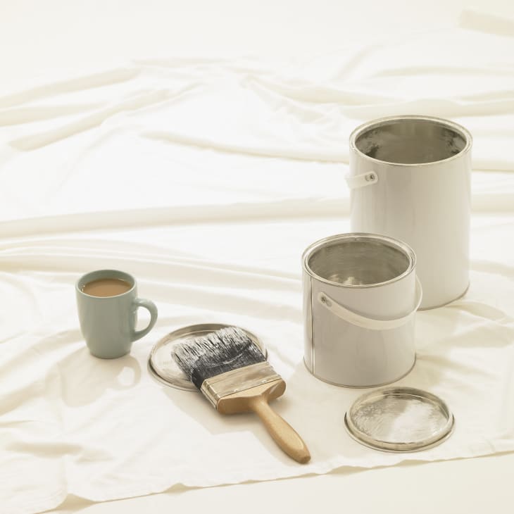
On October 10, the paint brand gathered design editors, interior designers and other industry folk at The Grill & The Pool at the Seagram Building in New York City (a bastion of mid-century modern design). After a few minutes of socializing and a welcome glass of champagne, it was time for the big announcement.
The lights dimmed and a hush fell over the crowd as a short video was projected onto the wall. It showcased a variety of inspiration images before finally revealing the big news: the Color of the Year was Metropolitan AF-690. (No, the AF doesn’t stand for what you’re thinking, it just indicates the color is part of the Affinity Collection.)
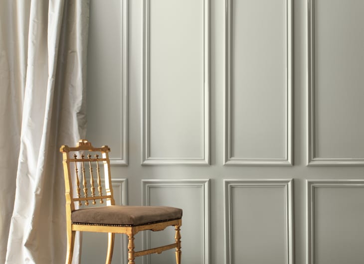
Metropolitan AF-690 is a light gray with cool undertones, that can read just the slightest bit green depending on the light. It’s basically a neutral-lover’s neutral.
“Comforting, composed and effortlessly sophisticated, Metropolitan AF-690 exudes beauty and balance,” said Ellen O’Neill, Benjamin Moore Director of Strategic Design Intelligence in a press release. “It’s a color in the neutral spectrum that references a contemplative state of mind and design. Not arresting nor aggressive, this understated yet glamorous gray creates a soothing, impactful common ground.”
Once the announcement was made the crowd let out a collective appreciative ‘oooh.’ For me, that ‘oooh’ was not because the color was particularly breathtaking, but because it’s such an unexpected choice. More often than not, these COTY choices are bold, and, yes, beautiful, but just not something most people would integrate into their homes.
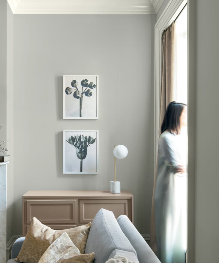
Last year, Benjamin Moore chose Caliente AF-290, a vibrant red, as their Color of the Year. And while I found it gorgeous and exciting, it’s just not a shade the average person is going to paint their walls (unless they’re looking for a full redecoration). So seeing a Color of the Year choice people might actually use is kind of invigorating. Metropolitan doesn’t feel like a color chosen for the shock value, instead, it feels like a thoughtful choice that consumers will actually respond to.
And sure, it doesn’t have the same Instagram-worthy vibe of some of the more out-there choices, but hey, we’re still waiting on Pantone’s COTY, so if social media fodder is what you’re craving, they’ll probably have you covered. But if a neutral shade that will work in just about any home is more your speed, Metropolitan AF-690 might be just what you’re looking for.