
The 11 Very Best Paint Colors of 2024 So Far, According to Designers
With thousands of paint colors to choose from, it can be overwhelming to narrow it down to just a few to incorporate into a home. So why not take a cue from the pros by copying the shades they’re loving right now? Tried-and-tested hues are definitely a great place to start when you’re searching for a paint palette. That’s why I asked 11 designers to share their favorite paint colors for 2024. Lucky for you and me, they’ve chimed in with everything from reliable neutral colors to bold green paints that will surely spice up your space. So there’s something for everyone on this best list.

1. Benjamin Moore Quietude (CSP-230)
Designer Aimee Lee Kinssies, the founder of ALK Design & Interiors, gravitates toward Benjamin Moore’s Quietude (CSP-230), a warm brown shade, due to “the state of calm I feel when I see it,” she says. “There are certain colors that make you want to touch them, and Quietude is one of them,” she adds. “Soft hues and colors like this … beckon us to sit down, put our phones down, and just be.” It’d be lovely in an entry, greeting you like a warm hug when you walk in from the busy outside world, or a bedroom, where you want to be in a restful state most of the time.

2. Farrow & Ball Sulking Room Pink (No.295)
Designer Julie Couch paired Farrow & Ball’s Sulking Room Pink (No. 295), a sweet shade, with a blue and white toile wallpaper. “It feels a little moody and dramatic but so feminine,” she says of the color. You could put this in a bedroom, too, for a glamorous vibe.

3. Benjamin Moore Santa Monica Blue (776)
Looking to put a little pep in your step? Say yes to Benjamin Moore’s Santa Monica Blue (776). “This bright blue shade is optimistic and upbeat but still dark and cozy,” says designer Michelle Gage. “It hits all the right notes, making any room’s walls really pop!”

4. Sherwin-Williams Tricorn Black (SW 6258)
Make it moody with a classic black. Designer Kelley Gable of Gable Interiors is partial to Sherwin-Williams’ Tricorn Black (SW 6258) for exterior architectural elements. “It gives beautiful depth to entryways, trim, shutters, or accent features,” she says. You can also try this shade inside, as shown here in this kitchen by Gable, where it’s used on an interior door.

5. Benjamin Moore Ballet White (OC-9)
There’s something to be said about a classic shade of white. “I’ve never been trend-driven and tend to stick with timeless colors so that a room can evolve over time,” says designer Jacob Laws. He opted to introduce Benjamin Moore Ballet White (OC-9) into his own informal dining space for that reason, and you can’t go wrong with this designer-approved white — especially if you like to accent with colorful art, textiles, and objects.

6. Farrow & Ball Teresa’s Green (No.236)
It’s safe to say green’s moment in the sun isn’t over quite yet, whether you feel like using it in a bedroom, bathroom, or kitchen. According to designer Michal Rubin of MR Interiors, Farrow & Ball’s Teresa’s Green (No. 236) is the “perfect shade of eucalyptus or sage green with just the right brightness.” She recommends trying it on an accent wall or on walls with molding and millwork. “Can’t go wrong with either,” says Rubin.

7. Sherwin-Williams Garden Gate (SW 6167)
If you’re eager to go moody with a deeper green, Sherwin-Williams’ Garden Gate (SW 6167) is “a perfect way to lean into the unexpected,” says designer Cat Walker. “As homeowners become more daring in their selections, this is a powerful color to add to your radar in 2024,” she adds. “Whether used as an accent or a bold statement, Garden Gate is sure to captivate and inspire.”

8. Benjamin Moore Gray Huskie (1473)
In search of a great gray? Designer Julie China, the founder of Idea Space Architecture and Design, is all about Benjamin Moore’s Gray Huskie (1473), “a versatile and timeless shade of warm gray with subtle blue undertones.” Pair it with white for a nice contrast and note that it looks just as stunning with reclaimed wood floors, as shown here in one of China’s projects.

9. Farrow & Ball Singed Red (No.G15)
“To add more vibrancy to our palette, we are incorporating red and deep green shades this season,” says designer Anna Vasiltsova, the founder of Studio Anna Design LA. Don’t be afraid to use a shade like Farrow & Ball’s Singed Red (No.G15) in a smaller space like a powder room, as the designer did in conjunction with oak veneer panels. “The result was a perfectly aligned design that was beautifully complemented by Viola marble, adding a rich and luxurious touch to the space,” she shares.

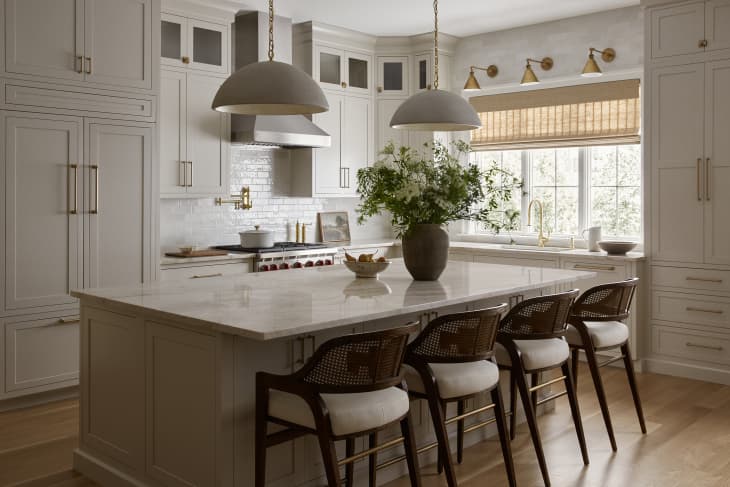
10. Sherwin-Williams Gossamer Veil (SW 9165)
In search of a trusty kitchen cabinet hue that will carry you through 2024 and beyond? Try one of designer Katie Winnington’s favorite whites, Sherwin-Williams’ Gossamer Veil (SW 9165), for the kitchen. “It blends so beautifully with brass and still has such a rich tone to the color,” says the founder of C&E Furniture + Design.

11. Sherwin-Williams Sensuous Gray (SW 7081)
Make an effort to bring some romance back into your primary bedroom with the addition of some Sensuous Gray (SW 7081), which actually reads as purple, says designer Paige Williams. When working with this color, bring it to the ceiling, she suggests. “It creates a finished, cohesive look that gives the room a moody makeover, and [this] is always recommended when using a darker color,” she says.
Design Defined
Never miss the style inspo and recommendations you crave with Design Defined. Follow along each week as our Home Director Danielle shares the best style advice, latest trends, and popular decor finds you just can't miss.