
I Hated My Baby-Blue Walls — Adding This Unexpected Color Saved Me from Repainting
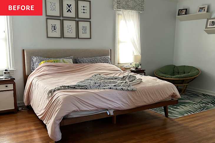
Light blue walls are said to be serene. But waking up in a bedroom with the same palette as a nursery? That’s something that irked me more than hitting the snooze button in the morning.
Yet, I lived in this blue bubble for three years. After moving to Cleveland, Ohio, from a Florida suburb, my 1938 house kept me busy with other projects. So this uninspired space stayed the same — even though my old mid-century modern bed and ikat cornice upholstery didn’t quite suit my Normandy-style home’s character, which now includes my bold home office and a William Morris-inspired music room. While this primary bedroom is large, the long rectangular shape and window placement made furniture positioning awkward.


The Makeover Started with Peel-and-Stick Wallpaper
When I found Nabela Noor Home’s Aliviya peel-and-stick wallpaper, I jumped at the chance to give this space some personality. The background matched the blue wall color, which saved me hours of labor because I didn’t have to paint, and the delicate florals and trailing vines almost looked like a mosaic.
But the real transformation began when I stumbled on a CB2 dusty lilac velvet bed, which was a much-needed upgrade. We were still hanging onto an older, oat-colored, mid-century modern-inspired frame we had had in Florida, so it was time for a change.

Lavender Vibes Started to Take Over
My obsession with lavender started with a bath towel. Soon after, I added Quince linen sheets in a similar color to amp up my bedscape. This soft tone offset the boring blue walls, and the bedroom began to have some depth. At this point the design bug took over, and I began scheming on a full bedroom makeover.
I knew I had to reupholster the cornices. The white-and-blue ikat pattern blended in too much, especially with the bright white window trim paint. Finding the right color and pattern took over a year. I didn’t want the pattern to be too busy, but at the same time I wanted it to coordinate with the dusty lilac velvet of the bed frame.

I Found the Perfect Fabric and Paint Color
As luck would have it, my favorite wallpaper brand, Chasing Paper, released fabric in the Kent Street print. I’d been eyeing this pattern for another project and couldn’t believe it when they dropped the fabric in mauve. I opted for the horizontal orientation to lean into the whimsy of the wave, with delicate blooms as accents. At $180 per yard for the cotton-linen fabric, it’s a splurge, but I needed less than three yards to cover the three cornices, which was a win.
To tie everything together, Backdrop’s Good Intentions, an almost smoky lilac, was the perfect paint choice for the window trim. The color is so hypnotizing; I decided to paint the doors of my closet, too. (My bedroom has a vanity dressing area that connects to the bathroom, and this created cohesion between the two spaces).


I Worked with Existing Furniture and Art
My dresser and nightstand were passed down from my husband’s grandmother — and we have no plans of giving up her Century furniture. To soften the modern look of the white-and-wood, though, I looked to Ernesta to create a custom runner with leather strips running through the flatweave. By moving the dresser under the floating shelves on the adjacent wall, the bedroom furniture looked more cohesive. But now I was left with an empty corner that required some creative furniture shopping from around my house.
Around this time, I finished up a retro basement makeover and had an extra gray Burrow modular sofa that fit perfectly near the window. The modern art above reminded me of Lake Erie, and I wanted to embrace the warm color palette with accessories. By adding a geometric Cozey runner and a burgundy faux marble side table from Dayalane, I had a little reading nook that doubles as a mini work perch when I’m not quite ready to start the day in my home office.

Accessories and Bedding Completed the Contemporary Cottagecore Makeover
The final touch — a Queen’s Lace print above the bed — was a bit of kismet. I was at a local resale shop, Mix Vintage, when the cobalt blue art caught my eye. I went back three times before purchasing it because I couldn’t stop thinking about it. Turns out, this limited-edition original work is by a Cleveland artist, Martin F.W.J. Szutter, who showed at the Cleveland Museum of Art in the 1970s. The clean lines and emerald green stems of the flowers are just what this room needed to stay fresh. Hanging up the print also gave me an excuse to get my hands on cordless Pooky lamps with marbled paper shades. The blue happens to contrast with the red swirls, which gives the nightstand setup an unexpected moment.
Part of my job as a design writer is testing bedding, so I had a field day going through my linen closet. I settled on this groovy Brooklinen duvet and sham set with florals that make me think of verdant cyanotypes — a lovely contrast to my lilac linen sheets. Adding the Sijo cover in sky blue between the sheets and duvet played up the stripes of the runner by the bed. As a final touch, I threw on a multi-stripe waffle quilt to bring all the elements of the room together.

The Room Finally Feels Collected, Cozy, and Completely Its Own
The bed looks like it could belong in an art gallery, which is the antithesis of where this project started. Even though the walls are still that same baby blue, they aren’t swallowing up the entire bedroom with their boringness.
By layering patterns and zoning the room’s layout, the space is far from boring and reminds me of a boutique hotel. I love that the final result is a spin on a contemporary cottagecore motif anchored in collected design.
Design Defined
Never miss the style inspo and recommendations you crave with Design Defined. Follow along each week as our Home Director Danielle shares the best style advice, latest trends, and popular decor finds you just can't miss.