
This Bathroom Went from Boring Builder Grade to “Wow”
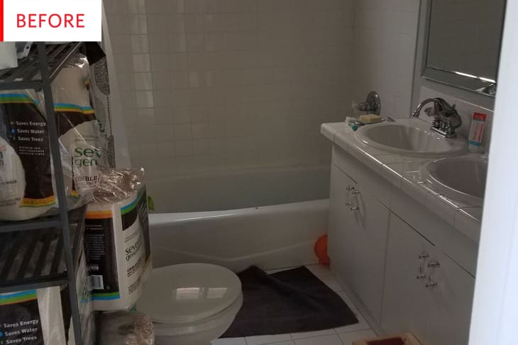
While there isn’t anything inherently wrong with this “before” (it’s clean, it’s white, it’s rocking some fun cabinet hardware and additional storage), we’re saying it: it’s boring. This bathroom could be in just about any house in any part of America. The “after” though…well, we’re smitten (it features one of the most stunning floors seen in all our Before & Afters). Bid farewell to the seashell sinks and get ready to greet the world’s dreamiest tiles…
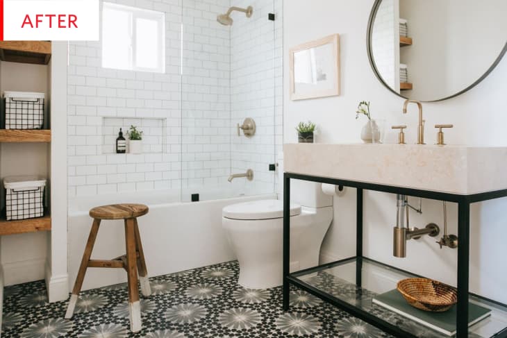
This renovation by Katie Monkhouse Interior Design is all-around gorgeous, but I only have eyes for that floor. It is elegant and mesmerizing, and yet somehow understated. It utterly transforms the room without dominating it. The room’s clean lines and classic, high-quality materials are perfectly suited to the 1920s Craftsman house in which it resides.

This bathroom had an awkward configuration: having the toilet opposite the sink makes for a narrow walkway and an overall crowded feeling. And while I salute the residents for their bulk-buying and stockpiling, the full shelves only add to that crowded look and feel.
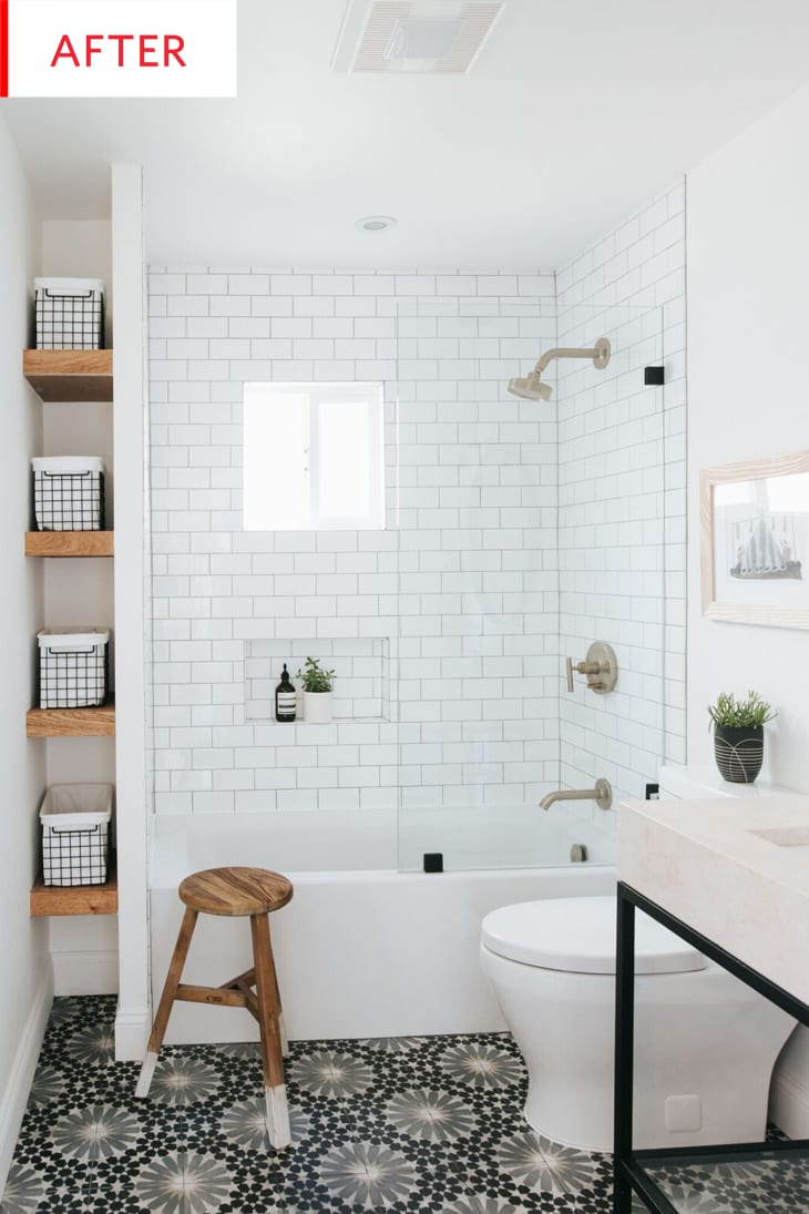
Now the toilet is tucked in next to the sink, leaving the rest of the floor open: same amount of floor space, completely new feeling of spaciousness. The glass shower surround is so much more streamlined than a curtain, and instead of the shelving jutting into the room, there’s now integrated storage that’s totally out the way. The only thing I would do differently in this bathroom would be to store rolls of toilet paper and paper towels on a couple of those shelves with taller baskets (so the contents are hidden).
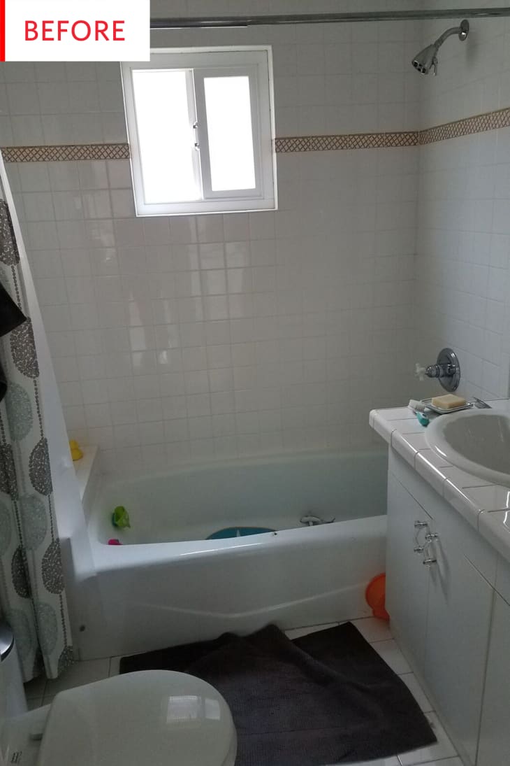
Honestly, this bathroom seems like it was in pretty good shape pre-renovation: all of the fixtures and surfaces seem clean and undamaged, and all the white surfaces bounce the light nicely. I have a personal grudge against tiled countertops and scalloped sinks, but there’s nothing actually wrong with either of them beside feeling a little dated.
This photo reveals that there used to be a shelf at the end of the bathtub, meaning that little-to-no bathing space was lost by adding the new storage.
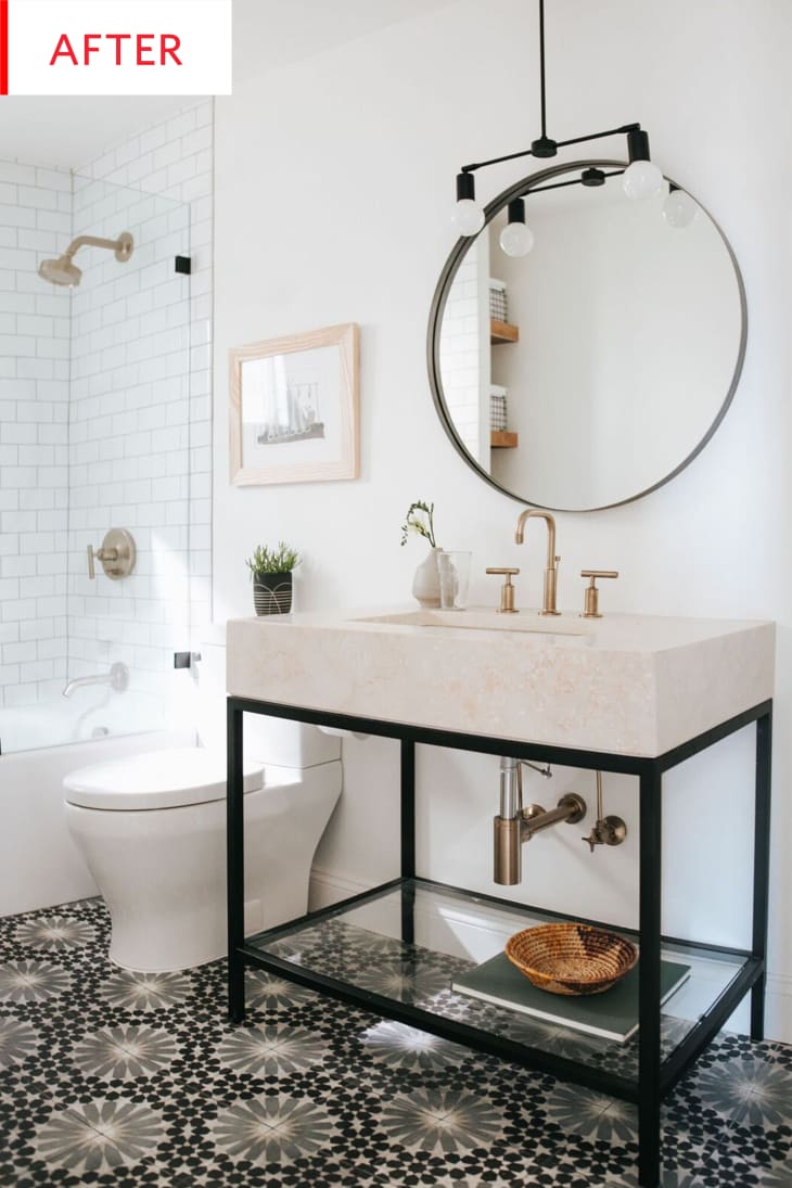
But now! That sink is a showpiece, with ample and easy-to-clean usable space around the bowl. The toasted marshmallow hue of the stone, the gold metals and the wood accessories warm up a room that, thanks to its white paint and shower tiles, could have felt a bit sterile to some. The three different wood tones (stool, shelves, and frame) mean that the remodeled bathroom doesn’t feel overrated or too matchy-matchy, but the whole remains unified.
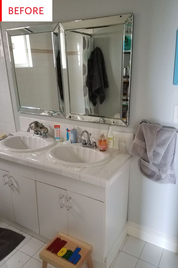
Ooh, I also have an irrational grudge against faceted mirrors, but I must admit that these are doing a bang-up job of reflecting the natural light (though it does feel forced to have them flush side-by-side like that). And Noah’s stool is darling!
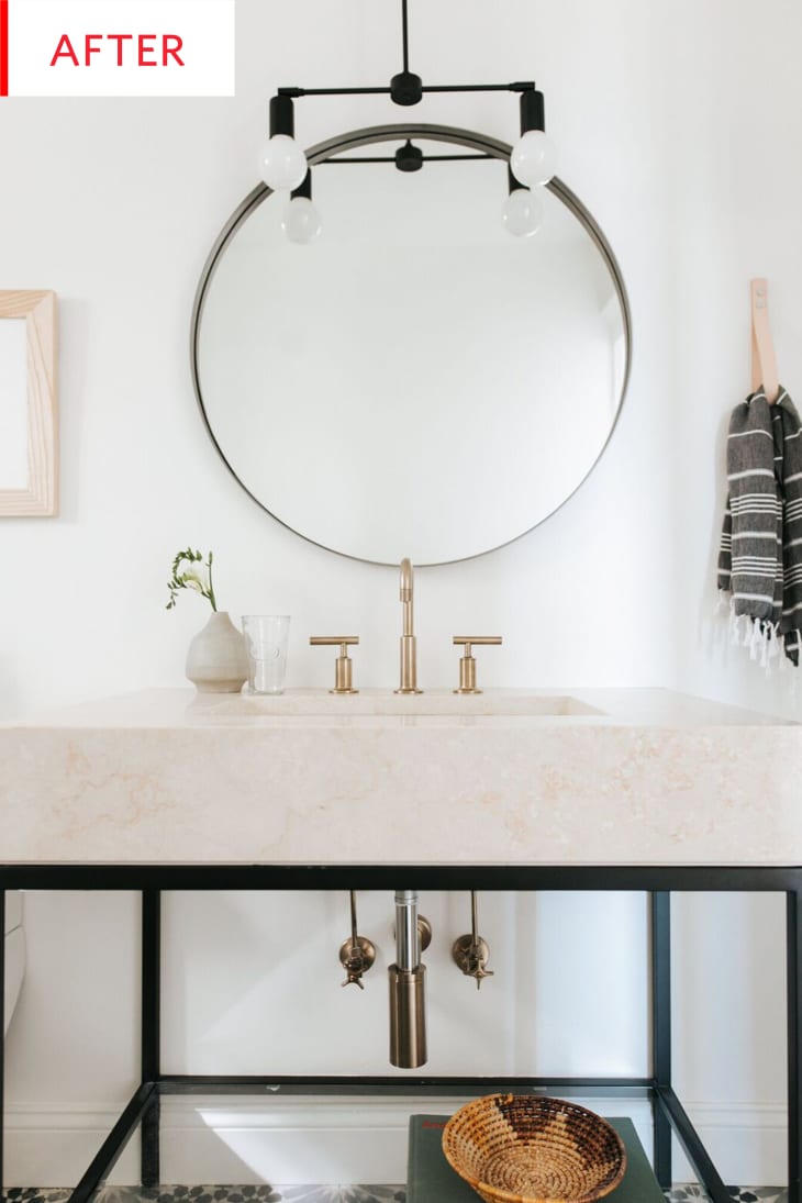
Dedicated readers should correct me if I’m wrong, but I believe this is the first time we’ve seen a pendant light hanging over a bathroom sink? The black metal of the light fixture pairs perfectly with the vanity’s legs, while the luxurious faucet and even the pipes are as lovely as jewelry—bonus points for the bold and beautiful mixing of metals.
Thank you, Katie Monkhouse Interior Design!
- SEE MORE BEFORE & AFTER PROJECTS
-
SUBMIT YOUR OWN PROFESSIONAL PROJECT