
This Kitchen Was Anything but Functional Until It Got a Light, Modern Redo
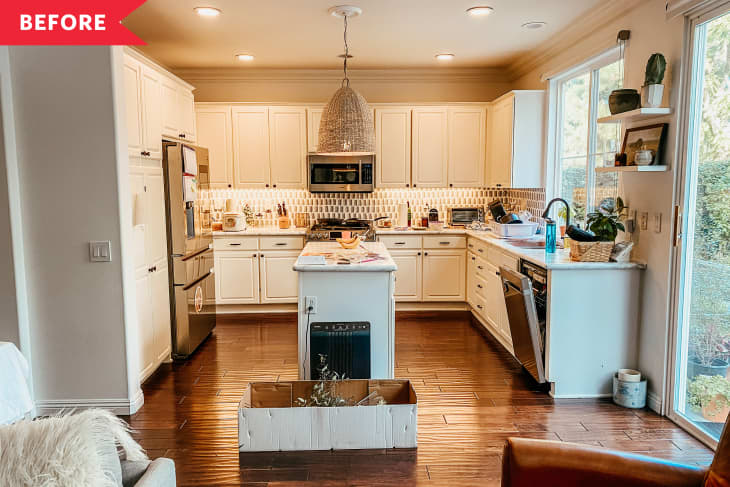
Sometimes you’ve gotta go big when it comes to a renovation, and that doesn’t always mean in terms of scale. Often, it’s about the scope of the work and taking a chance on layout tweaks and storage changes to find what works for you. That was the case for designer Anita Yokota and her late ’90s cook space, which she shares with her husband, Travis, and three daughters.
At first glance, there was nothing glaringly wrong with Anita’s open-plan kitchen; she had DIYed a few cosmetic fixes to bring it into this century, brightening the dark granite countertops with white marble contact paper and using Rebecca Atwood wallpaper as a backsplash.
What you can’t see from the photo is that the melamine cabinet doors had begun peeling and falling off their hinges, while the odd dimensions of the cabinet boxes and the island were bringing the space’s functionality down.
While It Looked Nice on the Outside, It Was Falling Apart and Was Dysfunctional
“There were so many dead corner spaces with deep recesses of nothing, so when we stored things there, everything got pushed to the back and lost or wasted,” Anita says. “The dysfunctional flow of the kitchen, blocked by a narrow island, also kept me from being my best self, or mom, or partner in there.”
After saving enough money and finally having the time and energy to dedicate to a gut reno, Anita was finally able to DIY the desert palette-inspired, functional kitchen of her dreams. Of course, as a pro designer, she had a leg up on knowing her aesthetic and certainly hired out a few of the smaller jobs throughout the process.

She Planned Her Kitchen Around What Their Goal as a Family Was
At the core of Anita’s project — and really the core of her client work and design philosophy as a trained therapist — was the “why,” and that’s something any DIYer should suss out and use to their decorative advantage. “Our main goal was to be a healthier and happier family in the kitchen,” she says, of the motivation behind her redesign.
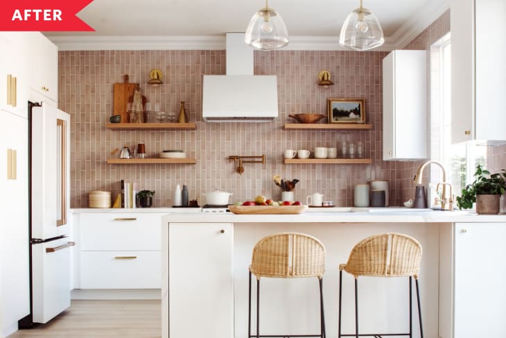
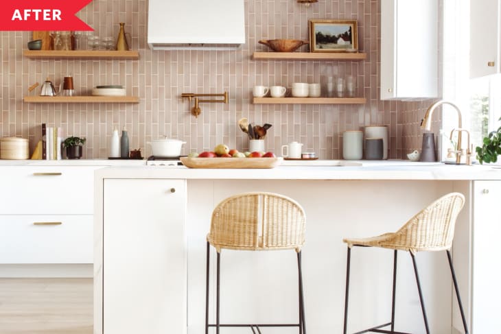
To that end, Anita focused on spatial flow. Even though kitchen islands top most people’s wish lists, she decided the room’s footprint would be better for cooking and meal planning if she brought in a peninsula instead, creating more room for the family to pitch in and a better work triangle between the range, sink, and peninsula countertop. Pre-assembled cabinetry from BOXI by Semihandmade was chosen for its ideal depth, where snacks, pantry items, and canned goods wouldn’t get lost.
Pots and pans are at the ready in new base drawers, instead of hidden in the back of upper cabinets. Favorite cups, bowls, and serving boards pepper the back wall of open shelving, which is the new statement focal point of the space (as opposed to the former awkward island). Having limited real estate in this spot in particular has made the whole family more mindful about what they keep and need.

She Used Whites and Pinks to Create a Warm and Bright Atmosphere
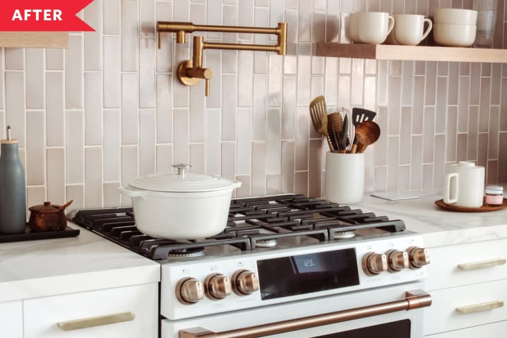
In terms of finishes, Anita decided to create a warm, California casual atmosphere where the family would want to linger. So she had Fireclay Tile’s Desert collection tiles laid vertically for a dramatic, ceiling-high backsplash, which is the perfect cozy pinky-beige backdrop that sets the tone for the honey colored woods and brass accents throughout the space. She chose Sherwin-Williams’ “Pure White” for the trim, walls, and cabinetry, which makes the room look big, bright, and airy.
New matte white appliances and a range hood from GE’s Café collection now seamlessly blend into the space, even though they’re still in their original spots. The flooring in the kitchen was previously very dark, so lighter Cortec floors now reflect all the sunlight coming in from the windows instead of absorbing it, visually opening up the space further. Clear glass light fixtures anchor the peninsula, which is larger than the original island but doesn’t cut off the space and make it feel closed-in.
The work took five weeks, which is a truncated timeline for a reno of this scope, but Anita is, after all, a pro who waited many years for this kitchen and really knew what she wanted from the room.
That said, getting her cabinets level when installing them was a true challenge, and if she could do the work over again, she’d have ordered her fixtures and cabinet hardware at the same time, since the different brasses throughout the space are not a perfect match.
She Recommends Planning and Communicating Everything Ahead of Time
“Pre-plan all the fixtures and materials ahead of time, but not so far ahead that you can’t return things,” Anita says. “I made that mistake and had to keep some fixtures that I bought too early on.”
Clear communication with your subcontractors, installers, and fabricators is also key, and she has another great tip for hiring out any job. “Tape up printouts of spec sheets with elevations/measurements and websites’ photos of fixtures and materials where they’re supposed to be on the actual site,” Anita says. “This way, the trade can get their questions possibly answered even if you aren’t home.”
From a design standpoint, Anita couldn’t be happier with the kitchen and has found that it’s truly changed the way her family lives in their home for the better.
“Swapping out the island for the peninsula not only offers more space, but since it seats only two people at a time, we’ve started eating in the dining room again,” Anita says. “Restructuring the kitchen has helped redirect traffic to the right areas of the home.”
Inspired? Submit your own project here.
Shop This Before & After


- Paint
- Products
- Cabinets from BOXI by Semihandmade
- Aksel White Oak Wood Floating Shelf from Shelfology
- “The Desert Collection” Ceramic Tiles from Fireclay Tile
- Rose City Fitter Rod Pendant in “Aged Brass” from Rejuvenation
- Commercial Hood Ventilation in “Matte White” from GE Cafe
- Smart Convection Range in “Matte White” and “Brushed Brass” from GE Cafe
- Smart French Door Refrigerator in “Matte White” and “Brushed Brass” from GE Cafe