
The New “It” Color Is Something You Probably Wouldn’t Pick, but Designers Love It Anyway
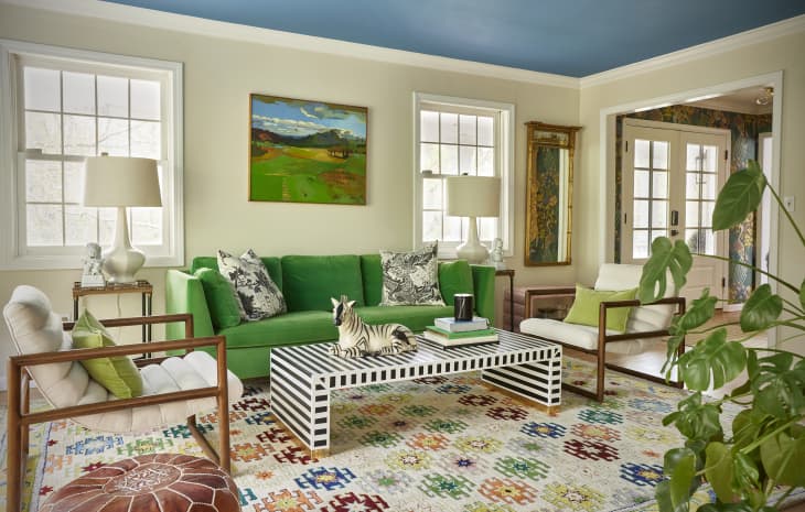
It’s no secret that the design world has been loving greens lately. It all started with earthy sages at the beginning of the decade, and then forest and hunter greens started to make their way out of ’90s kitchens and dining rooms and into post-COVID palettes. But those shades were maybe a little too safe or neutral for the maximalist design revival that’s happening right now, as the second half of the 2020s continues to unfold. Homeowners and renters seem to want drama, with colors that shout instead of whisper quietly. If that doesn’t describe chartreuse — the midpoint between electric green and bright yellow — perfectly, then I don’t know what does.
I started tracking the reemergence of chartreuse back at Maison et Objet in January, where high-end furniture and fabric brands were choosing this somewhat polarizing shade for everything from smaller accents like tassel trims and striping to major furnishings like upholstered chairs and carpeting. Now, a quick web search suggests that the mass home decor market has followed suit, with some of the most trend-forward brands leading the way. Where does this shade come from, though, and how are designers making it feel fresh for right now? I spoke to a few pros for their hot takes on this zingy shade’s recent rise to one of today’s coolest colors.
What Is Chartreuse?
Although chartreuse seems like a super-contemporary color, it actually dates back to the 18th century. The hue takes its name from Chartreuse liqueur, a French herbal drink first produced by Carthusian monks in the 1700s and similar in color and shade. Later, the shade rose to popularity in fashion and interiors, with its energy embodying the optimism and excitement of the Roaring ’20s. The Great Depression all but buried the color as tastes shifted, until it surfaced again during the mid-century modern era, where it felt futuristic and played well with the darker woods of the time. It also vibed with the pastels of the ’80s and the neons of Y2K, so the world saw smaller resurgences then as well.
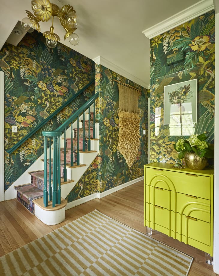
Chartreuse didn’t rise to prominence overnight this time around, either. For years, Nordic Knots has carried several yellowish green rugs — particularly the Grand in Milano Green and the Climbing Vine in Olive — that absolutely stole the show in many rooms on Instagram and in publications like this one. Then came a watershed moment: Designer Heidi Caillier’s masterful use of custom chartreuse Zia Tiles in Kendall Jenner’s viral mountain house bathroom. Emma Chamberlain wove a slightly softer version of the shade into her best-selling West Elm collection earlier this year. And now? Designers everywhere are discovering the shade anew, using it for furniture focal points and underfoot as carpeting to anchor rooms — and as wall and ceiling paint to create an enveloping backdrop for art and other furnishings. Chartreuse also makes for a pretty great accent color because it’s so peppy.

Designers Love Chartreuse’s Versatility
In Apartment Therapy’s State of Home Design Survey for 2026, three pros — Ryan Kirk Kopet of the Miles &Kirk firm, Leah Alexander, and Kristina Phillips — all named chartreuse as an unexpected hue that works in virtually any room. Kopet has even used Benjamin Moore’s Chartreuse (2024-10) and Exotic Lime (399) in recent paint projects, one of which is the living room you see just above, where it shines in a glamorous scene of patterned chairs and a teal French door.
Whether this shade is coating entire walls or not, it’s still taking on a starring role in many high-end interiors, thanks to its bold brilliance, especially relative to other hues on the color wheel. “I love chartreuse because it is such a shocking contrast to a lot of the other colors out there, so it can really cut through some of the other color stories,” says designer Michelle Gage. “We like to use it with orange tones or navy, or even pinks or lilacs.” If you’re looking to invigorate a neutral backdrop or find something to hold its own against another equally saturated shade, chartreuse could be just what a room needs. That’s what makes it such a color chameleon.

Chartreuse Isn’t Just Trendy — It’s Surprisingly Classic
Many designers are also tapping into chartreuse’s nature-derived intensity, which means it plays well with warm and cool tones, as well as earthy and man-made materials. Take the use of the color in the drapery and furniture in the lobby at the hotel ROW NYC, for example. “The existing architecture already has a warm, rich palette of wood and Corten steel,” says Tony Machado, senior vice president and head of design at LUCID, a hospitality development firm that collaborated on ROW NYC’s design. “So chartreuse felt like the perfect way to introduce a fresh and unexpected energy.”
And don’t forget: Chartreuse may feel like the latest “it” color, but it does have a longstanding history — and can actually be quite classic, depending on its surroundings and context. “It has a slightly traditional nod, because if you look at old interiors, you’ll see that some of those great decorators do use chartreuse lightly,” says Gage. “But we’re going to use it a little bit more heavily in the next year.”

The Best Chartreuse Finds for the Home Now
Although chartreuse definitely has main character energy, it’s also great as an accent color. Adding a pop or two of this punchy hue can be the solution to waking up a tired room. These chartreuse picks will do just that — I promise! Hopefully, you’ll see the benefit of decorating with this electric green color.


Design Defined
Never miss the style inspo and recommendations you crave with Design Defined. Follow along each week as our Home Director Danielle shares the best style advice, latest trends, and popular decor finds you just can't miss.