
The “Color Echo” Method Is How Designers Make Bold Paint Look So Incredible
When it comes to painting your home, bright colors can be intimidating — especially if your space is on the smaller side. Color becomes crucial when they’re vivid and flamboyant, meaning you’ll need to be intentional; throwing a hot pink pillow on the couch or a lime green print on the wall of an otherwise understated space may come across tacky rather than tasteful, design pros say.
I spoke to interior designer Linda Hayslett of LH. Designs in Los Angeles about what she dubs the “color echo” method to incorporate bold, rich, and sometimes iridescent hues without fear (especially for those like me who just can’t completely let go of their millennial gray).
What Is the Color Echo Method?
According to Hayslett, this simple equation allows you to incorporate more color without veering into “tacky” territory. The main principle to remember is that you should always repeat a chosen color in at least two locations within the eyeline. This way, the brighter hue throughout your space feels cohesive, curated, and flowing — instead of random and potentially overpowering.

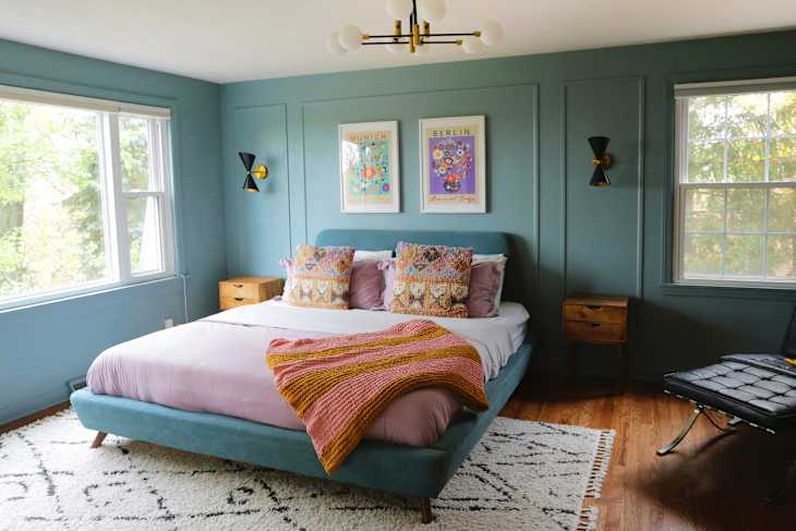
In the space pictured above, for example, Hayslett uses a pop of pink in the wallpaper, perforated sconces, window treatments, and bedding. “Echoing [this] pink across these different elements anchored the palette and tied together all the deeper, moodier colors in the room,” Hayslett explains.
She adds that using the method helps create “a visual storyline” that feels much more intentional and curated upon first glance. “By ‘echoing’ that color in two or three touchpoints within the main sight line, you create a subtle rhythm that ties the space together,” Hayslett says.

How to Use the Color Echo Method in Your Home
This method is versatile and works nearly anywhere, both within the interior and exterior of the home.
“It’s the quickest way to make a room look intentional instead of ‘I just bought things and hoped for the best,’” Hayslett says. In the kitchen pictured above, Hayslett repeated an olive green tone across the paint, tile, and accessories to “create a cohesive, elevated look without feeling overly matched,” she says.
“It’s less about matching things perfectly and more about creating continuity. Even the smallest accents, such as a ceramic bowl, a book spine, or a woven detail, can make the echo feel intentional when placed thoughtfully,” she explains.

Hayslett warns not to interpret the term “echo” to mean “copy and paste” — that mistake can quickly take a space from curated to cartoonish. You want to avoid a whole room bathed in the same color, and you don’t want to pick items in a color family that don’t actually match.
Her fix? “Choose one exact tone and commit. Then repeat it just a couple of times, not five, not 10. Think curated cameo appearances, not a takeover,” Hayslett adds.
What to Do if You’re Afraid of Color
“For neutral fans, this method is the perfect baby step. One color, repeated twice — that’s it. Your room stays calm and soothing, but now it has a little spark,” Hayslett explains. “It’s like adding a great accessory to an outfit; subtle, but it makes everything feel more pulled together.”

For this project, Hayslett used blue as a connecting color, with wallpaper to anchor the space and that same hue echoed in the bedspread and candlestick holders. “Even though each element differed in pattern, size, and material, repeating the blue created a cohesive rhythm that pulled the whole room together,” Hayslett adds. The result? A calming blue sanctuary that feels both unique and cohesive.
The best part? You don’t need to go on a shopping spree for decor. Start small and build from there, using budget-friendly items to create a color echo. “Start with one piece you genuinely love in a color you’re drawn to, such as a pillow, a piece of art, a vase: Something small, but meaningful,” Hayslett says.
Lastly, if you’re trying to avoid adding clutter into a minimalist space, start with textiles or framed art. Hayslett says these two wall additions carry color the best into any room, and keep your purchases to a minimum. Happy hunting!
Design Defined
Never miss the style inspo and recommendations you crave with Design Defined. Follow along each week as our Home Director Danielle shares the best style advice, latest trends, and popular decor finds you just can't miss.