How to Pick the Perfect Color Palette for a Mid-Century Modern House, According to a Real Estate Agent

A great deal of mid-century modern homes were constructed in the U.S. following World War II. Overall, they were designed in a thoughtful, streamlined manner, with the emphasis on functionality rather than ornamentation. These types of homes tended to be dressed in distinctive combinations of colors, inside and out, the likes of which still resonate with homeowners today.
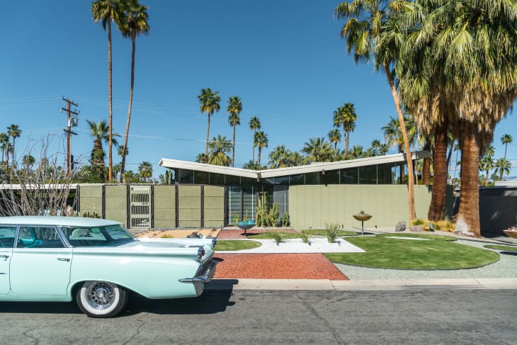
According to Bruce Irving, a home renovation consultant and real estate agent based in Cambridge, Massachusetts, a true mid-century modern color palette comprises earth tones like ochre, muted yellow, tan, and brown, energized by punchy accent colors like aqua, acid green, and bright red.
“Mid-century modern architects were extremely attuned to the natural world. They wanted to make sure that these homes were highly connected to the spot on the earth that they occupied,” he says. “So, lots of glass, lots of stone, lots of wood. And my understanding is that they wanted that connection to continue on into the walls.”
While earth tones are a hallmark of mid-century modern design, curated colors are just as important to the style and can be used as accents to draw attention to doors, panels, trims, and other architectural features. “Aquas and acid greens and bright, bright reds — it’s a nod to the man-made quality of the home. And I think that’s why bright, not-really-found-in-nature splashes of color are very important to the style,” says Irving.
Of course, there are countless iterations of mid-century modern-inspired colors palettes (like this one by Benjamin Moore), which pay homage to the style without being overly literal. There’s lots of room for personalization. But before you start picking out paint swatches, Irving suggests familiarizing yourself with the motivations of mid-century modern architecture and design.
“I’m a huge fan of doing your research. The more you know of where it all came from and the fact that these things didn’t just spin out of the ether with no thought behind them, the better consumer you are,” he says. “Understanding why mid-century architects made certain choices makes you look at your home and say, this room is kind of talking to that yard; what’s going on out in this yard that might be worth bringing inside?“
If you’re devising a palette yourself, take it step by step, selecting your body colors — muted earth tones and neutrals that relate to your home’s natural surroundings — followed by your eye-catching accent colors. Take into account the color wheel and that a high level of contrast between body and accent colors is what makes mid-century modern homes so iconic and memorable.
And if you’re feeling stumped on how to bring a mid-century modern-inspired palette to your tastes, there’s nothing wrong with bringing on a more experienced set of eyes.
“I highly recommend hiring people who have been trained. And you can find these folks in paint stores. You can consult with a color theorist and they’ll give you some really informed ideas,” Irving says. “You don’t have to do what everybody tells you to, but you’ll get some good, fresh advice.”
