Before and After: These 3 Shade-Shifting Paint Redos All Use the Same Color (Really!)
Paint colors sometimes have all the energy of a slick con man — they might look one way on the card at the store, another in the can, and a totally different way once they’re on the wall. Then, of course, lighting can do its own transformative magic: What looks beige during dimly-lit evening hours could lean more towards a soft pink once the sun comes up.
While the chameleonic qualities of complex and nuanced paint colors can feel a little like magic, they can also be a little frustrating when you see — and love! — a color in someone else’s home, only to find that in yours it looks completely different. Of course, this phenomenon can be a boon, too. Ever wonder why you often see the same paint colors popping up among designers’ favorites to use? Those picks are dependable, yes, but they also can bring a little bit of a custom touch to a space thanks to some slight shade-shifting. That means that even if you’re using the most popular color of the moment, your home can still feel one-of-a-kind.
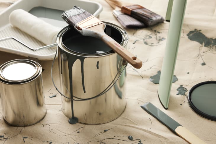
So just how much can one paint color reinvent itself? I was curious, so I put one adaptable shade to the test. I chose Behr’s Coney Island because while it sits solidly in the “grays” section of Behr’s paint offerings, the paint chip looked totally different under various lighting conditions and settings. Sometimes it indeed looked very gray; sometimes it looked a little more blue; other times I thought for sure I was looking at a green paint color. I wanted to see how it could morph in other peoples’ homes, too, so I asked three brave Apartment Therapy staffers to complete a weekend paint project and document how the paint looks in their own surroundings. Read on to see how the color transformed in their three very different applications and spaces.


A Small Side Table Redo
First up, Emma Dangel, sales coordinator at Apartment Therapy. Emma had a small wood IKEA stool she’d been using as a “clothes chair” in her bedroom, but she wanted to repurpose it as a plant stand with a little more style. When I sent Emma a link to the color we’d be using, she says she saw a dark gray. But then she was hit with a surprise: “When I opened the can, it appeared light blue/green!” she says.

As Emma was painting, she noted that the color looked pretty similar to how it had looked in the can: a blueish-greenish shade. As it dried, it looked one to two shades darker. “It went on a light, shiny blue-ish gray, and then quickly dried into a dark matte blue-gray,” she says. “I liked this because I could more easily tell which parts I had already painted.”


Once she was done, the stool definitely looked a lot more like a muted blue-green in the direct natural light that her living room receives in the mornings, though she says it skewed more gray in the evenings. That was fine by Emma, who’s usually color-averse with her furniture. “I probably wouldn’t have chosen it myself, as I tend to stick with neutral colors or natural wood for most of my furniture,” she says, “but I’m very glad it was chosen for me! It’s the perfect intersection of neutral and colorful.”
The slightly-offbeat neutral tone harmonized perfectly with other “muted turquoise and blue-gray colors” throughout Emma’s apartment. “I love its versatility. Because it looks different in different lights and spaces, I could totally see this little stool making its way to my next apartment with me and fitting right in.”
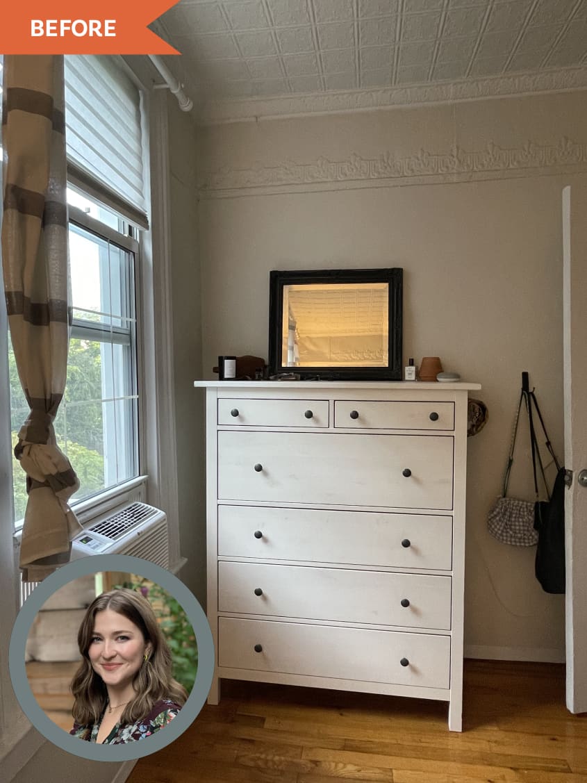

A Bedroom Dresser Makeover
This redo is another familiar IKEA favorite: the HEMNES dresser. After owning hers for a few years, senior project manager Brittany Fara wanted to give the plain white piece a fresh look. It sits near the north-facing window in her bedroom, which gives it a softer diffused light that leans a little more cool.
“When I first saw the color I was excited, as I do have some accents of gray and blue in my home already,” Brittany says. After sanding down her dresser (with the help of her landlord, who lent her his electric sander), Brittany started in with the paint. “As I was painting I was a little nervous and thought to myself, I’m not going to like this,” she says.


Thankfully, the color won her over. “In the morning light, the dresser almost illuminates to this really lovely lighter blue. This is my favorite time of day to see my newest addition in my bedroom,” Brittany says. At night, it looks like a darker green.
“I probably wouldn’t have chosen this color myself as I’m one of those ‘paint everything white’ people,” Brittany says. “But as I brought the dresser into my room and styled it, I began to have a change of heart. I’m slowly falling in love!”
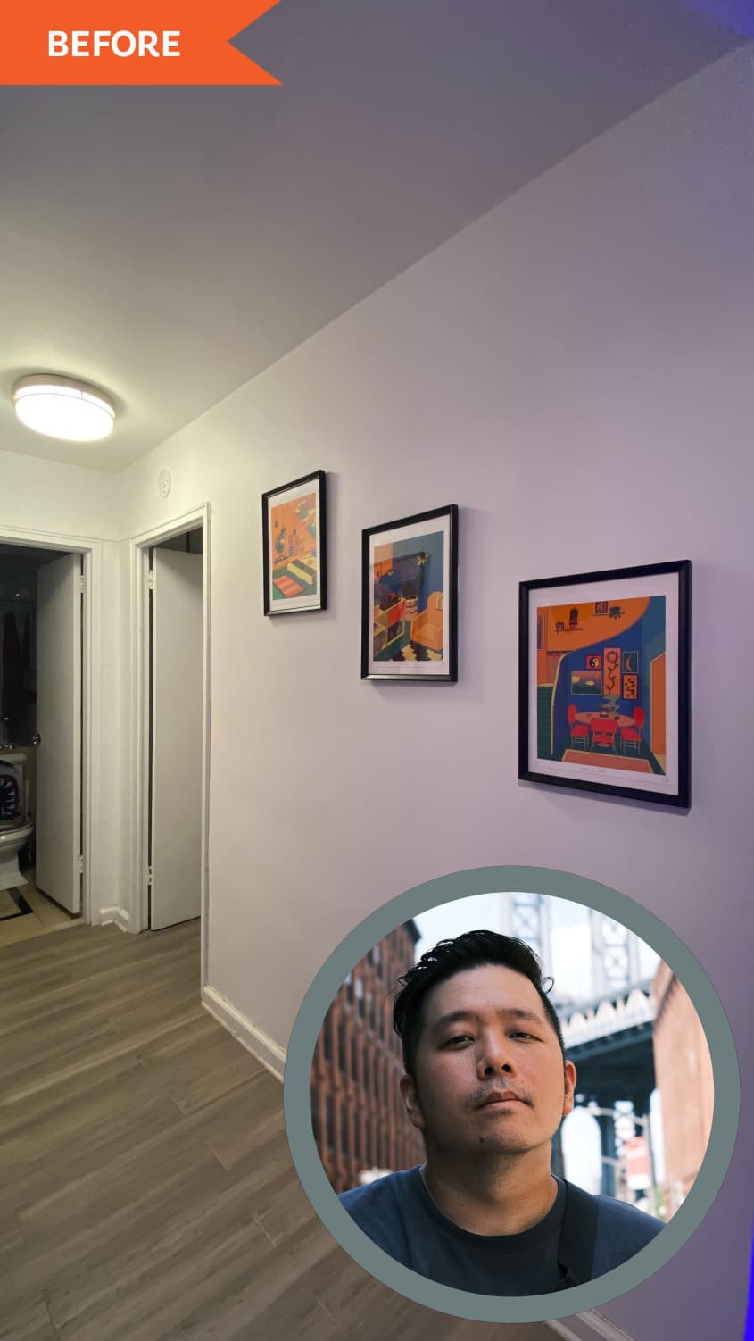
An Interior Wall Transformation
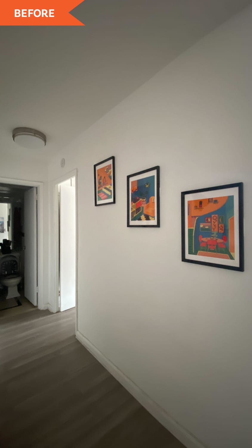
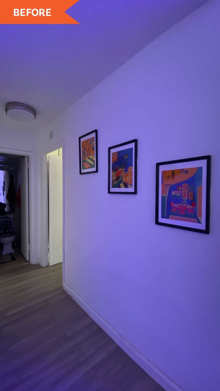
Some spaces receive almost no natural light, and those can be the toughest when it comes to predicting how a color will shift. That was the case for Brian Wong’s entryway. Brian, AT’s social media manager for commerce and branded content, had a long stretch of wall at his apartment’s front door that he wanted to give an accent color. Because of its location, the wall receives no direct natural light; it gets tiny peeks of indirect light from nearby north-facing windows, and at night, it has a soft blue glow courtesy of Brian’s nearby fish tank.
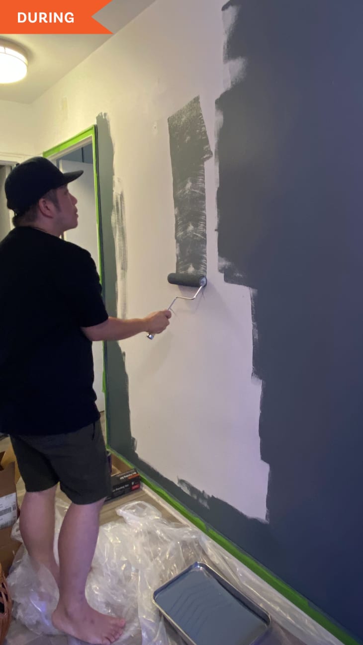
“When I first opened the can, I had to do a double take to make sure it was the right color,” Brian says. “On the computer screen it looked more like a dark green/blue/gray, but when opening the can it looked completely gray.” That kind of freaked Brian out — he didn’t want his entryway wall to feel too dark.
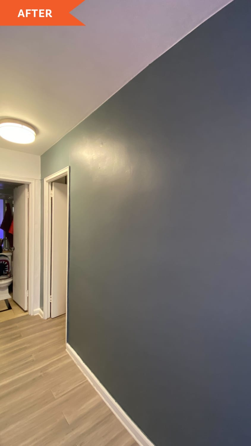
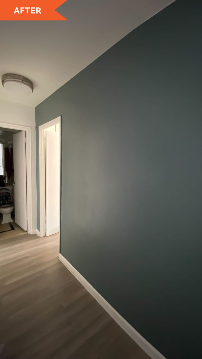
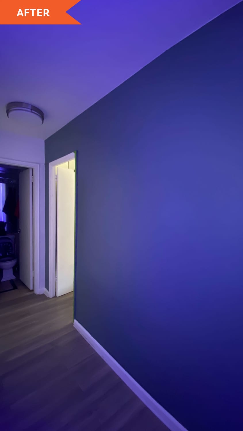
“After the first coat it looked really dark but as the paint started to dry it became the color I wanted, but still a bit on the darker side compared to on computer,” Brian says. And while during the day he says it looks like a dark blue-green, it also takes on a decidedly more gray tone at night.
“It looks the best at night with some lights on which makes the entry into my bedroom a bit more cozy and warm,” Brian says of the paint color, which he calls “calming.” If he were to pick again, he would make some changes. “I love the color but for my wall I would have done with a slightly lighter version,” he says. “The color would be great in a well-lit space.” Lightening up the paint shade may have helped re-introduce a little more color versatility, too.

A Can’t-Quite-Pin-It-Down Color
There’s a lot of adaptability and variability to this gray-meets-blue-meets-green paint color, and these projects prove it. The same could be said for a lot of edge colors that border two different tones — paints you’ll find among the whites, beiges, and of course, grays. Sometimes the surprise shift is a good one, as it was for Emma and Brittany. And other times, it might just not be what you’d envisioned (sorry, Brian!). So the ultimate lesson here is this: Invest the $5 in a sample pot and sit with your wall or furniture for a few days in a few different lighting conditions. You might get exactly what you predicted, or you might not (for better or for worse). But before you shell out the money and the time for a full-scale redo, you’ll at least know what to expect. Happy painting!