
How “Dear White People” Uses Design to Tell an Intricate Story of America Today
When streaming Dear White People, watch closely. Because while the bold Netflix series offers standout acting performances, innovative storytelling structures, and timely social commentary on race relations in America, it does so with visual techniques that will make you feel some type of way.
“There are times when a frame may feel vaguely familiar, but it’s because we’re visually quoting a major cinema moment that almost always has white or European faces in them,” says creator and showrunner Justin Simien of referencing films like Persona, Barry Lyndon, and Metropolis. “It triggers something in the subconscious to see a black face in a classical pose. It just sort of rewires a part of your brain, like you never thought to put those things together. I tried to create those moments visually as much as possible.”
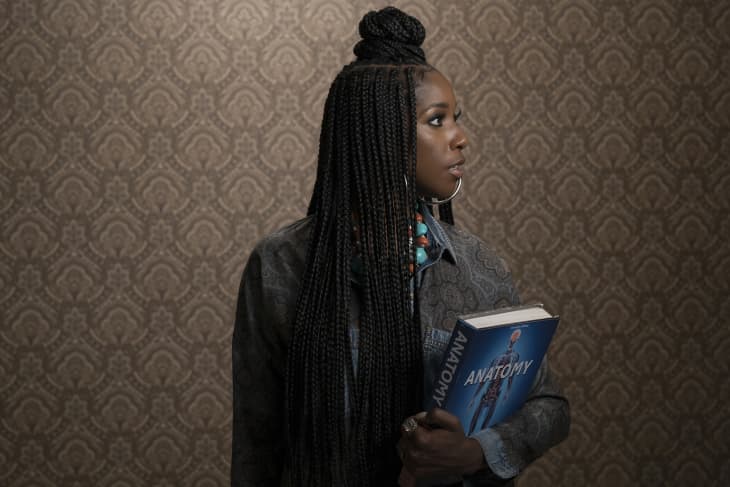
The strategy is also employed in each episode’s intricate title card, which always features a character dressed in an outfit that’s perfectly coordinated with the wallpaper in the background. It’s a series-long homage to Kehinde Wiley, the painter who pairs black figures with bold patterns (as he did with former president Barack Obama’s official portrait). “African-Americans don’t have an art tradition that’s celebrated the way European art is celebrated, and in a lot of ways, that tradition was stunted or appropriated,” says Simien. “But [Wiley’s] idea is to put things together that somebody says shouldn’t go together, just because.”
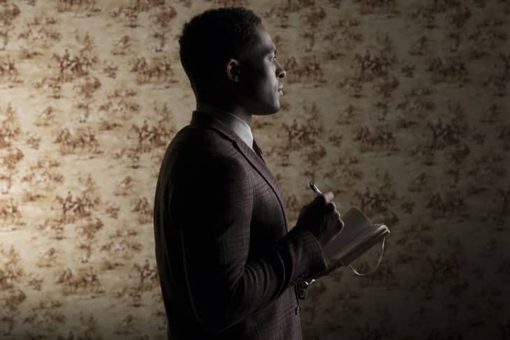
Selecting each character’s signature patterns—which also appear as their dorm room wallpapers—was a team effort between Simien, production designer Greg Grande, and costume designer Ceci. Grande sourced a slew of graphic wallpaper patterns, which were then individually examined by the trio.
“One room at a time, one character at a time—what do we want to see behind their heads? We just combed through that gigantic binder over and over again until we found things we liked,” recalls Simien. “Some have deep meanings: Troy (Brandon P. Bell) has horses behind him because he’s ‘well-bred,’ and Coco (Antoinette Robertson) has a lot of red because she’s taken on that aspect of American identity. And some are just like, ‘That looks great together!'”
Even more so, the title cards show each character with their individual talisman—Samantha (Logan Browning) has her camera, Joelle (Ashley Blaine Featherson) holds her anatomy book—and rotates them 90 degrees counter-clockwise with each appearance.
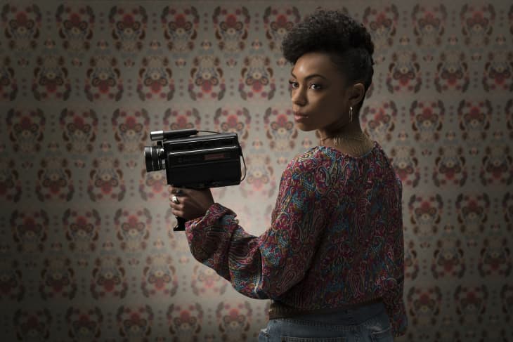
“For example, Sam begins over her shoulder, and with each new successive chapter, opens up to you and then she turns back around. It’s a very subtle ‘let me show you something and then hide it again.’ I like this idea of presenting the character almost as they want to be presented to you, before we break down into all the dirty little truths and secrets and goings on that make up their actual life.”
The entirety of the series—which is based on Simien’s 2014 film of the same name—features an incredibly intentional color palette. It’s extrapolated from a particularly “striking” Civil War-era propaganda poster that essentially aimed to recruit black soldiers, even though all of the black men pictured are shorter than a white man, topped only by a white tent that resembles a KKK hood. The image, which briefly appears in the second season’s final episode, predominantly features tones of red, white, and blue, as well as brown (in the men’s faces and the soil) and green (the same color as produce and money).
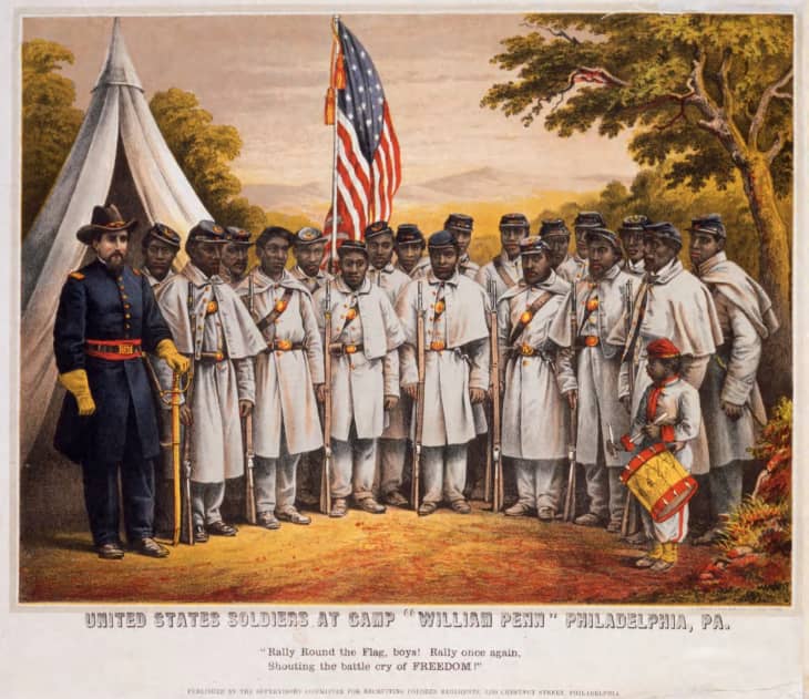
“The rarest color in the image is gold, which at the time was really the only thing that was considered true wealth,” Simien explains. That color is rarely used onscreen, and when it is, “it’s when one of these kids can finally break out of their black identity and have a sense of their real self.” Likewise, red resembles aggression, white means lies or coverups, and blue symbolizes oppression and confinement: “It’s the color of the sea, where slaves would sometimes hurl themselves on their way to the America, and it’s the color of the police.”
It doesn’t matter to Simien if viewers are actually aware of each hue’s hidden meaning. “It’s all subtext that works in your subconscious, but it can’t help but make an impression on you when you watch it,” he says of the colors in the second season, which zooms in on a specific type of social media user. “The main elements of trolling on Twitter—anonymity and white supremacy—have been in the culture since the abolition of slavery, and this season pushed forth the theory that we’re really still in a period of reformation, we never quite really put the country back together, and we’re not aware of that because all of these forces keeping us unaware.”
Dear White People has even infiltrated Simien’s home, as actress Nia Jervier (who plays Kelsey) doubles as an interior designer and outfitted the showrunner’s tudor house in Silverlake, where he lives with his boyfriend. “The furniture is mostly mid-century modern, but there are a few industrial touches of wood and copper and gold,” he says. “We added whatever feels personal to us, we like to buy meaningless beautiful things and plop them places. It’s cute, honey, I’m not even gon’ play.”