
“Expert” Advice Designers Always Break (& Why You Should, Too)
You know what they say—rules are made to be broken. Ok, some rules really shouldn’t be. But when it comes to gorgeous interiors, some forward-thinking pros are breaking certain decorating ideals in the best possible ways. If you’re ready to play by your own rules, take inspiration from these designers who happen to be doing the same (because how boring would design be if everyone went by the book?).
Let’s Meet the Designers:
- 2Yoke Design is a multidisciplinary creative studio specializing in interior wellness design for the home and workplace. The verb “yoke” means to join together, a bond or tie. 2Yoke Design is fueled by an ethos to unite the principles of health and wellness with the built environment.
- Bethany Adams Interiors specializes in high-end residential projects in Louisville, Kentucky, and beyond. Before establishing her firm in 2015, Bethany worked for noted designers and architects in Chicago on projects including a whole home renovation of a 12,000-square-foot apartment on Chicago’s Lake Shore Drive, a remodel of an historic ladies’ athletic club, and a newly built mountain house in Aspen, Colorado.
- William and Susan Brinson are interior, lifestyle and food photographers who moved from NYC to the Hudson Valley to renovate an 1800s estate called Stony Ford. They chronicle their life and renovations at House of Brinson and @houseofbrinson. The Brinsons define their style as Ruralist Modern, a combination of modern thinking and convenience while appreciating mentions and aesthetics from the past.
- Alyssa Kapito is a New York-based interior designer who focuses on neutrals and clean lines. Her work has been featured in Elle Decor, The New York Times, Vogue, Architectural Digest and various other publications.
- Todd Martz, who has an extensive historical knowledge of architecture and furniture styles, opened Home on Cameron in spring 2017 in the Washington, D.C. area, with Susan Nelson. The design veterans have more than 35 years combined experience and bring new, vintage and one-of-a-kind finds to their shop as well as offer energized spaces via their design services.
- With degrees in fashion marketing and design, Natalie Officer’s love for textiles has inspired her entire career. She has spent the last fifteen years building a successful design practice that encompasses both residential and commercial design. She works with clients of her Natalie O. Design Co. in Louisville, Ky. firm to design spaces that are authentic and inspired, creating richly layered spaces that are inviting both visually and tactilely.
Rule to Break #1: Paint small rooms a light color, as dark hues make spaces feel even tighter
“This is true when you leave the trim a contrasting color, whether that be white or stained wood, but the key to doing dark small spaces is to paint all of the trim the same hue—though in a higher sheen. The absence of delineation expands the space visually and the result is a room that comfortably envelops, rather than boxes, you in. If the room is smaller than 50 square feet (think: a powder room, butler’s pantry, etc.) I would paint the ceiling in the same color as well, otherwise a white or very pale blue ceiling keep the space feeling open.” —Bethany Adams Interiors
“Admittedly, this is one of the most heavily imposed rules here in our studio, but it’s also one we often break. Homes are now so often open concept with people moving fluidly within spaces. It can become challenging to create memorable moments throughout a home like that. There is something alluring about the deepest of hues. It makes people want to stay in a space. We’re particularly fond of using Farrow & Ball Studio Green.” — Natalie Officer
Rule to Break #2: Wallpaper belongs only on the wall
“I consider ceilings to be the fifth wall in a space. It finishes the decor of the rest of the room. In this master bedroom I designed (above), the ceiling adds another layer to the design. The traditional pattern of the wallpaper that I added to the ceiling contrasts with the modern, abstract color blend in the carpet, plus it adds some interesting lighting in the space. The gilding on the paper reflects the light in the space to add soft warmth.” — Todd Martz
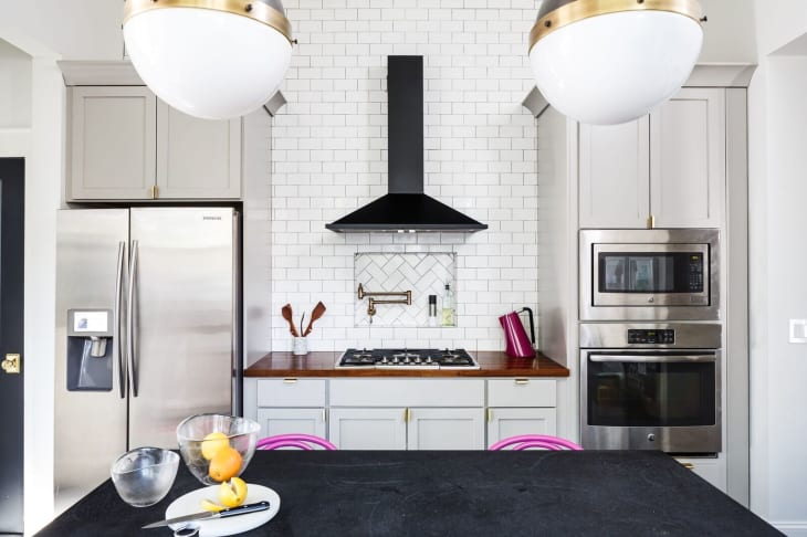
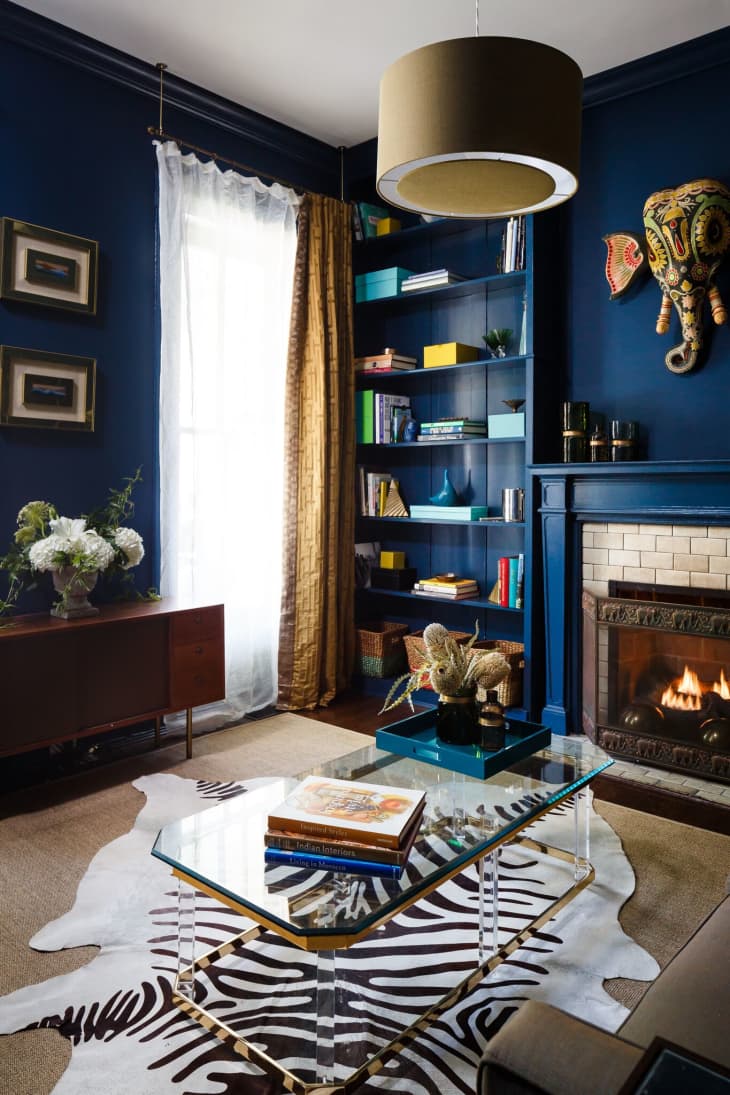
Rule to Break #3: Don’t mix metals
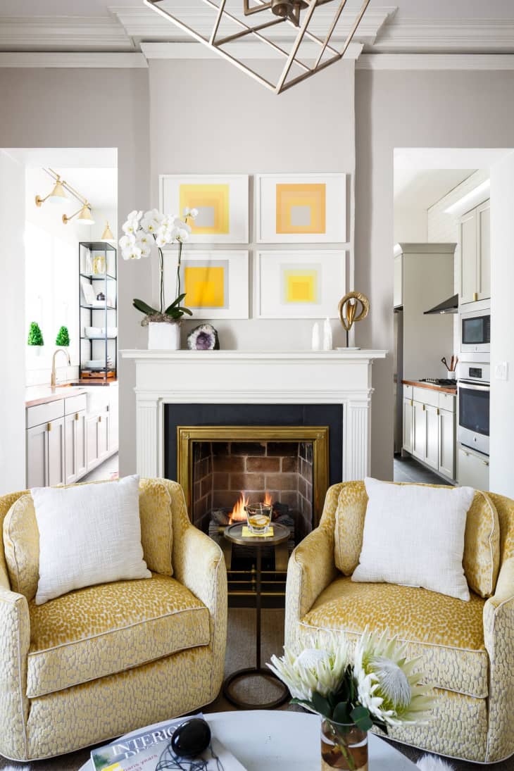
“With the resurgence in popularity of warmer finishes, this old rule is flying out the window, especially in a space like a kitchen where stainless steel appliances are still de rigueur. In this kitchen, the door hardware is polished brass, the pot filler by Delta is champagne bronze, the cabinet pulls by Rejuvenation are brushed brass, the appliances are stainless steel and the hood is matte black. Because the stainless reads as gray, like the cabinets, and the black hood and brass hardware reflect the finishes of the pendant lighting, which in turn relate back to the black doors with brass hardware, the overall effect is cohesive and unifying, despite the use of multiple metals.” — Bethany Adams Interiors
“Mixing metals and woods is one of my very favorite rules to break. Light and dark woods go really well together and so do brass, bronze, nickel and silver.I’m not sure why a lot of people feel that metals and woods should match. For instance, there is this idea that if you have brass doorknobs your curtain rods should be brass and if you have a dark oak dining table then your chairs should be dark oak too, and so on and so forth. That’s just wrong.” — Alyssa Kapito
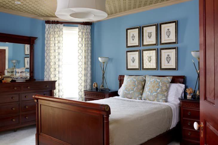
Rule to Break #4: Painting original woodwork is a crime
“While there are still times when painting original, stained woodwork—especially intricate paneling or doors—would be a true travesty, every situation is different. Despite having 11′ ceilings, the nearly 12 inches of dark crown moulding outlining this room made the space feel compressed both in height and width. Since the window moulding had previously been painted and the baseboards had to be replaced during the electrical rewiring, it was odd to only have dark moulding remaining at the ceiling and fireplace mantel. Painting both in Benjamin Moore’s White Dove (OC-17) did nothing to diminish their importance as the key architectural and historical features of the room, and now the ceilings absolutely soar. — Bethany Adams Interiors
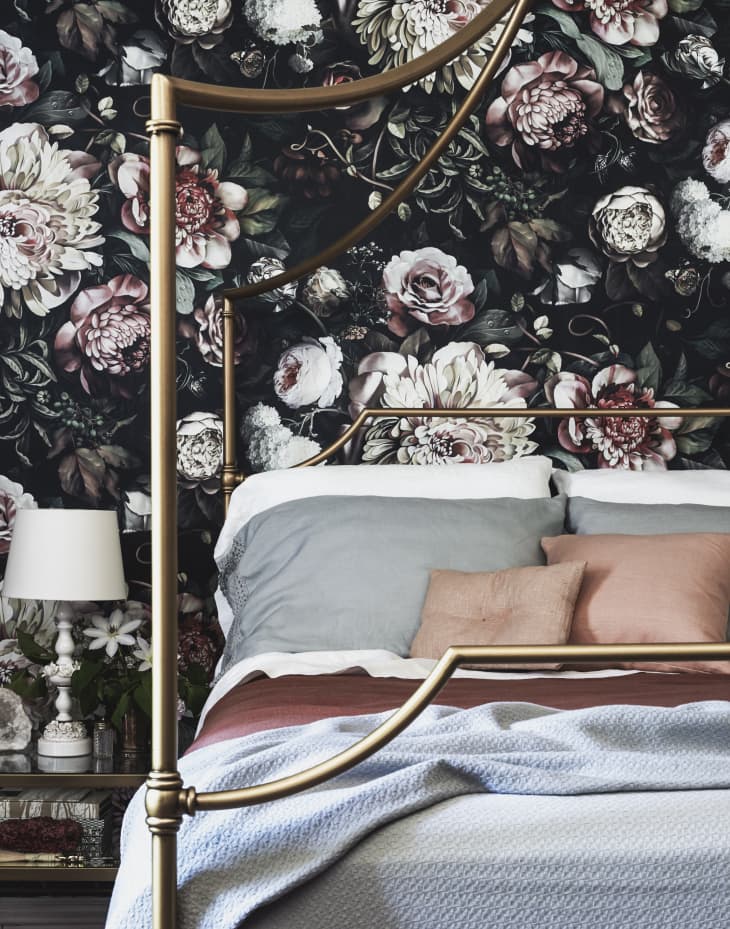
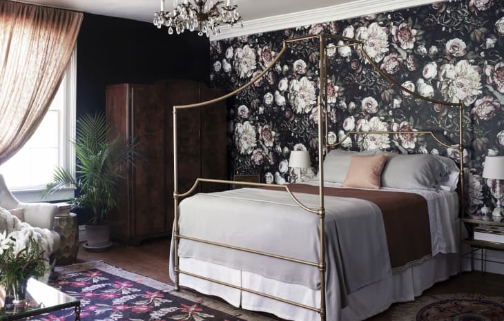
Rule to Break #5: Bedroom design should be serene
“Putting a busy wallpaper in a bedroom is a bit unconventional by traditional design standards because a bedroom is generally a place to relax and rest, but we were strategic in our decision for the design of this space. For the first guest bedroom we worked on when we moved into our home, we painted the room black and installed this very intense, busy wallpaper. You only see the paper when you walk into the room or are sitting or standing in the room, not while you are laying in bed. The room is quite large and has three windows, so painting it black felt good, as it calmed the light from the windows. It’s a guest room and we hope our guests enjoy having a unique experience. — House of Brinson

Rule to Break #6: Never paint a ceiling a dark color (it’ll suffocate you)
“I feel like dark ceilings have been making a comeback in recent years, but it was a major no-no for some time. In our second guest bedroom (above), we wanted to do something over the top, ’cause again, it’s a guest bedroom, let’s create an experience, so we went with a dark color on the ceiling. Most people think a light-colored ceiling makes a room look ‘bigger’ but we played with the scale of furniture and using tone on tone colors to create a sense of expansive space. Most of the furniture we used was vintage and on the smaller side of scale, which makes the room feel bigger.” — House of Brinson
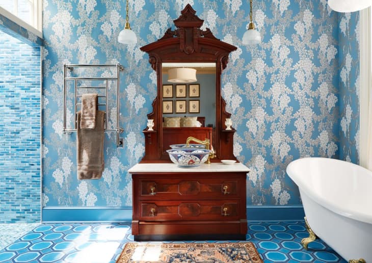
Rule to Break #7: Be light-handed when mixing patterns
“This bathroom definitely breaks this rule. It contains a geometric custom-patterned floor, over-scale floral graphic wallpaper, and small iridescent glass tile in the shower. It all works together because all of these elements are in varying blue tones, as well as different materials and scales.” — Todd Martz
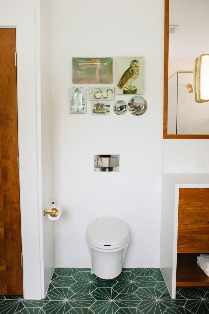
Rule to Break #8: Avoid going overboard on trends
“This runs counter to your internal laws of attraction. Thanks to the internet, everything is visible to us and often repetitively. Pinterest is a beautiful tool, but it makes every idea or item feel like it is everywhere, making it difficult to enjoy trends the way that they should be enjoyed…with the potential of becoming a classic. This tile floor may feel trendy if you see it on the screen as you scroll by. However, in person it is the most perfect shade of emerald green and the graphics create a soothing symmetry that can come through as something more imposing in a photograph. — Natalie Officer
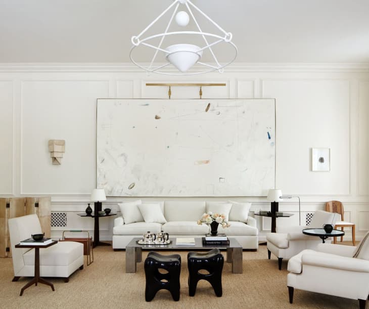
Rule to Break #9: Art should never be bigger than the piece of furniture it sits above
“Throw this one out the window. Really large art is really fun. I just love it because it’s slightly off and unexpected.” — Alyssa Kapito
Rule to Break #10: A window should never be covered by anything other than drapes
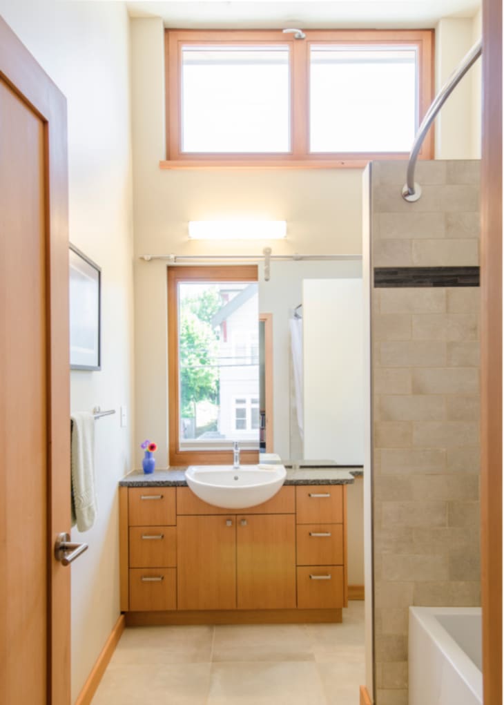
“For a passive house co-housing community we worked on in Portland, Oregon, we took a different approach. Co-housing communities sacrifice individual personal space in order to share communal amenities, such as bike storage, garages, community kitchens and more. In response to the limited square-footage, we designed this bathroom to feel larger and brighter by locating a window above the sink, and a mirror mounted to barn door hardware that allows it to slide in and out of the way, as needed. Not only does the unusual design solution bring in more natural light, but two people can more efficiently use the space together!” — 2Yoke Design
(Bonus!) Unofficial rule to break #11: Play by the rules
“Turn off the noise. You know, the critics. We eat, sleep and breathe by this when making aesthetic decisions for our home. When you browse the inter webs of the design world, there are so many opinions. I find that when you get attached to this world, you worry too much about what other people think and not about having your unique point of view. Turn off the noise. Take a risk.” — Susan of House of Brinson