9 Designers Share the Unexpected Colors They Really Love Right Now

What are the paint colors that are making designers flip at the moment? Well, as it turns out, a bunch of different shades are topping their lists. Here, a handful of pros share the unexpected hues they’ve been using lately or are eager to try in their next big decorating projects. It’s possible you’ve maybe even implemented a few in your own home already. If not, get ready for a little color inspiration!
Dark grays
“Deep, rich, and moody tones are taking the design world by storm. Dark grays that are just a shade shy of black provide a beautiful backdrop to add contrast and create depth in a space. Layering lighter colors alongside a rich gray tone can make any wall pop in a room.” — blogger Mansa Krishnamurthy of Simplicite
Pinks and purples
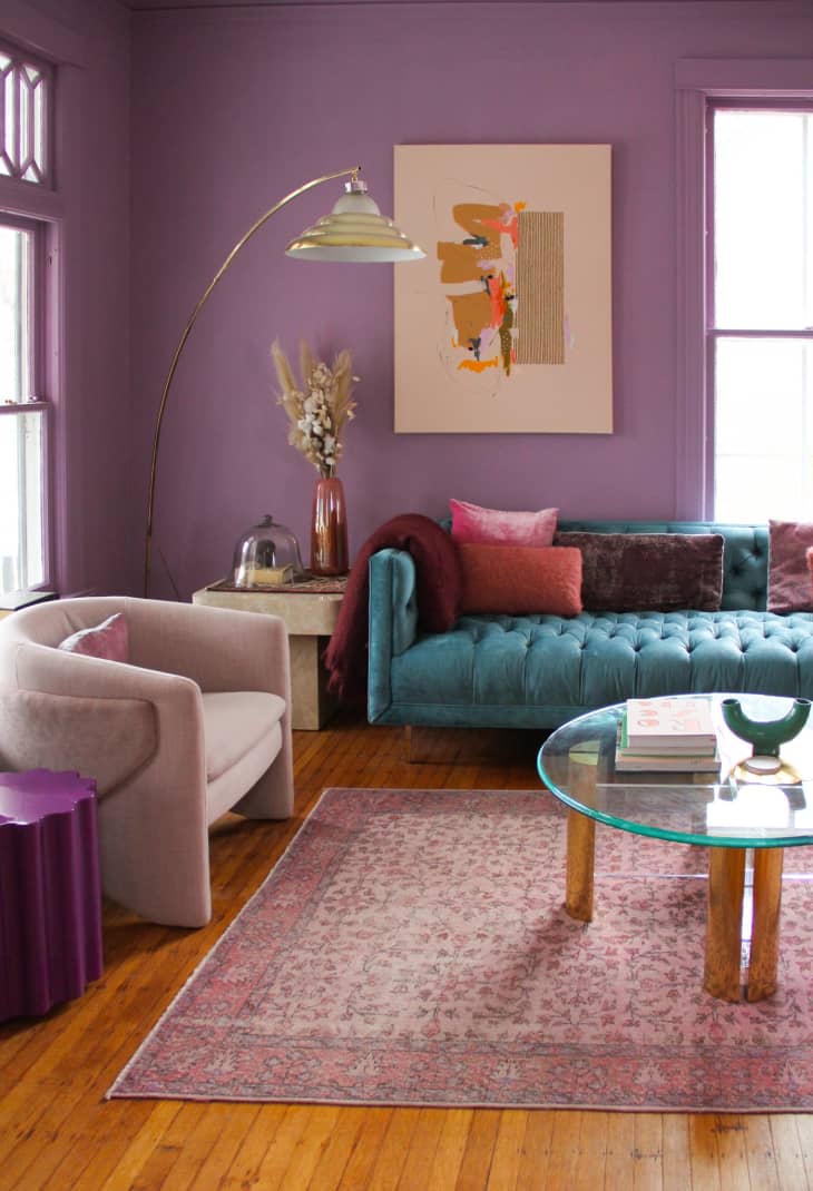
“I love it any time I get to incorporate shades of pinks or purples — blush, lavender, eggplant, fuchsia. Chartreuse would be really fun to pull into a space, too!” — designer Liz Toombs of PDR Interiors
Coral and aqua
“These days I’ve been using a lot of color in general but lately have been wanting to use happy colors like coral and aqua. I think it has to do with 2020 being such a dull and colorless -feeling year.” — designer Phyllis Lui of Kalu Interiors
Fuchsia
“This year, I’m finding myself drawn to fuchsia! So many of our interactions with color can be subconscious, though for me, so much of my inspiration for color comes from the fashion runways. This year, fuchsia is front and center. Translating this to an interior would be pretty magnificent; I envision a high-gloss fuchsia encapsulating the walls (and even the ceiling!) of a fashionista’s powder room!” — designer Aleem Kassan of Kalu Interiors
Bold, earthy hues
“I think due to the pandemic and everyone living off of what their ‘mood’ is, I have seen a lot of bold colors mixed with soothing colors; for example, a color combination of tangerine orange, olive green, and soft blush pink. I am also seeing a lot of rusty, earthy, traditional colors making a comeback.”— designer Jess Reilly of Domicile 37
Orange
“I recently painted a wall with [orange] in the living room. Orange stands for joie de vivre, curiosity, and creativity. It fits in almost every living area and also gives the right ambience for every season.” — blogger Mani Tagba of Afro Bohemian Living
Greens
“There is a lot of layering of neutral colors right now, and I’d love to design a room with different shades of green. Green is such a calming, tranquil color, and designing a green peaceful, monochromatic room sounds challenging and fun — from Chameleon by Benjamin Moore to Bunker Hill Green by Benjamin Moore to every hue in-between.” — designer Annie Tipton of Annie B Designs
Violet
“I’ve been dying to use violet in an outdoor space. It’s the perfect compliment to all the greenery that surrounds you. I don’t know if we blame Barney the dinosaur, but I find most people are terrified of ‘purple.’ Maybe it’s in the marketing — it is more palatable as wisteria, lavender, or eggplant!”— designer Jill Howard
Terracotta
“My cousin, who’s newly engaged and lives in Houston, Texas, purchased a darling mid-century home, and we’ve been working together to get it to her/our liking. Thankfully, she has great taste and brought the paint color Sundrenched Terracotta from the Farrow and Ball California Collection to my attention, and we’re going to use it in the front office of the home, which has wonderful natural light. The space reflects the dense greenery from the outside, which we will repeat in her indoor planter wall, too. It will be yummy and warm with her French white oak new flooring and curvy furniture.” — designer Ashley Roi Jenkins of AJR Design
