These Are the Most Popular Paint Colors, According to Instagram
If you’re thinking of painting your room gray, you’re not alone—there are some 24,000 others who have the same idea.
A recent study by Homehow.co.uk revealed that gray, specifically Paris Grey by Zoffany, is this year’s most popular paint color on Instagram. The researchers determined this by looking at the number of hashtags for different colors and brands, and found that paint colors in shades of grey, green, and blue, are the most commonly used.
Here’s the complete list for your decor inspiration:
1. Paris Grey, Zoffany (23,971 hashtags)
It’s not hard to see why Paris Grey is the most popular paint color. Inspired by French chateaux, it’s elegant yet versatile. “It is easy to accessorize and works well in all rooms,” said Alex Willcox, the director of Burbeck Interiors.
2. Green Smoke, Farrow & Ball (21,355)
Not too far in second place is Green Smoke, which Willcox said is popular for country homes and exteriors. “It adds a subtle pop of color, and works particularly well in kitchens, or bathrooms. It’s usually chosen as it works for all seasons, and rarely needs updating.”
3. French Grey, Little Green (13,851)
“This color provides both green and grey hues, which looks great when well-lit. The color is popular because it brings a room to life. It’s soothing, so works well in living rooms, bedrooms, and guest rooms. It’s also a great exterior color, or for garden furniture.”
4. Bancha, Farrow & Ball (9,827)
If you need an accent color, Willcox recommends using the fourth most popular entry on this list. He said: “It’s a strong colour and creates a Zen-like atmosphere in a room. Browns, pinks, and creams are natural complements, and it works well with a minimalist style.”
5. Jitney, Farrow & Ball (8,883)
Perfect for high walls or homes by the sea, this earthy brown hue has a more traditional vibe, and can evoke feelings of calmness. “I would recommend using bold and stylish furniture to lift the color and bring it to life.”
6. Sulking Room Pink, Farrow & Ball (8,585)
A shade of pink that catches the eye but doesn’t overpower. Willcox suggested that its soft and warm aesthetic should be paired with “overly bold and bright colors,” to make it more appealing.
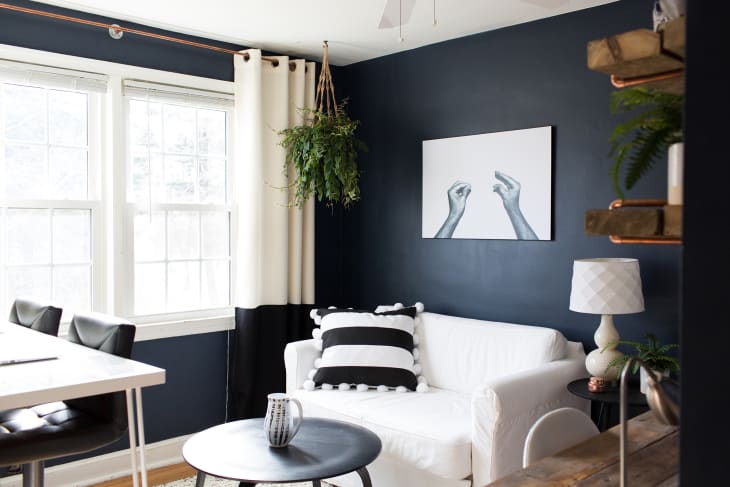
7. Hale Navy, Benjamin Moore (7,984)
“Hale Navy is the perfect color for kitchens and dining rooms. Whether it’s for a statement wall, or cupboard doors, this hue breathes a lot of energy into the space and is incredibly stylish,” said Willcox. “It also works well for exteriors, and front doors, or smaller porch areas. The color is strong and gives off a feeling of power and strength.”
8. Denim Drift, Dulux (7,477)
Although only eight on the list, Denim Drift is a color that Willcox said won’t be losing its popularity any time soon. “It’s a fun color and can be utilized in any room to add personality.”
9. Spiced Honey, Dulux (7,089)
A rather unconventional color but has proven popular nonetheless, especially if you know how to mix and match. Willcox advised: “It’s great when paired with undertones to bring it down. It doesn’t work with louder colors that lift. Pair with darker hues of browns, blacks, and oranges.”
10. Purbeck Stone, Farrow & Ball (6,678)
Somewhat similar to French Grey, Purbeck Stone is also easy to accessorize. Plus, it comes with a bonus if you’re moving out: “Homes with neutral colors are also more likely to sell when on the market. It works in any room, any style of home and with any theme.”
11. Skimming Stone, Farrow & Ball (6,244)
A popular choice for bathrooms and bedrooms. “It can be dressed up, or down, though brighter colours tend to work best for a modernised look. Match with wooden floors, soft furniture and dramatic wall accessories, such as paintings and large mirrors. It is also popular due to the clean finish it provides.”
12. Polished Pebble, Dulux (5,326)
“Polished Pebble is a popular color as it opens space, and makes a room feel bigger and brighter,” which would make it an excellent choice for cramped or dimly-lit areas such as hallways, staircases, and an attic bedroom.
13. Setting Plaster, Farrow & Ball (4,993)
If you’re an old soul who finds your grandparents’ house and the smell of freshly-baked cookies romantic, Setting Plaster is the backdrop color for you. “It almost gives a historic feel when added to a room, and makes you feel welcome,” said Willcox.
14. De Nimes, Farrow & Ball (4,458)
A great choice for home offices and dens, De Nimes feels like a sharp suit. “It has a royal feel to it and holds dominion over other shades. It works particularly well against oak wood and natural, rustic elements.”
15. Chic Shadow, Dulux (4,174)
And last but not the least, Chic Shadow is another shade of grey that is beloved for its versatility. “It works best when paired with both bright and dark colors, so match yellows with blacks, and blues with dark browns,’ said Willcox. “It also creates a calming emotion and is a grey that works nicely with metallics.”

