
Dunn-Edwards’ 2027 Color of the Year Is a Moody Mix You’d Never Expect
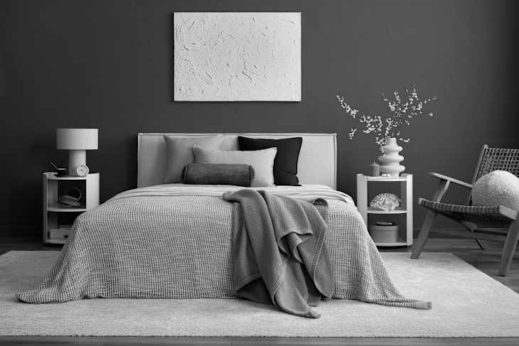
Just like many style enthusiasts, I’m also over the “sad beige” trend that gained mass popularity in the early 2020s (think: greige-colored walls and taupe, minimalist accessories). But that doesn’t mean that the design industry will rebuke neutral hues forever. In fact, the color pros at Dunn-Edwards Paints just announced that a moody brown is its 2027 Color of the Year — and there’s nothing sad (or beige!) about this hue. Those of you who swear by a sweet pop of color might even find this shade a must-try as an accent in your next makeover.
Dunn-Edwards has dubbed French Press Coffee (DEBN 07) as its 2027 Color of the Year. And even though it’s definitely a neutral hue, French Press Coffee looks as if it’s one of the boldest choices you can make for your home.
Ready for more style recs? Our Home Director covers what’s new in the design industry on Substack, in her weekly Design Defined. Subscribe for free!


Why Dunn-Edwards’ French Press Coffee Is Far from Beige
The brand’s French Press Coffee is a deep, atmospheric, and totally sophisticated brown that features a rich plum undertone. That slight purple hue is what sets this paint apart from other browns out there, as it’s multidimensional, warm, and can shift in tone depending on what other colors surround it.
“French Press Coffee is the kind of color that reveals itself gradually,” said Lauren Hoferkamp, marketing manager at Dunn-Edwards, via a press release. “As light shifts throughout the day, its subtle plum undertone emerges, adding complexity you don’t always see in a neutral. It’s grounding and restrained yet full of character. With its moody, rich hue, this color works beautifully across a wide range of spaces and applications.”
How Color Pros Will Use Dunn-Edwards’ Newest Take on Neutrals
Despite its purple base, French Press Coffee is still very much brown, making it a fun bold pop for those who don’t want to stray too far away from a neutral palette. When paired with clay tones, earthy greens, creams, and warm-toned woods and metals, this buzzy hue feels warm and comforting — making it a great color for bedrooms, bathrooms, and living rooms.
However, it can also play well with cooler hues and silver to read more modern and contemporary if that fits your aesthetic better. Mixing any deep, dark, and moody neutral hue into a sleek, modern space is a great plan for any of your upcoming makeovers — this year or next!


It’s Unexpectedly Fabulous Outside, Too
French Press Coffee can also be used on exteriors, bringing a classic touch to shutters, garage doors, and trim when paired with lighter taupes and creams. Or, make a statement and color-drench your entire exterior to set your home apart from your neighbors’.
With this fresh and bold choice for an annual trend forecast, Dunn-Edwards proves that you can stick with brown without leaning into sad beige territory. Give French Press Coffee a try if you’re looking to freshen up a space in the year ahead.
Design Defined
Never miss the style inspo and recommendations you crave with Design Defined. Follow along each week as our Home Director Danielle shares the best style advice, latest trends, and popular decor finds you just can't miss.