
Erin Napier Just Gave This Helpful Tip For Picking The Right Pink
If you’ve been thinking pink for your next home reno project, but have been too scared to commit, HGTV’s Erin Napier is here to help. Napier shared her favorite tip for picking the right pink paint if you’re looking to keep your design neutral and not neon.
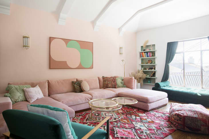
“In the Staples house, I worked with a color that makes some folks nervous!” Napier captioned a Jan. 31 Instagram post. “If you’re going to paint with pink, choose a dusty one with a yellow undertone that leans peach like Cape Sands by @valsparpaint.
“It reads as a neutral in natural light,” she wrote, “never babyish or bubblegummy.”
A light pink with a yellow undertone warms up a space just like a beige or cream would, but adds a little something unexpected — it’s the perfect shade for someone who wants to dip their toes into the color sphere rather than dive in head first.
Napier’s tip can be applied to darker pink shades, too. If you pick a darker pink that leans orange rather than blue or purple, it will read neutral, similar to a terracotta color. Valspar’s Poppy Petal is a good example of a deeper version of Cape Sands.
Pink doesn’t have to be scary. If you take Napier’s advice and stay dusty with warm undertones, you’ll end up with the perfect pink that pops yet blends into your neutral-heavy home. And it will look great with your brass finishes and hardware, too.