
Color Fail: How I Should Have Painted My House, According to Experts
When I chose the trim color for my home, it was the last decision in a long line of decisions at the end of a gut rehab. I was in project overload and gave some vague instructions to the painter one random day that I wanted gray, and the next thing I knew it was done. I’m totally fine with the color, but it’s maybe just a teensy bit dour? (Never mind that Edward Gorey called from the grave to accuse me of stealing his look.) Moving on, almost ten years later, the peeling paint tells me it’s time for a new coat, and perhaps a new (more cheerful) palette as well. So I asked three experts to tell me their favorite schemes for my historic building’s trim. Here are their picks, along with a really amazing way to visualize potential paint choices!
About The House
The house is a typical masonry building in St. Louis. It was built in 1909 by a couple from Bohemia (we have their framed marriage certificate, so this is true, and not an alternative fact). They ran a butcher shop down below, and lived above the store. Over the years it was a hardware store, a consignment clothing shop, and finally, the office for a board up company.
No word on what a traditional trim color should be for a early 20th century brick butcher shop/apartment built by immigrants —much less its other identities over the years — but this is what my architect tells me:
Paint colors in the past were more muted than paint colors now. Deeply saturated and very bright colors were hard to make, expensive, and with a few exceptions, not as UV resistant as paints that are made today. Virtually all paint manufacturers have historic paint color lines, and some even break it down to colors appropriate to the style of the building. Also remember that your historic building can provide input, either by carefully stripping existing elements in place to reveal original colors, or by removing small pieces and sending them out for analysis.
Option #1: The Architect
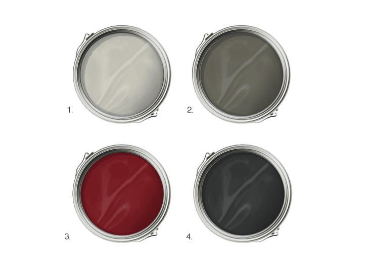
The Palette
- Brushed Aluminum from Benjamin Moore: For the trim color we wanted something to complement the brick and terracotta colors on the building, and to provide contrast against the operable sash/door color.
- Gloucester Sage from Benjamin Moore: For the moving parts (window sashes) we wanted a stronger color that would pop out from the adjacent brick and fixed trim.
- Heritage Red from Benjamin Moore: For the front door accent, we prefer clear finish on the original wood door, but since it’s already painted, we selected a red accent color.
- Black from Benjamin Moore: For this corner storefront we need an additional paint color for the original cast iron on the two main facades. We always recommend black for this because it performs better overtime, and is visually appropriate.
Phil Durham is the founder of Studio|Durham Architects, a full service architectural firm dedicated to working with clients in a highly interactive process. Their award-winning commercial and residential design projects are found throughout the Midwest and Eastern United States. Their primary goal is to conceive projects that are sensitive to their environment and context, embody a consistent attitude towards creating an architecture of lightness and clarity, and to utilize materials and technology in an innovative manner while maintaining a focus on environmentally-responsible building.
Option #2: The Color Consultant
The Palette
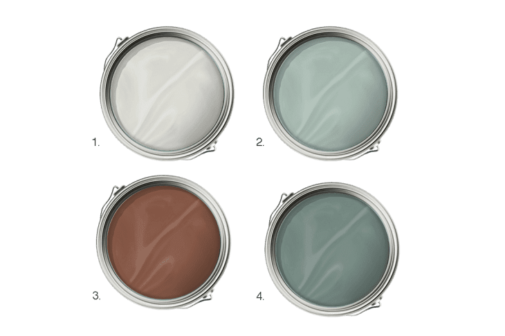
- Sheep’s Wool from Benjamin Moore: This color was chosen to best match the exactly color of the home’s terra cotta. Since it is all at the top we wanted to bring the color down through the middle and bottom of the building. Light colored windows also make a building feel more open and pleasant.
- Wythe Blue from Benjamin Moore: For the rest, we wanted to use colors that were fresh and that had a more modern aspect than historic colors. We also wanted it to look like a fun and agreeable building to come home to. Wythe Blue was used on the store front framing.
- Pumice Stone from Benjamin Moore: We chose a lively red which not only creates some fun and pop but also brings the red tone of the brick down in the realm of the trim colors to integrate further all of the colors on the building.
- Stratton Blue from Benjamin Moore: We used the slightly darker Stratton Blue on the storefront to frame the window walls by using it on the beams and columns. Then we integrated this color with the whole building by using it on all the window and door frames. and additionally, on the panels of the store fronts to bring the color all the way down to ground level.
James Martin, owner of The Color People, a Denver based architectural color consulting company, has been creating exterior color designs for buildings since 1979. His original work with Victorian houses has now grown into a design service of international scope. He teaches seminars on New Colors For Old Buildings and writes articles for numerous magazines such as Victorian Homes, as well as trade journals for the National Apartment Association and Home Builders Association. He c- authored the book Benjamin Moore’s The Art of Exterior Painting. The Color People currently has work in all 50 states and numerous foreign countries.
Option #3: The Realtor
The Palette
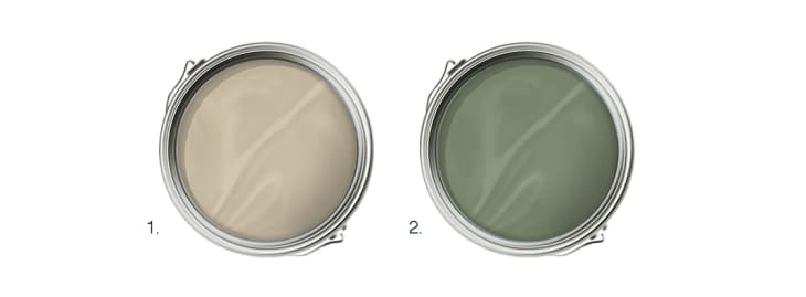
- Downing Sand from Sherwin-Williams: This is a nice color that’s a little darker and richer than the terracotta detail on the house. It plays off of the color, rather than introducing a new color scheme. The goal is to make the building more cohesive.
- Artichoke Green from Sherwin-Williams: This light green shade is a nice color to accent the doors, and works well with the lighter trim color.
With more than 14 years of experience selling real estate in St. Louis, Ted Wight specializes in the St. Louis, Missouri area. Over the years Ted has developed a niche of specializing in architecturally significant homes ranging from historic mansions to contemporary homes. Ted lives in a home designed by noted architect William Bernoudy, a student of Frank Lloyd Wright. His St. Louis Style Blog is widely-read by fans every day.
I won’t tell you my favorite, but I’m hoping you’ll tell me yours: