Faith & Mike’s Master Bathroom: The Big Reveal

- Name: Faith and Mike
- Type of Project: Master Bathroom Creation
- Location: Columbus, Ohio
- Type of building: 1920s, multi-level, single family home
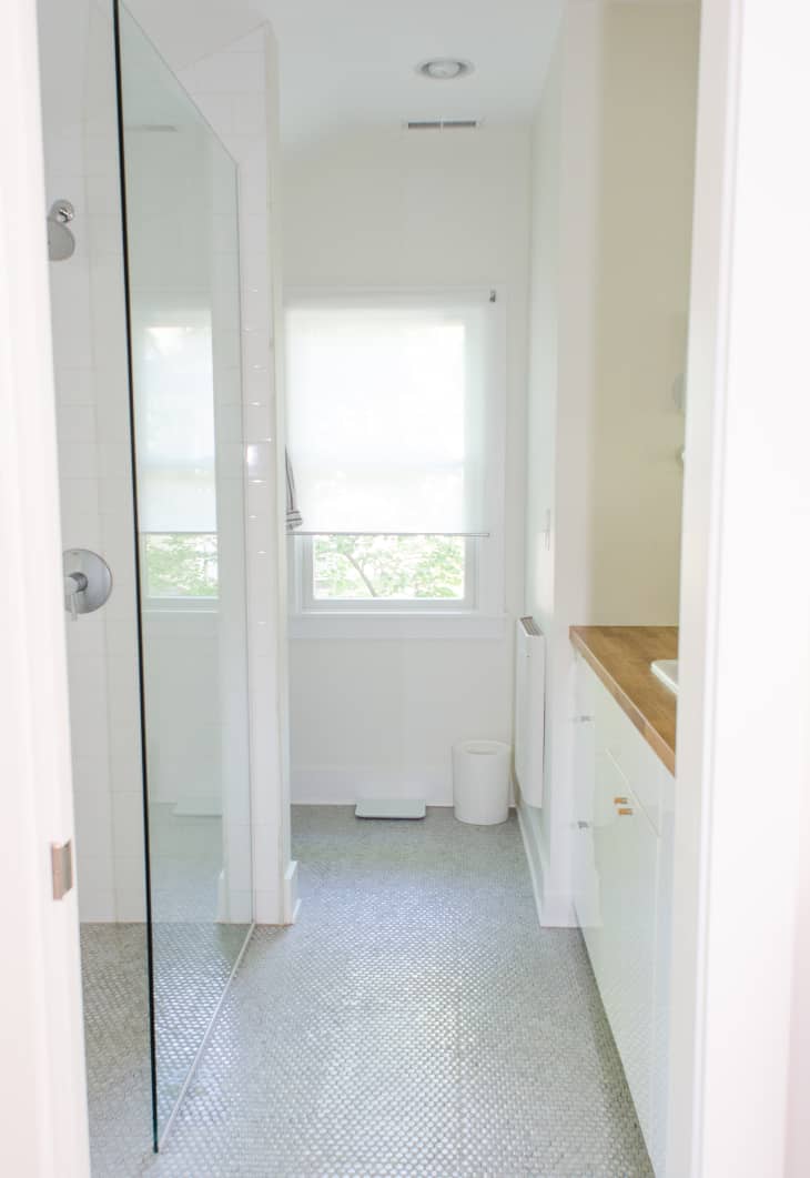
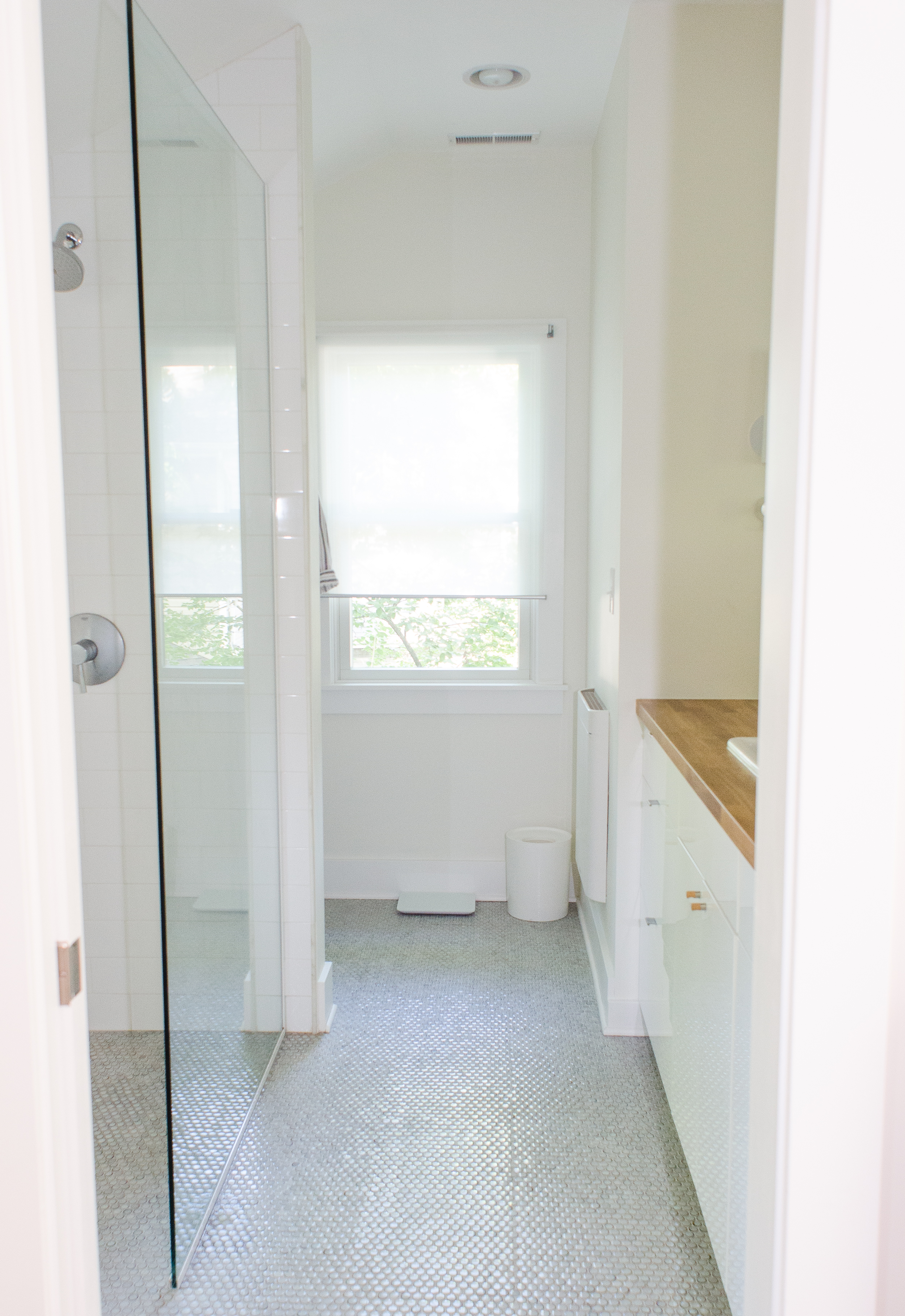
If you’ve been following along with the master bathroom creation in our home renovation, then today is the big day: you get to see how it all turned out!
After
Bathroom Dimensions
• Entire bathroom: 68 square feet (including vanity)
• Shower and vanity area: 48 square feet
• Toilet area: 20 square feet
The Floor Plan: Before & After

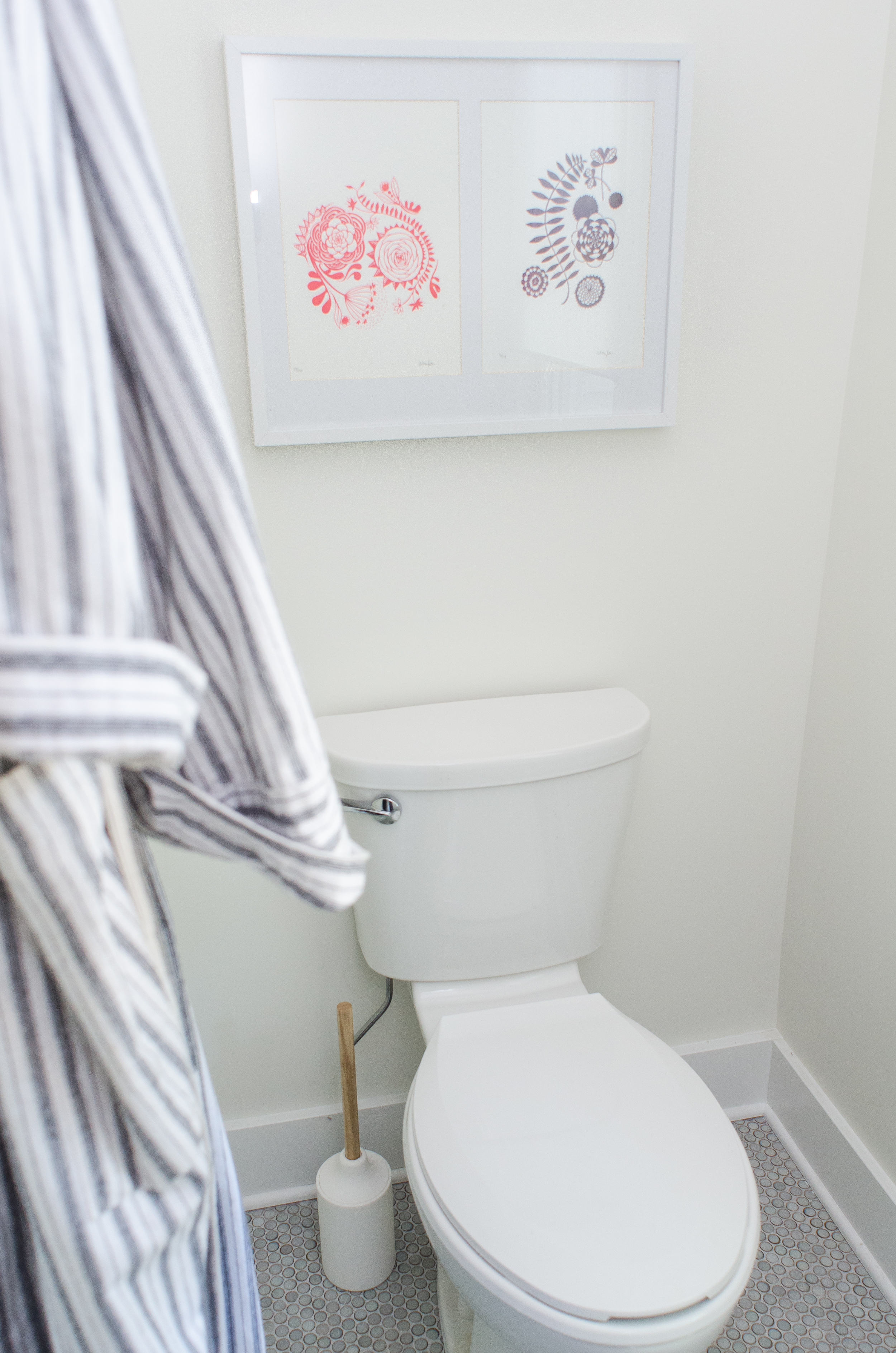
Moss penny-round tile from The Tile Shop. 
Artwork by Amy Marcella. 
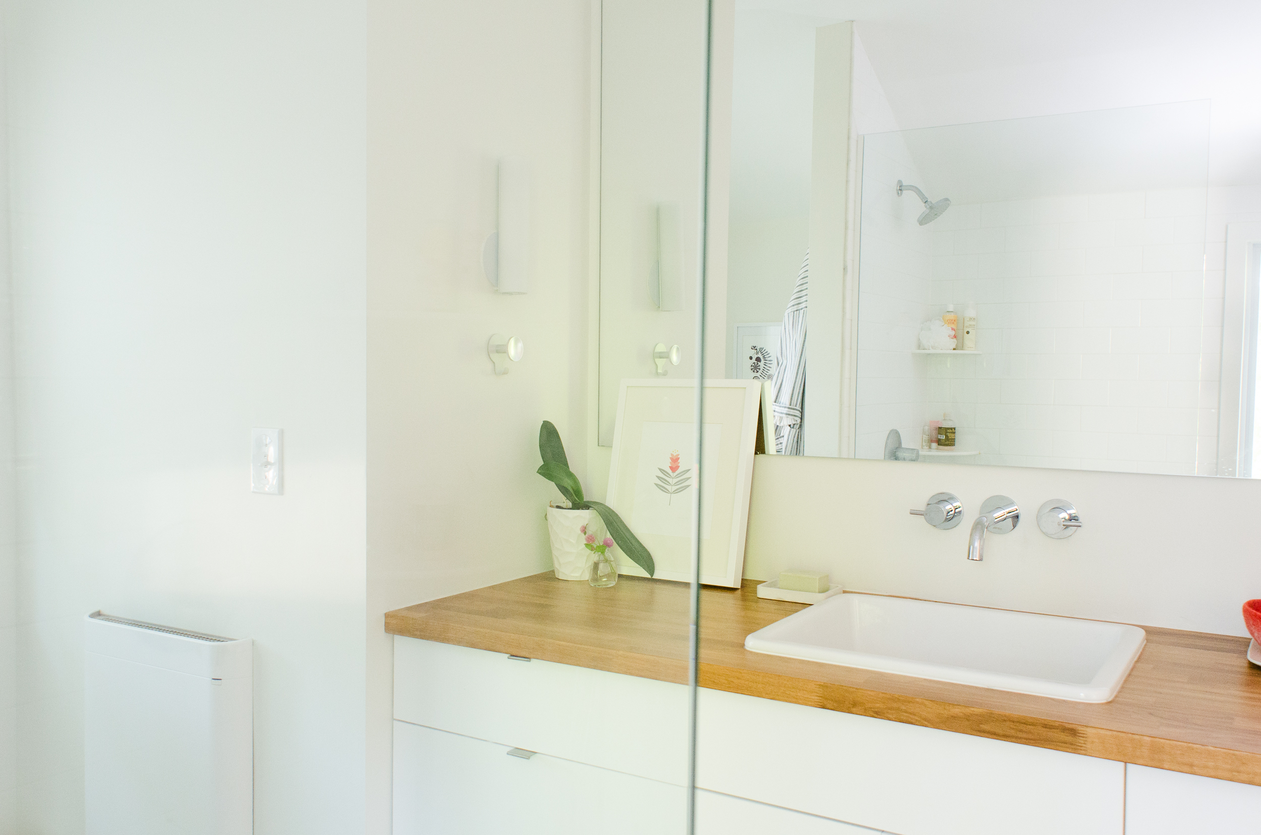
The vanity top is an IKEA kitchen butcher block countertop, sealed with a waterproof finish.
Unlike most of the other Apartment Therapy Renovation Diaries, this one wasn’t written in real-time. We finished the bathroom (for the most part) late in November, and we’ve been living with it for the past eight months. So my comments come not just out of the renovation process, but from having lived with our decisions for a good amount of time.
Here are a couple notes on the vanity and shower — but most of my comments and links to resources are in the slideshow, so make sure to go through it if you have questions.
The Vanity: An IKEA Hack
One of my favorite things about this bathroom is the vanity. Our rental house had a pedestal sink and zero counter space, so doing makeup and dealing with contact lenses happened on a little shelf opposite the sink. Having a full six feet of countertop feels so luxurious by comparison!
The vanity is IKEA kitchen cabinets, which are taller and deeper than the standard bathroom cabinet. We were happy to give up a little floor space for more storage. I love having deep drawers in the bathroom, with room to store our towels, toilet paper, travel gear, and of course all our toiletries and medicines. (We don’t have kids, so I don’t worry about having vitamins and medicine in the drawers, but if we have a sprog underfoot someday, we’ll change our setup.)
And of course, since these are kitchen cabinets, we can use the drawer dividers to organize. Love. It.
The Curbless Shower
We love our curbless shower. I think that having the same tile running through the entire bathroom floor helps it look and feel a little bigger.
I talked in my last post about the shower glass and how I was disappointed with its greenish tint at first. I’ve gotten used to it since then and barely notice it. In fact it hardly looks green to me now; it has more of a smoky cast, next to our white shower tile.
One other design decision we made about the shower: the shower glass is set into two channels, one at the bottom and one at the side. The default channel finish is chrome, but we paid about $100 extra for it to be powder-coated white. This seemed a little extravagant in the moment, as we were cutting costs everywhere we could at the end of our very long project. But we already had all the chrome I wanted in the shower and faucet trim, and I thought the white would look cleaner against the tile. I’m so glad of this decision — I think if we had gone with chrome it would have bugged me every day.
Our contractor: Tom Eastwood of Cornerstone Construction
Our architect: Tim Lai
The Renovation Diaries are a new collaboration with our community in which we feature your step by step renovation progress and provide monetary support towards getting it done in style. See all of our Reno Diaries here.
Congratulations, Faith and Mike! Readers, check out the full series to see the whole renovation process, step-by-step. And be sure to join us next week for a full budget breakdown.
(Images: Faith Durand)
