
9 Designers Share Their Favorite Colorful Living Rooms
No two colorful spaces look the same, and the following living rooms prove that color can make a home shine in a variety of ways, even if it’s used subtly. I spoke with nine experts who each shared their favorite vibrant spaces from their portfolios as well as the inspiration behind the design. Whether you’re drawn to bold walls or prefer to stick to pops of color with cheery textiles, these rooms are bound to inspire you to brighten up some aspect of your living room decor.
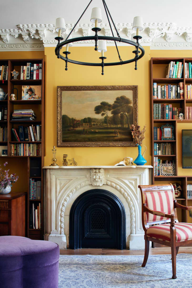
Quirky combinations
“When you find joy in your inspiration, it naturally comes across in the design. As our inspiration was an English library, we took notes from traditional English homes and paintings where saturated, quirky color combinations (yellow, red, purple, and aqua) are employed, creating a layered, rich, and truly joyful interior.” — designer Melissa Lee, Bespoke Only
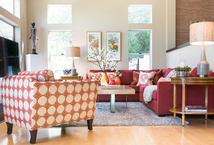
Seeing red (and orange!)
“From our first meeting, my clients said they wanted to embrace color, and the more, the merrier! We utilized a range of oranges and reds that really energized the space and speaks to the art, which was collected from their time living in Asia. It’s a joy to work with clients who do not shy away from a colorful living room!” — designer Rande Leaman, Rande Leaman Interior Design
Go big and bold
“In small spaces, we love really saturated color (even on the ceilings!). For the living room or family room though, the rules are a bit different. Rather than enveloping the whole space, we tend to go big and bold in designated areas, balanced with large pieces of neutral upholstery. That way, if you’re ever in the mood for chartreuse, you already have a backdrop conducive to a change, of course, so you can rock all the lemon-lime of your dreams!” — designer Meredith O’Reilly, Briar Design
Natural inclinations
“We went with a vibrant blend of watery blues, purples, and pinks, which was a color palette inspired by picturesque gardens overlooking the Mediterranean Sea in the South of France. The walls are a pale dove gray, almost white hue, which allows all of the accents, furnishings, and artwork to pop. We love incorporating colors in our designs that are inspired by nature that can also take the homeowner down memory lane to their favorite travel destinations.” — designer Imani James, Imani James Interiors
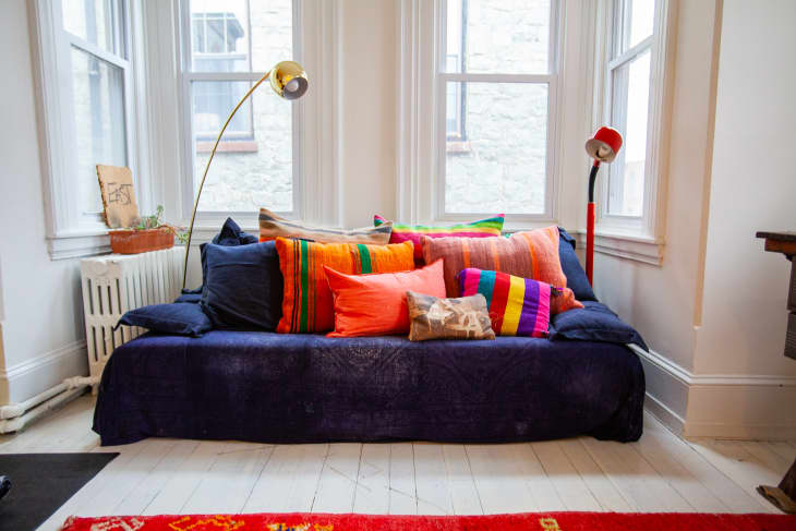
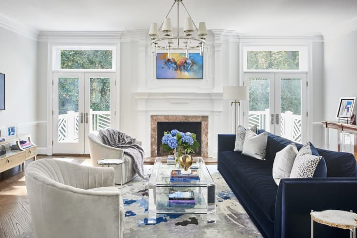
Calming shades
“We wanted to use color, but the client still wanted it to be calming. This sofa’s shade of blue still functions as a neutral and allowed me to mix other colors (like coral) without it being overwhelming!” — designer Stephanie Swander, Stephanie Swander Interiors
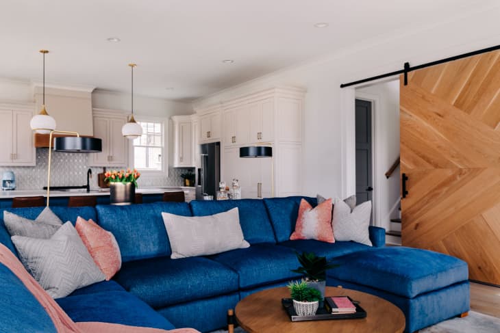
Pastel and preppy
“Our clients, much like ourselves, have a strong attraction to Southern preppy style. With a large family, it was important for us to create a bright, fresh space that their kiddos could run around and feel comfortable in while still having that sophisticated, designer look. We had fun incorporating both warm and cool color elements throughout the living room to give the space a unique feel!” — designer Bria Hammel, Bria Hammel Interiors
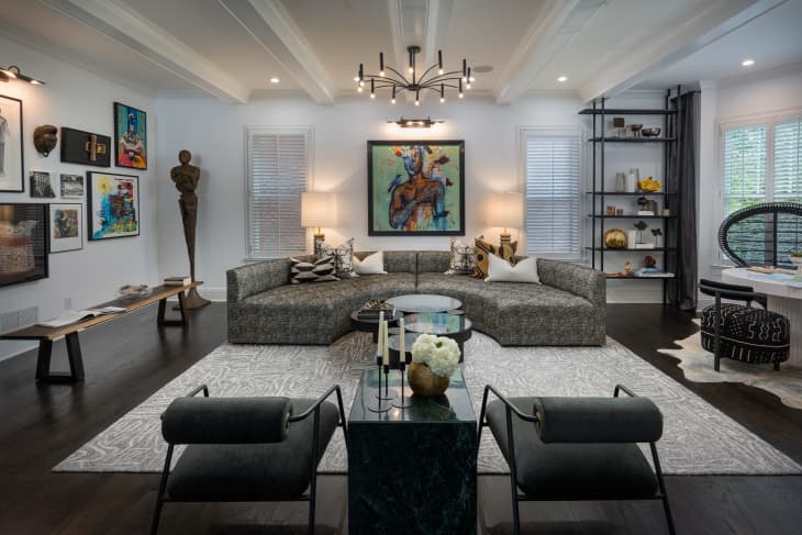
All about the art
“The thing about color is it can be used in myriad ways. In this space, we relied heavily on the art to bring color into the space. This allowed the art to be the focal point of the room and draw the viewer’s eye.” — designers Tavia Forbes and Monet Masters, Forbes + Masters
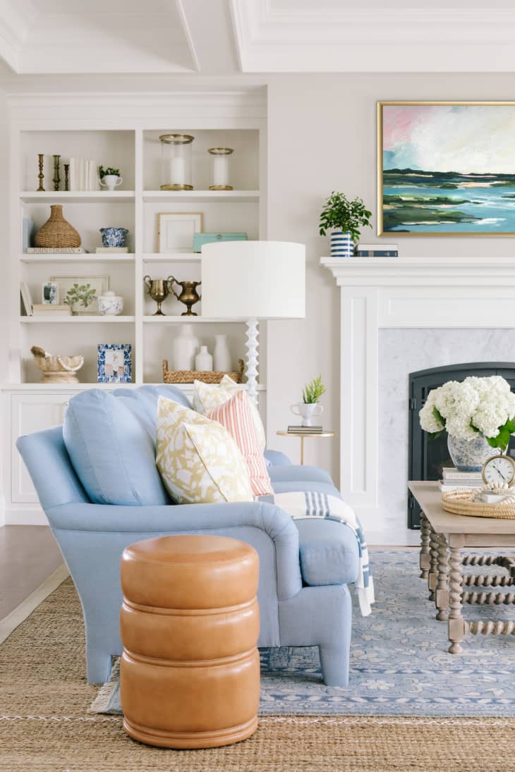
Less is more
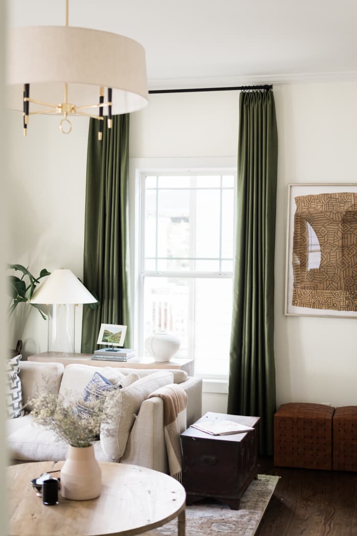
“I think color is best used sparingly and has more effect when it is employed intentionally. In this space, I wanted to accentuate the 10 foot ceilings by using stunning custom curtains in olive green to pop against the creamy white walls. This immediately draws your eyes into the room and subtly shows off the grand scale of the space.” — designer Dawn Heuer, The Heuer Design Collective
Bring on the books
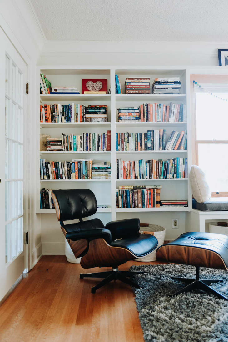
“When designing this room, we thought we’d let the books bring a colorful element to the space. This allowed us to brighten up the living area without the permanence of choosing bold paint and furniture colors.” — designers Sarah and Duane Reed, Arbor & Co