Glidden Is Not Naming a 2020 Color of the Year…For Good Reason

Don’t hold your breath for Glidden’s color of the year: The popular paint brand has announced its decision to opt out of choosing a 2020 hue.
While many consumers look to the annual practice for design inspiration (choosing a paint color can get pretty stressful), folks shouldn’t to worry because Glidden’s decision stems from a desire to better prioritize the decorative needs of DIYers who are anxious to get going on their last home makeover projects.
Along with announcing its official breakup with highlighting trendy hues every year, Glidden did name a color that’s intended to be a timeless option to be enjoyed by DIYers from here on out.
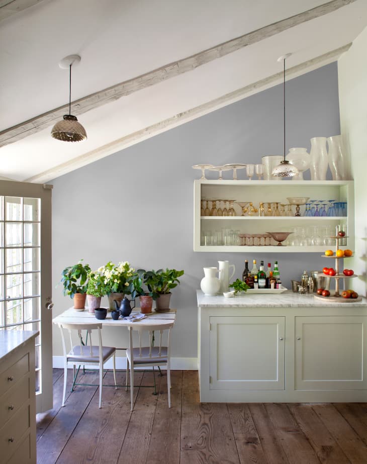
Named Whirlwind (PPG1013-3) the brand’s highlighted shade is described as a “fail-proof cool gray with a touch of blue.”
“Grays have been trending for more than a decade,” Glidden’s color guru Kim Perry said in a press release. “If it’s not broke, don’t fix it! Whirlwind was one of our top tinted colors this year, so DIYers can rest easy knowing they can enjoy it for years to come. Instead of staring blankly at a paint color card questioning all your life choices, you can spend time doing what you really want to do. Like drinking wine or binge watching TV in your freshly painted living room.”
We’re not surprised it’s a blue-tinted gray; research has shown that blue hues tend to have a calming effect on people; in fact, the shade has even be credited with making customers have more enjoyable shopping experiences, crime reduction and suicide prevention, Psychology Today reports. As long as people continue to search for ways to make their surroundings more peaceful, the staying power of Whirlwind appears to be limitless, regardless of future colors that may receive the celebrity treatment for a single year.
