
I Discovered This “Sensory Friendly” Paint Collection and It Made Me Rethink Colors
After a long day, there’s likely nowhere else that people want to go but home. For some, it’s a safe space and the need to create an environment to fully relax, detox, and release tension is essential. That’s why I was amazed when I heard about the collaboration between wall furnishings brand Graham & Brown and The Sensory Home, founded by designer Pippa James. It’s a line of 16 incredible paint colors that capture the essence of peace for several rooms.
These colors were created with more than just beauty in mind. The hues are grouped into four sensory-driven categories — Focus, Nook, Gather, and Rest — so you can apply the right hues to your space to inspire and enhance its purpose, which is especially good.
Graham & Brown x The Sensory Home’s Paint Collection Fosters Tranquility
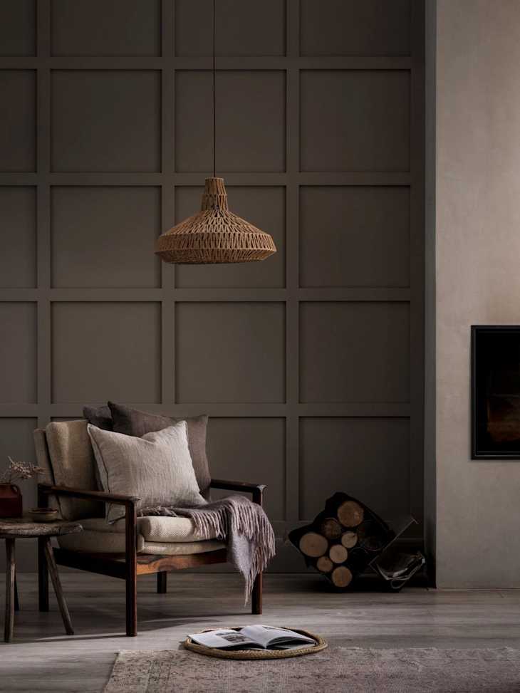
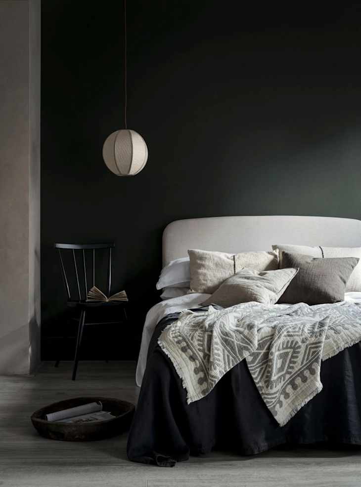
The Sensory Home specializes in designing spaces for neurodivergent clients and worked with Graham & Brown to develop colors that help regulate emotion, provide balance, and bring calmness to a room. The Focus category, for example, features cool blues like Breathe and Slide, as well as warm neutrals like Indian Ink and Plover, which promote concentration and clear thinking.

Gather brings together earth tones like Uluwatu, Hanami, and Sage, which will ground you and deep conversations among family and friends. Alternatively, Rest envelopes you with colors like Chimney Sweep and Axel to encourage tranquility and a restful night’s sleep.


For living spaces, the Nook category, with neutral muted tones like Warm Baguette and Warm Mittens, makes you feel cozy, comfortable, and still (the paint names alone makes me feel relaxed!). Each delicious color comes in four finishes, so you can choose the best option for your space.

You can check out the entire collaboration on Graham & Brown’s website and learn more about all 16 colors in the collection. If you’re looking to bring a bit of rest and relaxation into your home during a time when it’s difficult to be calm all the time, choosing one of these shades will help you do just that.