
A Dining Room Goes from “Builder-Grade” to Breathtaking Thanks to Bold Colors
Green is a great color to use in interior design because it’s so versatile. Muted sages make for calming sleep spaces, and bold or dark greens can create statement-making bookcases. Brandi Katherine Herrera (@alivelymanner) went with bright green in her Omaha cottage’s dining room makeover.
But the space when she bought it had a “palette of gray and white builder-grade finishes.” Her job (and that of her team of contractors) was to bring color and charm back into the cottage. In the dining room, this meant adding colorful beadboard, putting up wallpaper, and removing two existing doors to swap them with a sliding glass one.

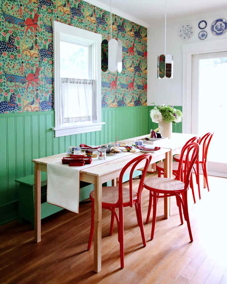
The beadboard and dining bench match.
“Our contractor installed and painted the beadboard throughout the cottage,” Brandi says (as the entire place went through a $50,000 renovation after Brandi bought it.)
Brandi says it’s her first time picking beadboard for a project, though. “I really love how it turned out,” she says. “It’s such a simple addition that makes such a huge difference in terms of the depth and character of a space. It really makes it feel so much more charming, I think.” It’s painted Sherwin-Williams’ Reseda Green.


The wallpaper adds even more green.
The green paint pairs nicely with the folk print wallpaper for the upper half of the walls, Fasnacht’s Absinth wallpaper, installed by Brandi’s mother-in-law, Nancy. “She’s a bit of a wallpaper whiz and volunteered to do it,” Brandi says.
Brandi says she wanted to lean into complementary colors: green and red-orange for the dining room. The wallpaper has pops of red that tie in nicely with the red bentwood chairs from Schoolhouse.
The dining tables are from IKEA, the pendant lights are from HAY, and the white (Backdrop’s Supermoon) walls got a bit of pattern, too, with the blue and white plates on the walls.
Inspired? Submit your own project here.