
The Best Colors to Paint Your Hallways, According to Home Experts
It’s easy to gloss over hallways. They’re just there to get you from one room to the next, right? Not so. Something as simple as adjusting a hallway’s shade of paint can transform the humble passageway into a statement spot.
“Hallways and corridors can create suspense of what is to come deeper in the home,” says Marie Flanigan, of Marie Flanigan Interiors in Houston.
To find out the best colors we should all be painting our hallways, we polled design and real estate professionals for their go-to swatches when it comes to creating an inviting narrow space. Ahead, what paints to choose for a hallway that’s for more than just passing through.
Keep it light
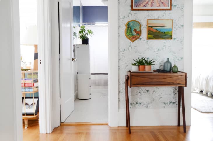
Because many hallways don’t have windows or other avenues for natural light, there’s a possibility they’ll feel cave-like with a paint color that’s too dark. So, light and bright is best.
“White or light walls can make tight spaces feel more open and spacious. Light neutrals also offer a blank canvas to allow personal collections or a gallery wall pop,” says Flanigan.
Some of Flanigan’s favorite shades of white include Wimborne White (#239) by Farrow and Ball, Snowbound (#700) by Sherwin Williams, and Sheep’s Wool (#857) by Benjamin Moore.
Warm up doors and trim
If just using plain white throughout your hallway seems too sterile for your home, Lora Lindberg, a house flipper in Seattle, recommends warming things up by painting your closet doors or trim. Lately, her favorite shades to use in her project halls are Benjamin Moore’s French Canvas (#1514) for the walls and Coastal Fog (#AC-1) for the baseboards or doors.
“Coastal Fog is a warm, light gray, and while still keeping it light, it adds some interest and complexity, while all staying very subtle. Sometimes if you go with a real dark trim and door paint, it’s just so broken up and so many lines, it’s distracting,” says Lindberg.
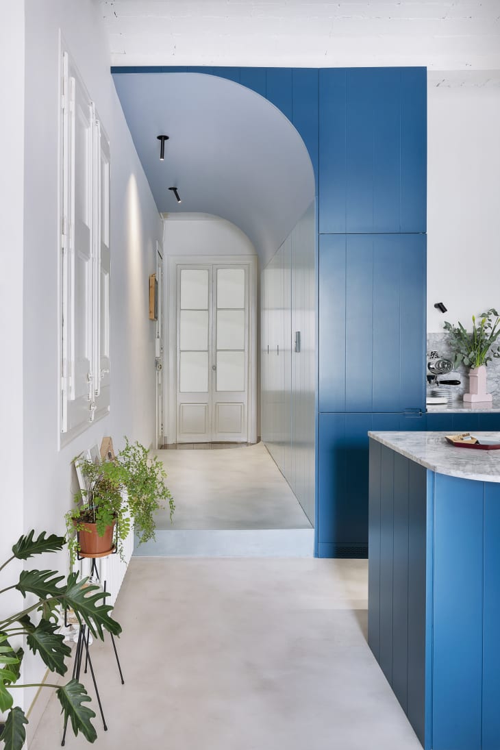
Go bold—under the right conditions, that is
Not all hallways are dark and narrow—some are even #blessed with rows of windows—which means you have a little more room to play around with color, says Shelly Wilson, a real estate agent in Indianapolis.
“I’ve even noticed that in model homes, a lot of the time when there are really wide [entry] hallways, the builder will do one wall a dark contrasting color, which is usually the opposite wall of where you’re entering,” Wilson says. “So, if the floor plan leads to the left, it’s usually the right wall that is the contrasting color. This is totally intentional so that you go toward the light.”
If this sounds like your hallway, don’t be afraid to go bold with a deep, rich color. Some of Wilson’s favorite swatches are a navy, sea-like Sherwin Williams’ Naval (#SW 6244), a dramatic black Benjamin Moore Wrought Iron (#2124-10), and an emerald green like Benjamin Moore’s Essex Green (#PM-11).