HGTV HOME By Sherwin-Williams’ 2019 Color Of The Year Is So Calming

With a new year comes the opportunity for a new start, including a fresh coat of paint for your living spaces. But with so many color swatches to choose from, HGTV HOME By Sherwin-Williams just made your life a lot easier with their 2019 Color of the Year unveil.
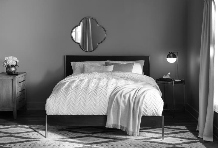
The winner is Reflecting Pool (SW6486), a hue of “many personalities” that communicates “a life of balance with a little bit of flair” with its versatility and adaptive skills.
“The 2019 distinguished Color of the Year, Reflecting Pool, is incredibly versatile and can be combined with any of the trending Color Collections,” said Ashley Banbury, Senior Color Designer at HGTV HOME by Sherwin-Williams. “It can be soft and calming when mixed with natural hues, but energizing and fun when combined with the vivid and bold shades.”
But beyond spotlighting Reflecting Pool, HGTV HOME revealed three 2019 Color Collections, which are coordinated palettes that help consumers “travel down a path of self discovery” and “bring their color vision to life.”
First, we have Sophisticated Whimsy, which exists to inspire positivity and encourage adventure. This palette includes Passive (SW7064), Dress Blue (SW9176), Afternoon (SW6675), Tricorn Black (Tricorn Black), Cardboard (SW6124), Dover White (SW6385), and, last but not least, Reflecting Pool, the 2019 Color of the Year.
Then we have Mystic Light that explores the relationship between physical and digital, motivating its users to look at “familiar materials in a new light.” This Color Collection is Nomadic Desert (SW6107), Magical (SW6829), Naval (SW6244), Dishy Coral (SW6598), Refresh (SW6751), Bunglehouse Blue (SW0048), Emberglow (SW6627), and Alexandrite (SW0060).
And finally, meet Everyday Balance, cultivated from the idea of soft natural elements. This color palette is meant to serve as a “retreat from the chaotic nature of everyday life to find a sense of calm and balance.” This palette includes Grizzle Gray (SW7068), Pure White (SW7005), Quaint Peche (SW6330), Interesting Aqua (SW6220), Borscht (SW7578), Filmy Green (SW6190), Dark Night (SW6237), and Believable Buff (SW6120).
We chatted with French photographer Garance Dore, who helped host the HGTV HOME by Sherwin-Williams event, on what she thinks of the palettes and how color plays a role in her life.
Apartment Therapy: What do you think of the 2019 Color Collections?
Garance Dore: I love that you can actually put them in your house, but I also love that it’s challenging. Color is a language and it’s great when you can have designers help you pick, because I would have never think to put these two colors together, and I think it’s fabulous.
AT: Which are your favorite colors?
GD: I think pink is one of the colors that always comes back in my work—a little softer, something feminine. I always have a thing for beige, it often comes back in the way I dress. And yellow is something that is really part of my brand. Those are some of my favorites, but my bedroom is going to be very dark. I’m starting to really get into darker colors, I think they have a great function in the house.
AT: Oh, so you’re doing renovations. Is it a full reno?
GD: It’s a new house, but it’s more like, how can we add personality to it? And then there were a few things that when I visited it, I was like, oh I need to change this. There is a lot happening. But it’s exciting for me to be here tonight because this is a new world for me. It’s not clothes or fashion, it’s home and it’s fascinating.
AT: How did you get into interiors?
GD: I’m a frustrated New Yorker, like probably all of us. I was living in New York for eight years and I was always in apartments that were rented where you couldn’t change anything. I had a bag of ideas and frustrations and all that. Now I live in a house in L.A. and it’s mine, I can do what I want.
AT: What is really special about the 2019 color palettes?
GD: What I really like is that it seems like it’s just colors, but it actually captures what you’re excited about right now. These collections a way to include trends in a very soft, subtle way.
AT: Why do you think these colors were picked for 2019?
GD: I think these are the vibes that are going around in the universe. You know at some point everybody thinks and wants the same thing, and I love that. It’s cool to be inspired by something at the same time.
AT: Where do you see these colors fitting into interiors?
GD: This is a guide. It’s like, here, you can follow these things if you like it, but you don’t have to use everything as a paint color. This could be your room color, this could be your pillow. And that’s how color can be everywhere. Use it to your personality.
