I Got a Color Analysis for My Home Decor and It Was Not At All What I Was Expecting

If you were to ask me how many different colors I have in my home, I honestly couldn’t tell you. In my living room alone, I can spot over 15 shades among the walls, furniture, and decor (I promise it’s not as overwhelming as it sounds!).
That number might make some people cringe — especially because we’re often told to keep things simple when decorating, and to stick to a palette of maybe five or six shades. While I’ve definitely started some projects with that mindset, I’ve always felt color should be about freedom — not rules. My home is proof of that: It’s filled with vibrant hues that make me feel energized and happy.
Then I did something unexpected: I got a color analysis. Yes, the rainbow-fabric-floating-by-your-head thing that tells you which colors supposedly make you look your best. And it got me thinking: Could this same approach work in home design, too?
For those unfamiliar, color analysis is all about finding the shades that complement your skin tone, hair, and eyes. Without getting too technical, it’s done by examining the value, hue, and chroma coloring in your features (what kind of undertones you have, how muted or vibrant your hair color is, etc.) and then homing in on your specific “color season” or palette. I got to experience the entire process firsthand when I met Dana Hammond, founder of Colorful Style by Dana, in the Hudson Valley.
“What we’re looking for are colors that will enhance your appearance, meaning your skin tone looks healthy, vibrant, glowing with an even complexion, and a more youthful look,” Hammond explained during the consultation. As I sat with colorful fabrics draped around my body, I was shocked to see changes in my skin tone — but even more so the specific colors making this happen. Shades of purple, magenta, and teal (which I never wear) suddenly made the dark circles under my eyes lighten, making my eyes pop and my face look more defined.
Hammond ultimately labeled me a “true summer,” and I couldn’t help but laugh at how unexpected this was. (Cue internal meltdown.) I’d been convinced I was a “true autumn” — I had the reddish hair for it, and I loved to wear rich colors like yellow, orange, pink, and green. Turns out my prediction was way off. After all, auburn isn’t my natural hair color, and my skin tone leans more cool than warm.
“The energy should flow between you and the colors,” Hammond reminded me, and that simply wasn’t the case with me and some of my favorite shades. Cobalt blue, for example, didn’t wash me out, but it did compete for the spotlight — as in, when you look at me wearing cobalt blue, your eyes go to the color before me.
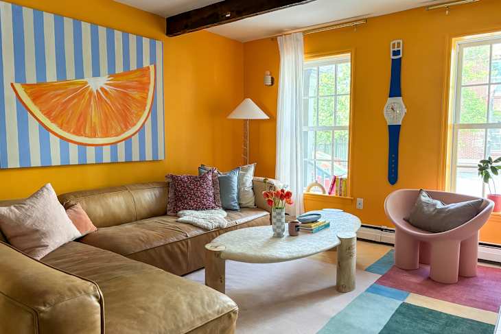
But just because something wasn’t in my palette didn’t mean I had to avoid it altogether. I was relieved to hear Hammond’s take when I showed her a photo of my bright orange living room (mind you, a color on my “worst shades” list) and asked if I should redecorate. “I feel like a healthy combination of cool and warm working together in different ways is very helpful,” she continued. “You can have your neutral be something that will work with you and your color palette, and then have great accent colors like your pillows or a blanket or a lamp that are cool and funky.”
I loved hearing how Hammond implements color analysis knowledge into her own home design, too. “You should make the colors of the room whatever you want to feel when you’re in the room,” she said. Using her bedroom as an example, she shared, “I wanted to feel calm and relaxed in my bedroom; just very easy, flowy, like the ocean. So it’s very calm in there now — dull grays, dull light blues.”
While color analysis is about finding colors that make you look your best, decorating your home is about incorporating things that will make you feel your best. Take my tangerine living room, as an example: I chose that wall color because I wanted the space to come off as cheerful and energizing. Apparently, it might not be the best Zoom background for my skin tone, but the room gives off such a warm glow that I always feel right at home. I wasn’t totally off from my colors everywhere, though. My dining room has shades of red and blue with purple undertones — all approved in my true summer palette.
As a designer, I always encourage others to choose colors that bring them the most joy. While I now know which shades technically make me look my best, I’m not about to ditch my favorite colors any time soon. Home should reflect what makes you happiest — not just what fits into a specific color palette. That said, I’m excited to experiment with some of the new colors from my analysis that have previously taken a backseat.
My next move? I’ll be swapping out my living room rug for one that aligns with my new palette — deep purples and blue-greens. I’m curious to see if bringing these hues into the room will create the same harmony I felt after the color analysis. Maybe I’ll play around with changing some pillows here and there, too.
