See How a Home Stager Used Retro Wallpaper to Set the Tone for a 1960s Ranch

Just as one person’s trash is another person’s treasure, one woman’s eyesore is another woman’s inspiration. That’s what happened when Amanda Eufer-Lewis, owner and lead stylist of The Den Rentals in Denver, was tapped to stage a 1960s ranch home in Golden, Colorado, which had much of its original character intact.
The “eyesore” in question? The home’s entryway, complete with a powder-pink front door and busy palm tree print wallpaper. Instead of seeing these quirky focal points as something to cover up or work around, Eufer-Lewis used them as the inspiration for her staging of the entire 2,060-square-foot home.
“We love when an opportunity arises to go down a road less traveled, if you will, in terms of staging,” she says, referring to the whimsical tone set by the door and wallpaper. “We leaned into a quirkier aesthetic through our furnishing selections.” She adds, “We wanted to play into the retro-cool vibes and create an eye-catching, attention-grabbing aesthetic while bringing it into the modern era.”
Once the form was set (what she calls a “playful-yet-elevated” aesthetic), Eufer-Lewis turned to function. She wanted to stage the great room, a living area right off the entryway, in a way that demonstrates to buyers how they could arrange their furniture while also “leaving some breathing room,” she says.
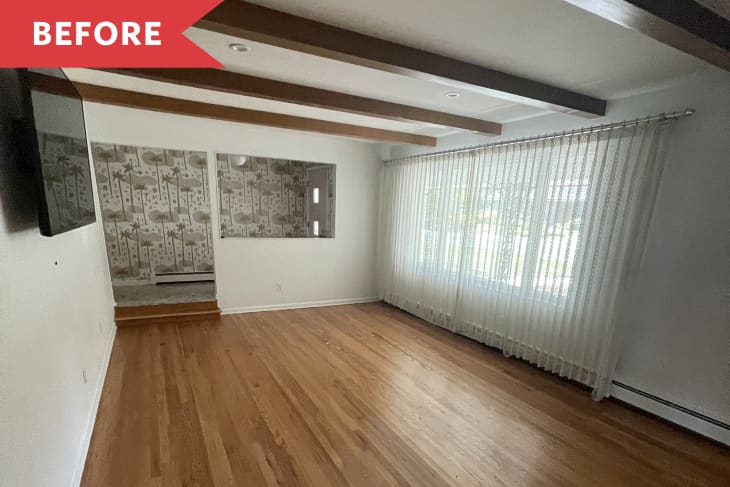
The room itself was a great blank canvas, with exposed wood beams, matching wood floors, and a large picture window. However, the space was large and long, so it didn’t show well empty. “Without furniture, the room feels cavernous and overwhelming and all the focus is on the beams,” she says. “It also had lace drapery that was left behind and not easily removable, so we wanted to be mindful of what we put in the space so that it didn’t feel dated.”
Since every buyer now endlessly clicks on Zillow while house-hunting, she says, Eufer-Lewis wanted the staging to wow — and stop potential buyers in their tracks. That’s why she used funky pieces like a 1980s tooth stool from a dental office in Los Angeles, which was sourced from Freska Living. The tooth-like stool is placed beside a green Urban Outfitters console — which she gave a nickname derived from an old-school claymation character — on the far wall. “Our jumping-off point was our ‘Gumby’ console that we positioned at the end of the space to immediately draw you in upon entering the home,” she says.
Artwork on and above the console adds further visual interest, including ribbon art by Angela Chrusciaki Blehm, a pop-art banana piece from JKC Vintage Decor in Toronto, and two white-framed prints. To illuminate that far wall, a white orb lamp by Nathan Lee Beck Studio was placed on top of the console. In the corner, a potted plant adds a touch of greenery and life.
To showcase the size of the great room, Eufer-Lewis chose low-profile furniture, which she calls a “trick that we love to use in larger spaces.” She explains, “There’s often a misconception that larger rooms require bulky and oversized pieces, which actually has the opposite effect. Again, we love breathing room so that it allows the eye to scan and take in the entirety of the room.”
The seating area comprises a white sofa from Article, two nubby chairs in a cream hue, plus an orb floor lamp from Star Power Vintage in Denver on one side and a side table reminiscent of a tree stump on the other. “We kept the furniture selections white and light cream so as to not overwhelm the overall decor since we chose a busier patterned rug,” she says.
The arrangement — which centers on a white CB2 coffee table topped with accessories like a giant aspirin objet d’art from JKC Vintage — is grounded by a graphic black-and-white area rug.
Those seated on the sofa are treated to a view of a custom monochromatic triptych created by The Den: large unframed canvases topped with a crinkled white material, adding further texture and further emphasizing the depth and scale of the room, she says.
This fun and funky home recently made a splash when it hit the market — thanks to Eufer-Lewis’ staging work.
