
Here’s How to Translate Your Decor Style into Tile
From shimmery zellige and colorful simple squares, we’re living in somewhat of a tiled surfaces renaissance right now. “After the last year-plus of staying home, people are expressing themselves more in their spaces,” says Kali Gibson, PR manager for Fireclay Tiles. “It feels like people aren’t playing it as safe and are leaning into going bold with color or pattern (or both!). It’s less about trends and more about personal expression.”
Because there are so many tile shapes, finishes, materials, and colors out there — and infinite patterns to lay those shapes, finishes, materials, and colors out in — it can be difficult to find a tile that works well with your your personal style. If you’ve honed in on your aesthetic but aren’t sure how to translate that into a tile you’ll love, look no further than this expert-sourced, handy guide of go-to tiles that’ll complement different design styles.
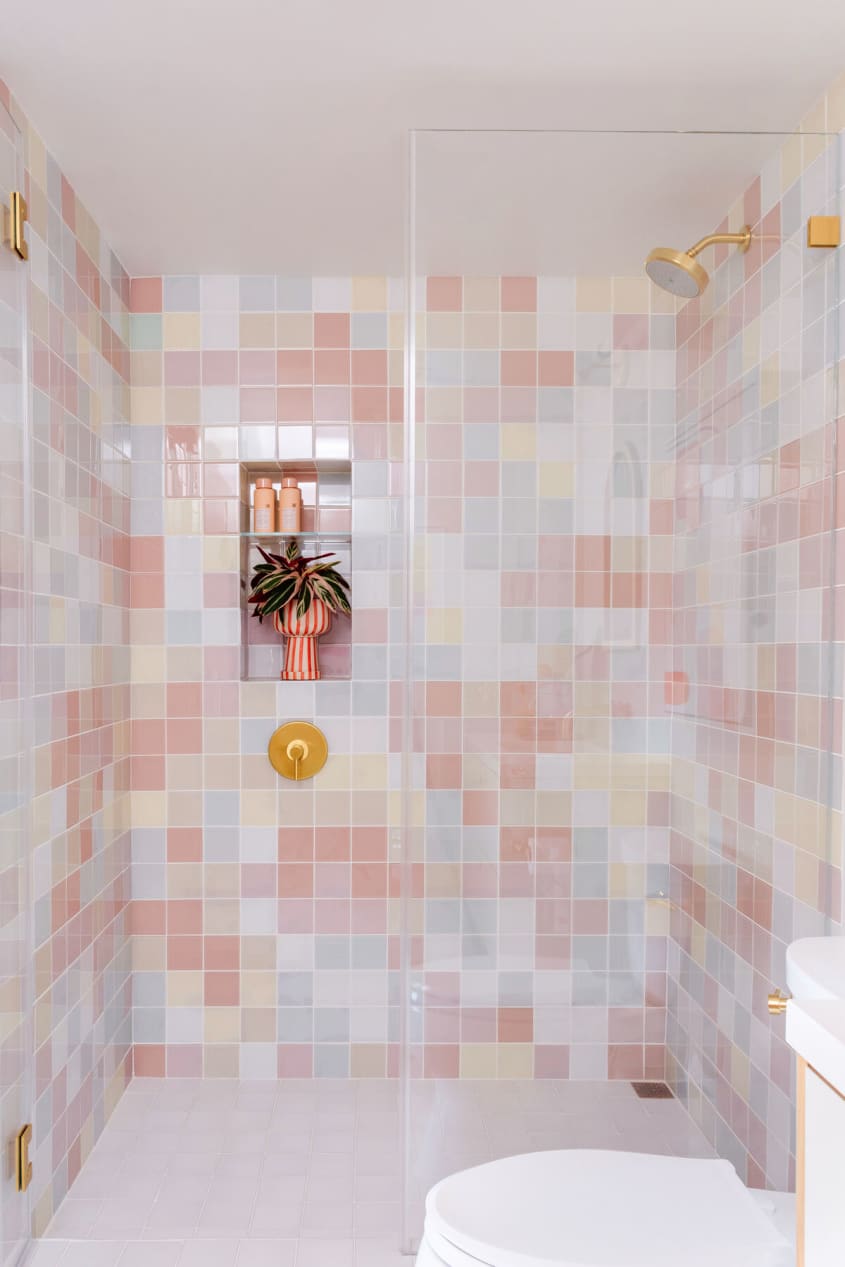
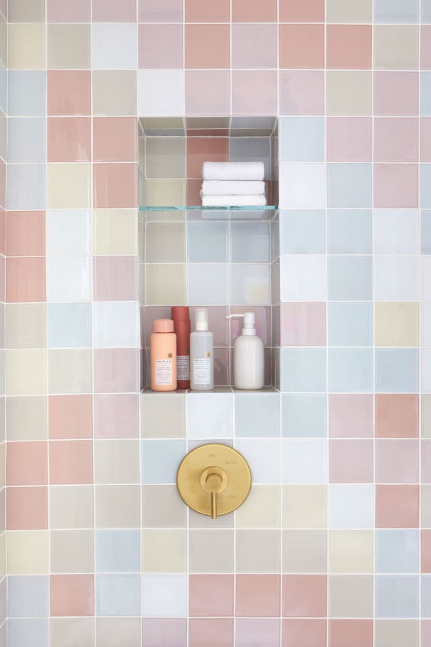
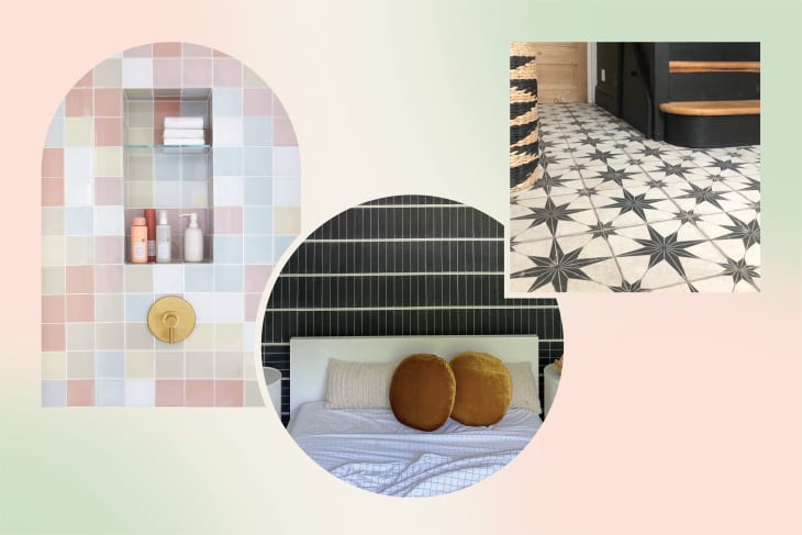
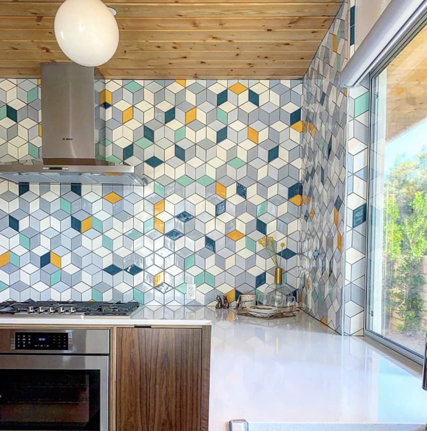
’80s: Go ahead, be a square
Design elements from the 1980s are huge right now, and square tiles provide a fun throwback to that era. “Square tile is definitely timeless and a classic tile shape, but it definitely had its moment in the ’80s and ’90s and has made a comeback in a fresh and modern way,” Gibson says. The ’80s iteration of the simple shape involves selecting fun colors — even purposefully mismatched ones, as shown in blogger and graphic designer Joy Cho’s bathroom above. Think of tiling a backsplash, shower surround, or even full wall covering in this way as creating your own personal, life-sized Tetris board in the colors you love. “Essentially in tile, you can use all shapes, and the idea is to elevate bold, bright colors accentuated in shapes,” CEO of Mercury Mosaics and tile designer Mercedes Austin says.
Cottagecore: Doily white
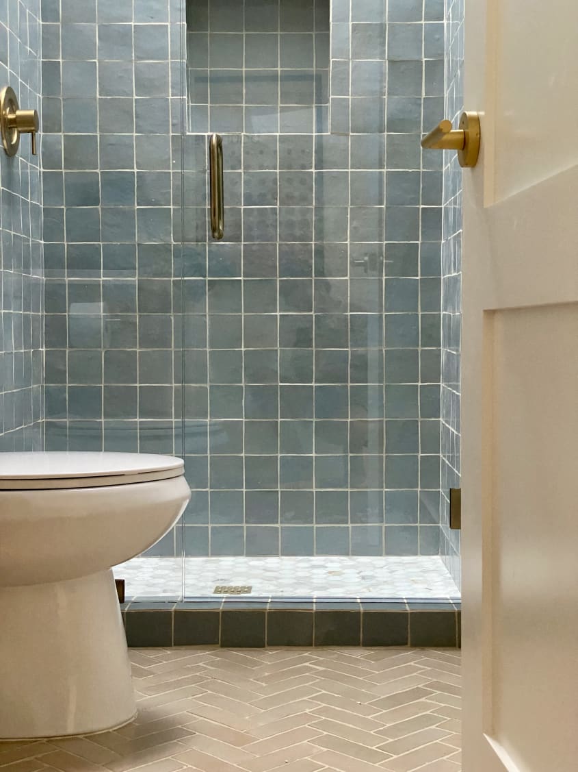
For the cottagecore aesthetic, Austin recommends going in the other direction and “sticking with classics like white and off-white.” Both Gibson and Austin say to keep the colors muted and add interest by varying up shapes or the way you place the white tile. For instance, a herringbone or hex pattern would also work well in a cozy, cottage-like space. “Don’t forget details like trim pieces to finish the look,” Gibson adds.
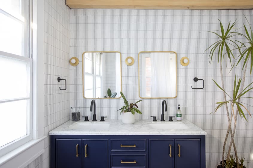
Japandi: Grid it out
Interiors photographer Margaret Wright is drawn to the minimal, Scandinavian influence of skinny rectangular ceramic tiles, sometimes called “Kit Kat tiles” because of their shape. The ones Wright used in her guest bathroom, shown in the second image above, were handmade by artisans in Japan, which makes them the perfect choice for the Japandi aesthetic, which blends Scandinavian elements with Japan’s more rustic, nature-inspired palette.
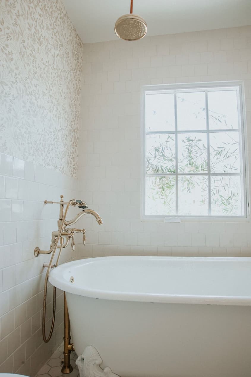
Bohemian: Zellige imperfection
Wright also says she’s photographing a lot of zellige looks in peoples’ homes right now. “I think the zellige trend is for the artist-type person because they’re all unique, and some of them might be damaged, or they don’t fit together perfectly, but they create such a beautiful look when it’s all finished,” she says.
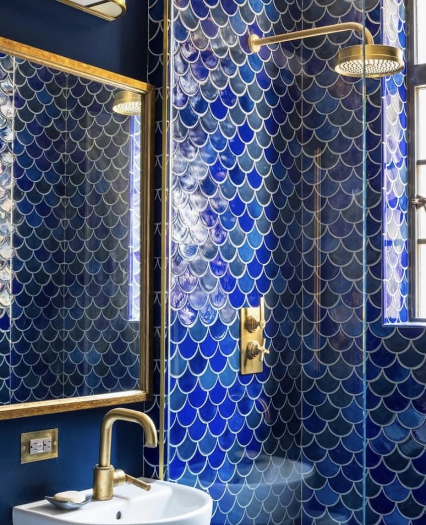
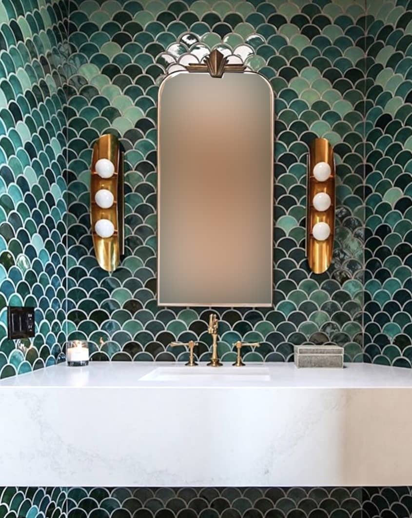
Hollywood Regency: Scalloped Deco glam
“The old Hollywood style for me summons the use of the scallop-shaped Moroccan Fish Scales,” Austin says. “Complementing [them] with gold, glamorous plumbing and hardware gives off that classy feel, no matter the space.” Stick to darker colorways like the bold blue and green jewel tones shown here to really nail a period style 1920s Art Deco or Art Nouveau look.
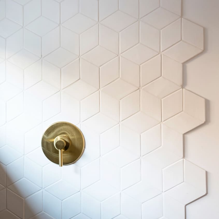
Scandi: Angled and simplified
While Hollywood Regency is about keeping things dark and moody, Scandinavian style is about keeping things airy and simple. “Scandinavian style is all about editing it down to the essentials and is ideal for layering natural elements and rustic finishes,” Gibson says. Her advice? Don’t feel pressured to stick with only white tile or classic installations. “Scandi aesthetic doesn’t have to mean you have to go for neutral-colored tile, so long as the overall feel is minimalist and streamlined,” she says. Sticking with straight edges but creating a pattern with movement is also true to Scandi style, she adds.

Traditional: Subway all day
Subway tile can definitely work with other aesthetics if you make bold choices with color or use it in an unexpected spot, Gibson says, but if you’re looking for something tried-and-true, go with a classic white subway tile in the kitchen. You can pump it up with dark grout if you want something a little more pronounced than the classic all-white kitchens you see here.
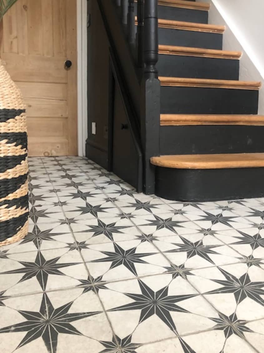
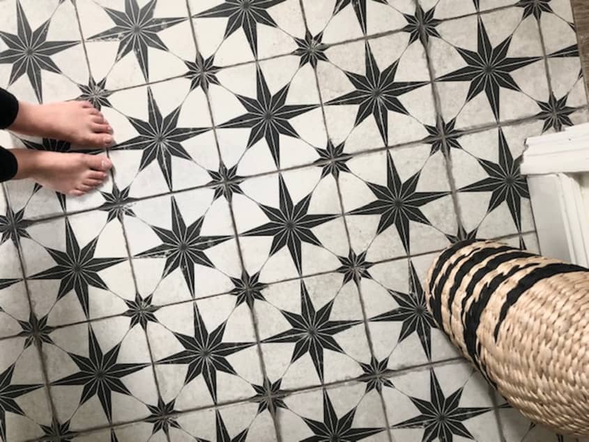
Farmhouse: Black, white, and vintage all over
The black and white color combo is also a classic, and a black-and-white cement tile is perfect for the modern farmhouse aesthetic. A patterned cement tile reminds Wright of a quilt, which is why it’s the perfect choice for this popular design style. Try a black-and-white starry scintilla pattern, shown here, to complete the cozy, lived-in look of any farmhouse-style entryway, kitchen, laundry room, or bathroom.
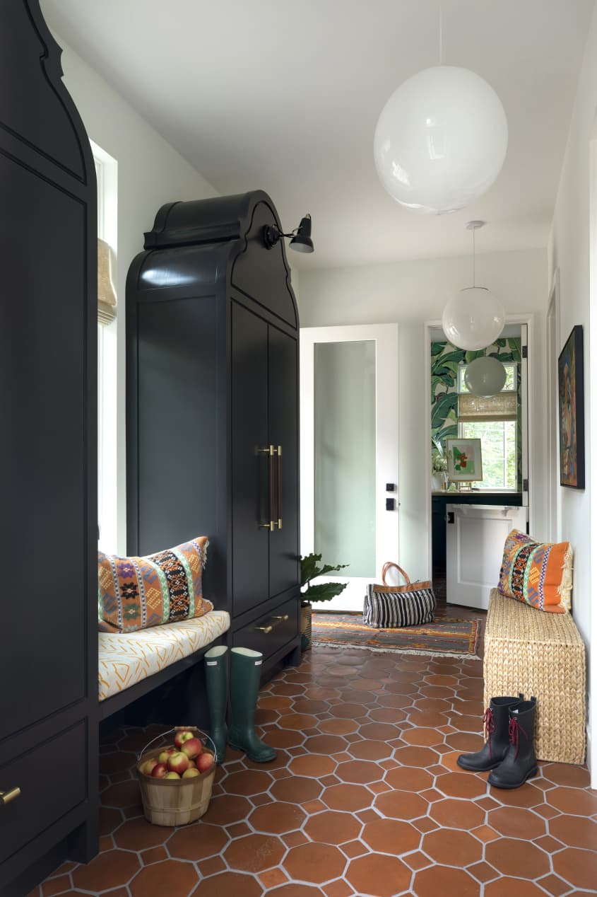
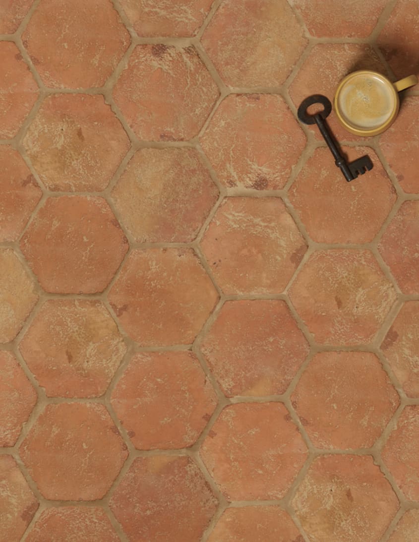
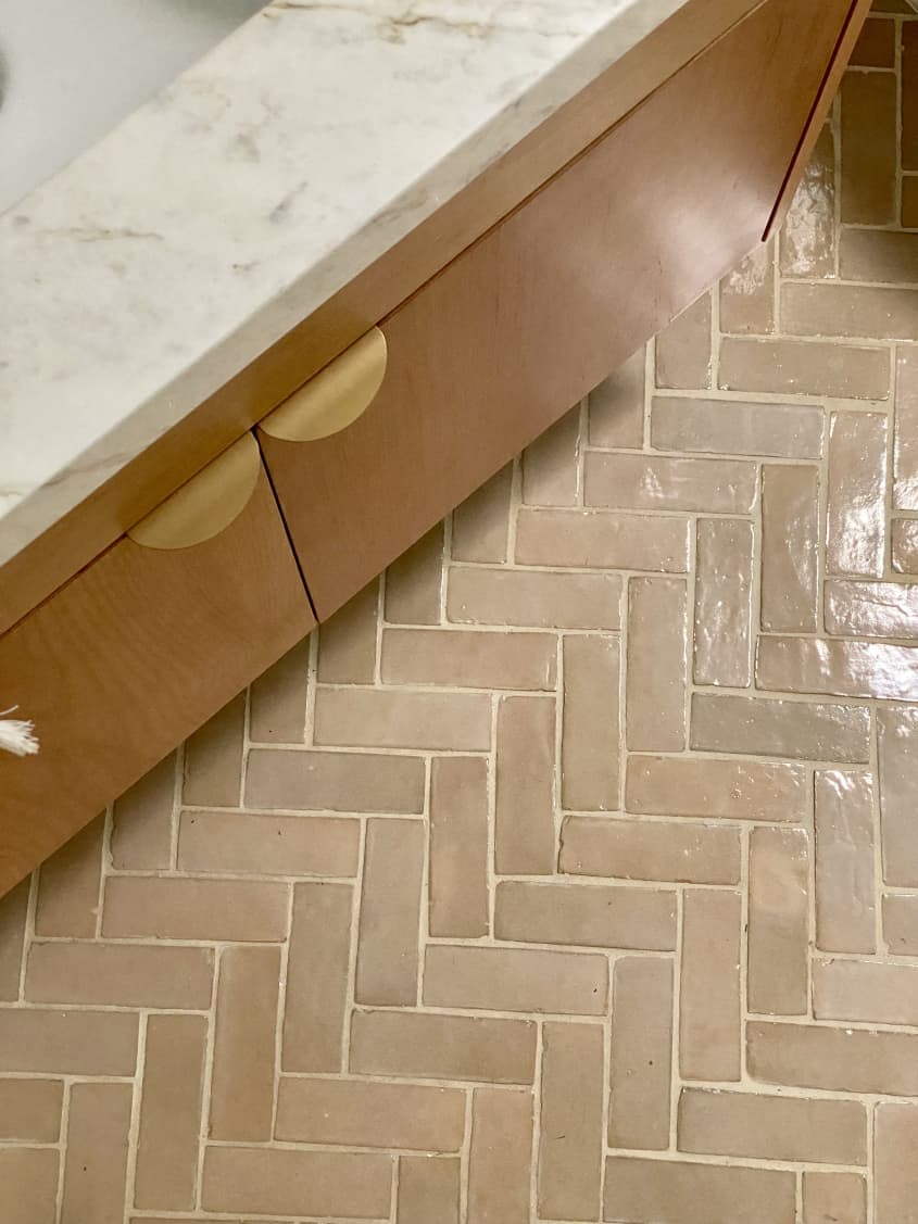
Spanish Style: Hand-hewn terracotta hex
Finally, no tile round-up would be complete without a hex in the mix. Deep red-orange stone is all the rage right now — and perfect for an old-world Spanish feel in your home. “From bathrooms to kitchens, we’re noticing more clients going for warmer neutrals, pinks, and oranges,” Gibson says.
So… you’ve chosen your tile. What next?
“You should always start with the general feel/style you’d like (the fun part) but ground it with specific goals,” Austin says of tile design. Here are some other steps to consider before installing your dream tile.
Logistics: Austin recommends padding your plan with extra money and extra time for shipping delays. That’s a 20 percent contingency to your budget and aiming to acquire most, if not all of your project materials before starting the labor on the project. “The logistics part isn’t incredibly fun, but if you discipline yourself on these elements, it will allow you to have fun with the fun stuff,” she says.
Grout: Your grout color and thickness can make a difference. These days, experimenting with grout is trendy, according to Gibson. “More and more people are wanting to incorporate a larger grout joint as a part of their design to create a sort of striped look,” she says.
Pairing tiles: If you’re working in a bathroom or kitchen, you might be selecting two types of tile at once. Wright says that small spaces are great for going with bold patterns and splurging on the luxurious finishes. As for pairing, she says, “You could either do it according to color, like a solid-color tile with a patterned tile that has one of the same colors in it, or you could do what I did, which is to choose a neutral and then put any pattern you want with it.” And Gibson says the same: Threading a common color or tone into each area helps create cohesion, echoing the same shape across multiple types of tile can increase the overall visual completeness, and knowing “when to let one pattern be the main star and the other serves as the supporting role” is key.
With these ideas in mind, you’ll be on your way to extremely stylish tile in no time!