
Kelly Wearstler’s New Paint Collaboration Captures the Beauty of California
Kelly Wearstler, the designer known for her fresh take on maximalism, surreal and sculptural furnishings, and avant-garde perspective on interiors, just announced her new paint line with Farrow & Ball.
In the British paint company’s 75 years, this marks the first time its tapped an outside designer to create a color palette. And of course, who better than the Elle Décor A-List and Architectural Digest AD100 designer who uses color on a strategic level. While not everyone can work with the LA.-based designer directly, you can now have a little bit of Kelly in your home through her new paint line.
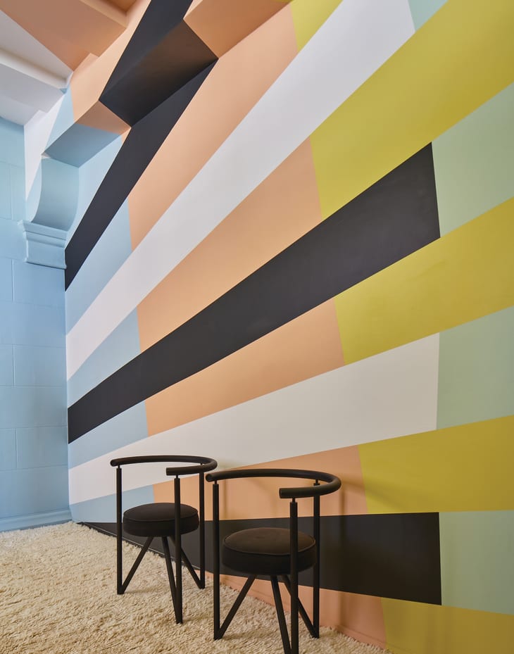
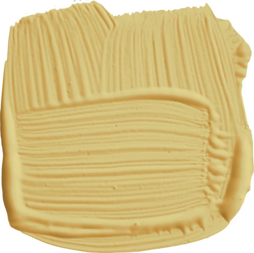
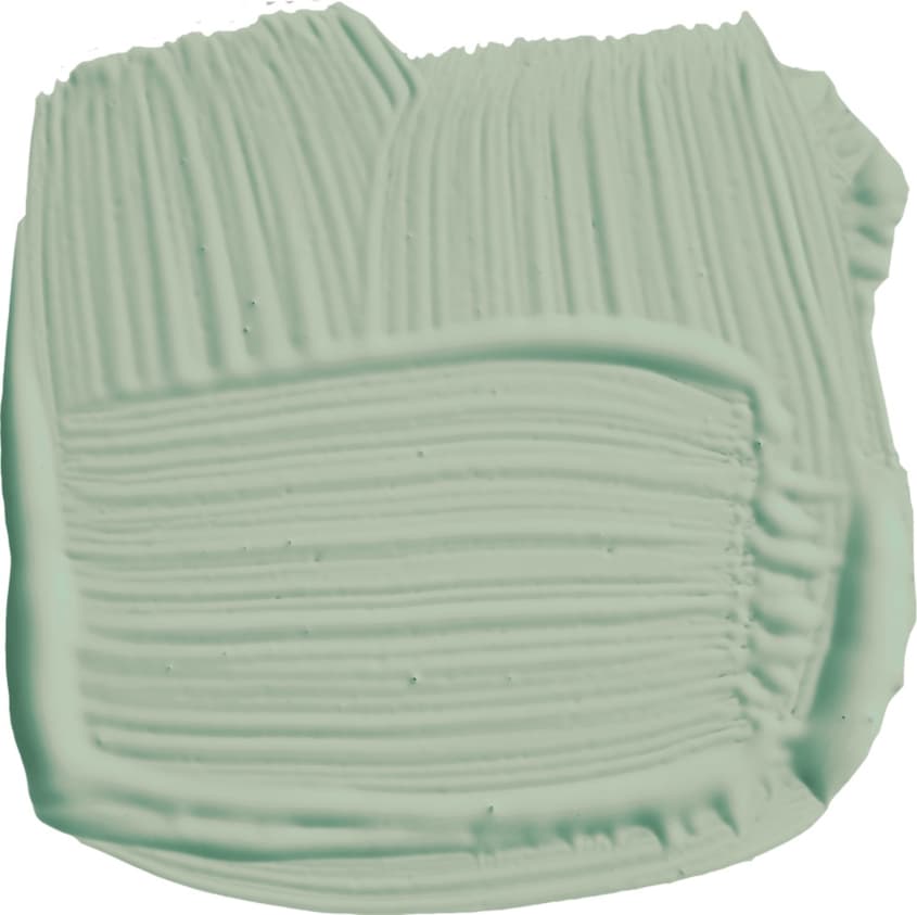
Dubbed The California Collection, the palette of eight hues draws inspiration from California’s landscape and the Pacific Ocean. For instance, Citrona pays homage to California’s sunny yellow lemon trees. And Hazy is a nod to the cool ocean mist and blue-grey coastline.
“The natural beauty of California provided the cues for the collection, from the verdant fields of agave and the plum succulents, to the coastal terrains of sand and stone on our coast, and even the endless highways,” Wearstler says.
Wearstler, who believes colors found in nature are beneficial for the psyche, also had environmental sustainability in mind when creating the collection, as the paints are low-VOC, water-based and packaged in recyclable tins.
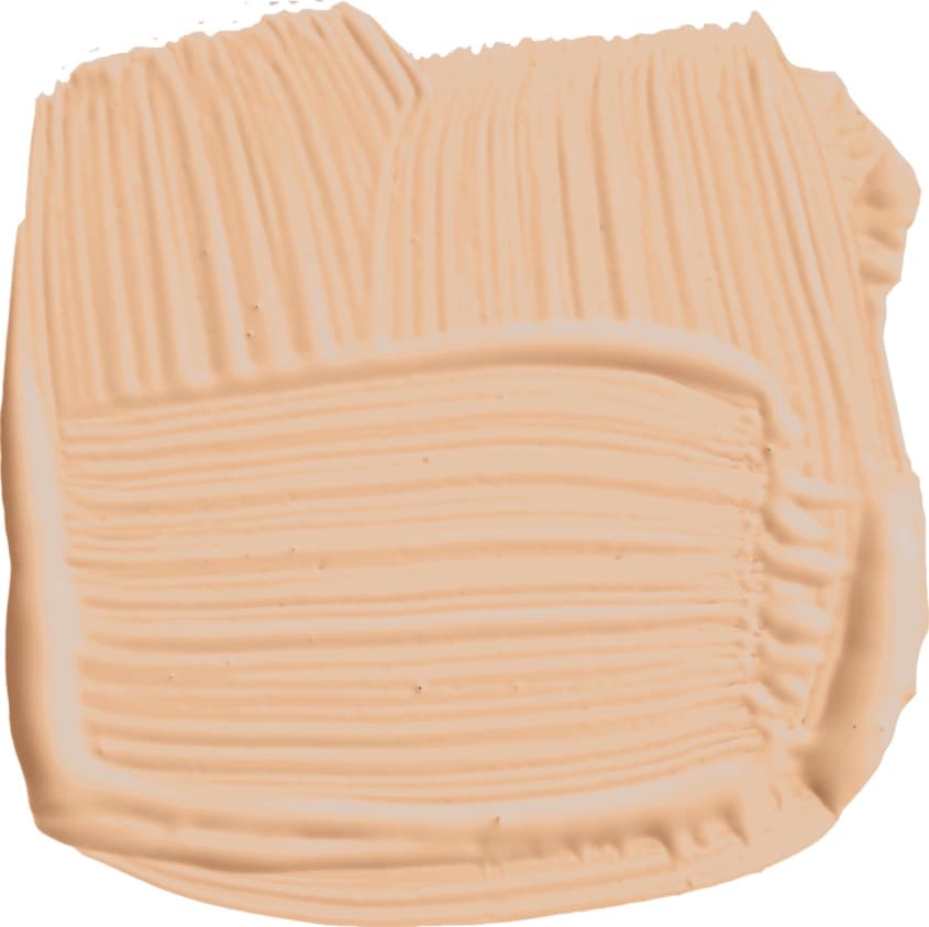
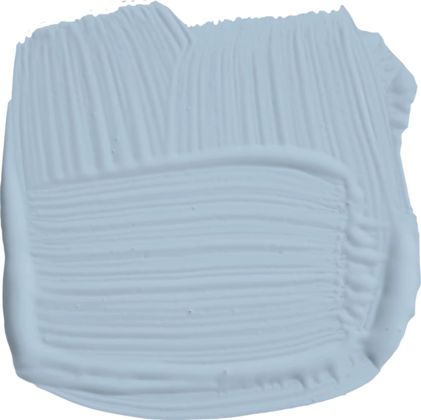
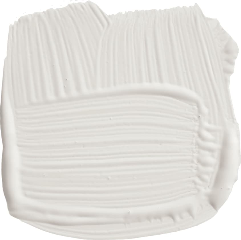
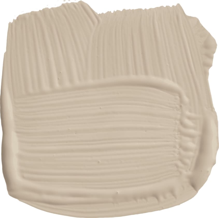
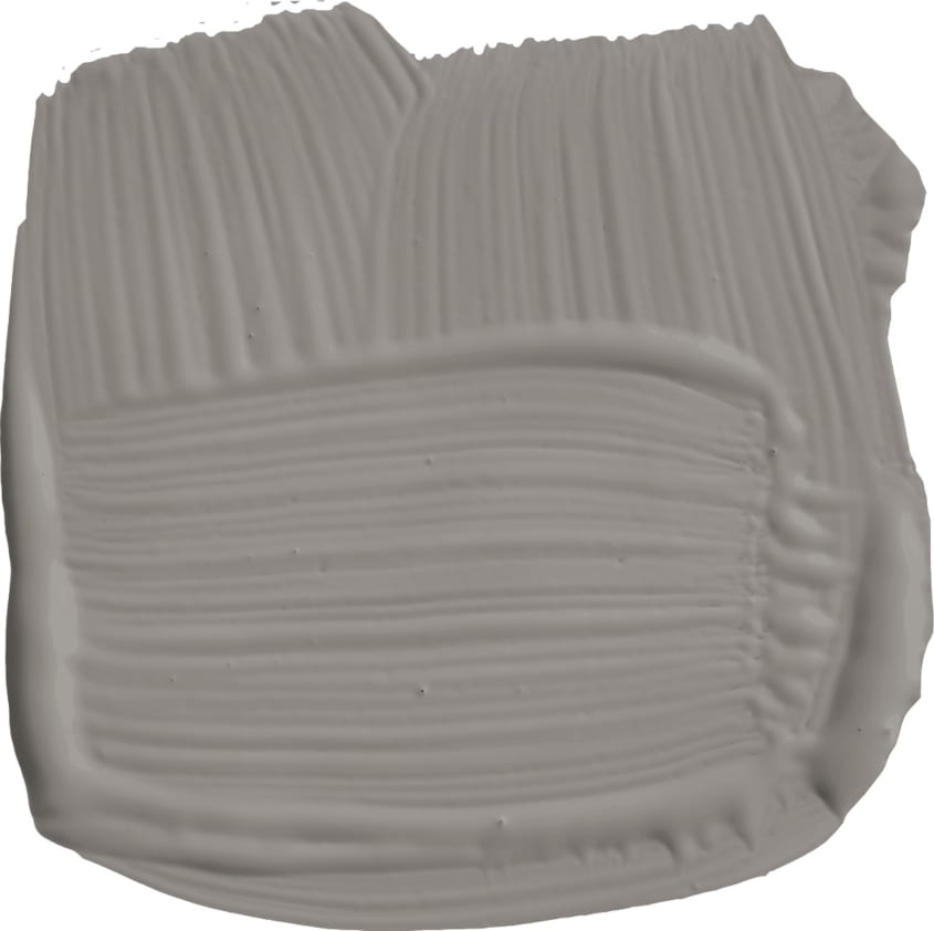
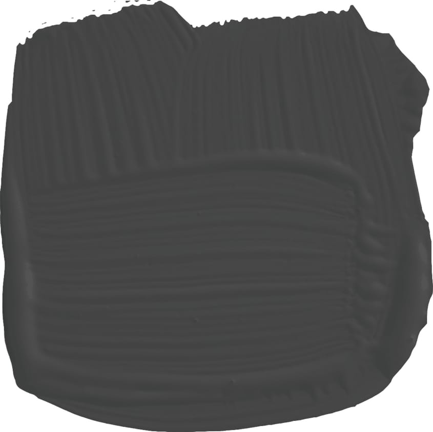
The palette includes four neutrals and four colors. Neutrals include Tar, a warm black; Sand, a beige-meets-white; Salt, a soothing white with depth; and Stroke, an earthy grey. Colors include Faded Terracotta, a peachy-earthy orange; marine-inspired Hazy blue; seafoam-tinged Palm green; and a toned-down sunny yellow called Citrona.
“I wanted to keep the palette focused, while still offering a number of shades that can work across different environments and different areas of the home,” Wearstler says. “The neutrals are tone-setters and complementary to the bolder hues in the collection.”
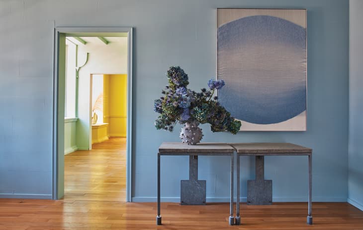
The collection’s hues are relevant more than ever now, as more people look to bring in the great outdoors and as we yearn for a visual breath of fresh air inside their homes.
“… their warmth and relaxed optimism makes them the perfect antidote to the mood of the moment,” Farrow & Ball’s head of creative Charlotte Cosby says. “Kelly completely captured the essence of California, fresh with a comforting heat, so using any combination from this palette will create an uplifting and positive space, something we are all craving right now.”
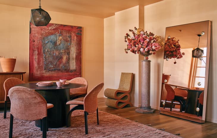
Each hue in the palette offers a new perspective on color with their unique undertones. And some of the colors manage to strike a balance between soothing and energizing. For instance, the Faded Terracotta has an innate earthiness to it, yet also has invigorating orange tones.
“The Farrow & Ball team are really amazing at crafting specific shades. I had a fairly precise vision in mind based on my inspiration, and they were able to convey the depth and versatility of each shade,” Wearstler says. “We worked really hard to choose the exact shade for each color — selecting from over 40 yellows to decide on Citrona. Faded Terracotta has a wonderful warmth for example; it’s impossible to look at that shade without thinking of a pot or a terracotta tile soaking up the California sunshine.”
The new collection is available through Farrow & Ball’s website starting March 4.