
These Are The Least Popular Colors to Decorate With, According to One Survey
Autumn is here, and everyone’s decorating with amber-tinted leaves and pumpkins. But just because the color orange is in season, doesn’t mean everyone’s splashing their walls with it. In fact, it’s quite the opposite.
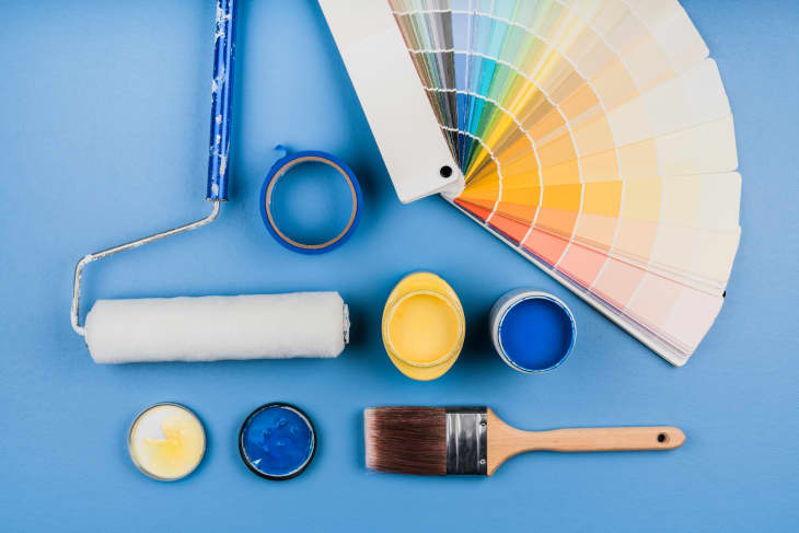
Modsy, an online interior design service, has released its Interior Wellness Report, revealing two of America’s least desired colors for home decoration. According to the survey, while homeowners favored soothing neutrals, such as blues and greens, over a third (36 percent) of participants disliked bold colors, especially orange and pink.
Lindsay T. Graham, a social psychologist at UC Berkeley, offered an explanation: “We associate orange with things that need our attention — traffic cones and construction signs — which can sometimes be overstimulating in a home.”
With life being so stressful in the past year and a half, it’s understandable that people would want to come home to a living room that’s chill and laid-back, rather than reminiscent of worksites.
As for pink, its low ranking may be surprising, given its calming effect in paler tones like Pantone’s Cherry Blossom and Rosewater. But “pink has become very gendered,” said Graham. “We’re conditioned to think of pink as denoting something demure and feminine, and that association is so strong that it feels like a big statement to use it in a space.”
A pairing of the two colors is probably not a solution to their popularity problems. “Orange and pink are closer to one another on the color wheel, which might make them more visually jarring when next to each other as opposed to complementary,” she added.
If you really want to paint your walls with either of the two, try using orange and pink as accents, applying just enough to add warmth. You can also include whites, blues, and browns in your palette to make the space more neutral.
What do you think? Should orange and pink really be America’s most disliked paint colors?