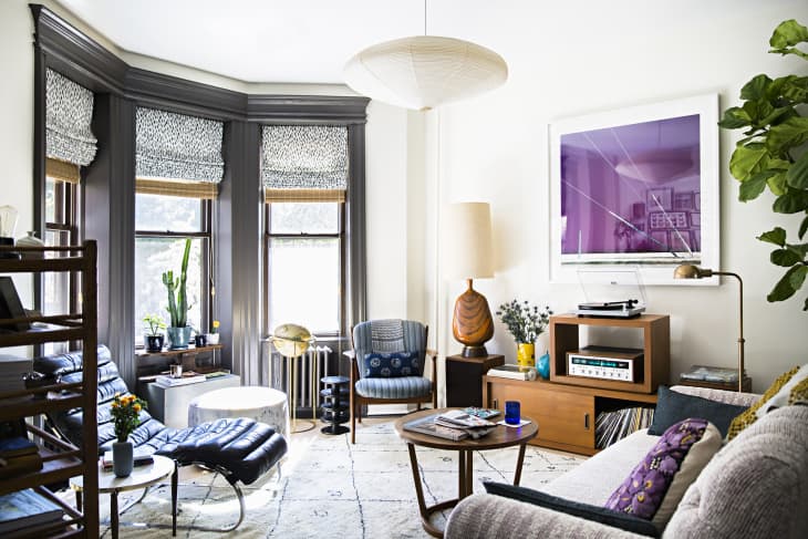
This Is How Your Favorite Music Genre Would Look As a Living Room Color Palette

We recently wrote about how your name has a correlating color, but did you know that music does, too? Those with a rare sensory condition called synesthesia see colors when evoked by musical notes, and to help others understand how they experience sounds, they’ve translated different genres into living room color palettes.
Online marketplace HomeAdvisor worked with two people who have chromesthesia—a particular form of synesthesia—to come up with the color schemes of each music type. Their names were Michael and Rachel (no last names given), and both of them utilized their ability to “see” music to also tap into the interior design world.
Here’s how the process worked: Michael and Rachel listened to songs from the top of Billboard’s charts for 10 different genres: Rock, Country, Pop, R&B, Rap, Latin, J-Pop, EDM, Chillhop, and Heavy Metal. As they were listening to each genre, both participants listed the colors they were seeing, and the colors that they agreed on made up each color palette.
From there, HomeAdvisor took each genre’s palette and “painted” virtual living room designs to showcase the colors in full. You can use these color palettes as inspiration to design your own room based on your favorite music genre, but it’s also interesting to see how those with chromesthesia experience sound.
The Country Room, for example, has a color palette of Tortilla (a medium brown), Laguna (a medium yellow), Cream, and Redwood. “Country is such a brown genre in my head,” Rachel recalled. “All the acoustics and loose vibrations without enough rich or diverse musical elements can be monochromatic, but there were some songs that brought a little something else. One was very black-and-white; that surprised me!”
Then there’s the Electronic Dance Music (EDM) Room, which is splashed with Azure Blue, Electric Purple, and Cyber Yellow that gives the living room an overall club-like vibe. “EDM is sometimes hard to grasp as I hear so many colors sometimes. Almost like a rainbow, bright and vibrant,” Michael explained.
The Heavy Metal Room is filled with a moody color palette of maroon, charcoal, and denim, among other neutrals. Michael described the blacks and reds that tend to be associated with heavy metal, and Rachel referred to the room as a Jackson Pollock painting. “I enjoy Pollock’s paintings more than the Heavy Metal experience because listening to it is like I’m standing behind a transparent canvas, watching all the paint fly at my face and darken my peripheral vision. My instinct is to cringe and look away,” Rachel recalled.
For all the different music genres and the color palettes they inspired, check out the full posting here. And you might as well jam out to your favorite tunes while browsing, while you’re at it!