Before and After: This Master Bathroom’s New Floor Tile is Absolutely Stunning

While this bathroom might not have looked bad at all before, its owner described it as “by far the worst bathroom we’d ever owned,” full of safety, sanitary, practical, and aesthetic issues. Two months later, the only issue with the bathroom is that it’s not mine.
This is so stunning. I am an absolute sucker for those starburst tiles—and an equal sucker for vanities that look like (or began their lives as) furniture designed for other rooms of the home. The elongated proportions and intriguing herringbone arrangement of the wall tiles add up to a look that even people who are exhausted by anything that remotely looks like subway tile can get on board with. This bathroom now has so much presence, and it’s all thanks to Becky Voboril of Preparing for Peanut.
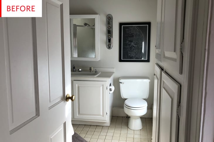
This is one of the (many) occasions in which the photos aren’t telling the whole story, because to my eye, it looks like this bathroom is in amazing shape. Here’s what was really going on, pre-renovation:
This bathroom was, in a word, icky. We bought the 200-year-old house in Old Town Alexandria knowing the bathrooms needed serious help, this one being the worst. All the tile was crooked and cracked with thick, wobbly grout lines that had turned a slimy shade of grey. The tiles would actually lift up on our wet feet. At least twenty layers of caulk fixed all the chipped and cracked corners of the dingy, dark shower. The medicine cabinet hung 6 inches off the wall, right in our faces as we attempted to do our business over the small, shallow sink with its ’80s hospital motif, complete with plastic inlays on the faucet knobs. Wonky soffits were built over multiple pipes and, along with the too-large vanity cabinet, made the already tight space feel even smaller.
This was by far the worst bathroom we’d ever owned, and it had to go down to the studs.
I especially love that the hues of the wood and the metals mesh so perfectly; it’s like they were all made for each other without being matchy-matchy. The two wall lights look like they would cast an incredibly flattering glow, while the white walls would reflect all the light both natural and artificial. Meanwhile, the dark and dramatic floor creates a feeling that’s grounded and glam. Here’s what it took to get the bathroom, including its “’80s hospital motif” sink, to this level:
This project took about two months from start to finish. There were some unknowns, as there always are with old houses, so there were lots of repairs to be made before tiling could begin. We kept the general layout of the space the same to keep our already high labor costs down as much as possible. We hired pros to do it from start to finish since we just don’t have the time to work on DIY projects like we used to, plus this was over our heads. The tiling was a massive project, floor and wall and shower taking probably a full two weeks.
One big issue was the vanity. The one we ordered had legs that wouldn’t fit around the piping we exposed at the floor. So we found a wall mount model we loved and had to wait for that to arrive. Then we decided we were uncomfortable with the wall mount design, so we ordered legs to go with it and luckily they fit around the pipe! We also have a pretty ugly wall radiator for which we can’t find replacement parts. It’s our last piece to tackle but we’re considering a custom cover.
It warms my heart when people admit the hiccups they’re still dealing with in their renovations—not because I want them to have to deal with them, but because they happen to everyone, and hearing evidence of that can make us all feel a bit less overwhelmed and frustrated.
I included this detail shot so we could all admire that fantastic brick wall! The juxtaposition of the brick and all the modern elements—especially the subway tile—is fascinating, and the bathroom has considerably more warmth than the other views would make it appear. Becky is even more enthusiastic:
The space feels so luxurious. It’s bright and and open and we’re just so pleased with all the design elements. It’s modern with nods to our house’s long history. We’re pretty obsessed with that exposed brick wall!
I’m torn, because that L-shaped counter definitely provides extra counterspace, but the nook that it creates just seems a bit awkward. There’s nothing wrong with it, and I can see why it was built like that, but if I were renovating, I would prefer to change it…
Becky obviously felt the same. That entire nook has been opened up, leaving room between the vanity and the new shower—which appears to be roomier than the old one, but it’s hard to tell. The glass walls and the continuation of the wall tile pattern in the shower definitely make the entire bathroom feel bigger. While I totally covet those two showerheads, perhaps my favorite aspect of this shower makeover is the fact that there’s ample room for products. The marble shelves and ledge nicely link the shower with the vanity.
Thank you, Becky Voboril and Preparing for Peanut!
