Before and After: A Bold $230 Rental Bathroom Redo

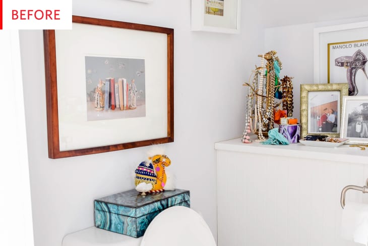
This rental powder room has bright white walls, interesting art, enviable jewelry displays, and very nice fixtures, but there’s just something missing. What could it be?
STRIPES! The answer is stripes. This bathroom is now so bold and glamorous. I love the way the wallpaper highlights the interesting ceiling, and the way the lampshade echoes the shape of the skirt in the illustration. The jewelry displays are as covetable as ever, and they and the other objets really stand out now that the art has been simplified.
Ariel of PMQ for two created this renter-friendly refresh with Tempaper removable wallpaper, sconces from Lamps Plus, and a jewelry stand and bangle bar, both from Amazon, and it’s a smashing success.
Here’s a fuller look at the space, as well as Ariel’s thorough description of the room’s issues:
The before is symptomatic of all the base housing I’ve lived in – tiny, cramped, poorly lit, and very bland. I had installed a renter-friendly tiled wall as a backsplash behind the sink, but after a year of just that, I knew it was missing something. Aspects of the space were also poorly thought out: towel bar instead of hooks, one pot light above the toilet, not enough plugs, no height to the space.
After a while, all those rental bathrooms can really blend together! How are they all so bland yet so problematic?
This is just so fun. The colors stand out fantastically against the stripes and all of the accessories have a fresh, modern vibe. Ariel calls it a “Kate Spade-inspired powder room refresh,” and it’s easy to see why: it’s feminine and fun.
The new sconce suits the space perfectly—I’ve never seen a light above the toilet before, have any of you? It’s a lovely piece, and a great reminder that even renters can add wall lights:
I dragged it out over the month, but I could have completed it in a weekend if everything had arrived at the same time. The Tempaper was probably the single most expensive part, but it was absolutely necessary to creating the space. It cost 78$ before shipping. The wall sconce above the toilet is from Lamps Plus. I got the set with the plugs, because as a renter I can’t be adding light boxes where there aren’t any. A pair cost $100, but I only had space for one of them in here. The hardware is Liberty Brand, and the 2 hooks + knobs cost about $50. The acrylic storage and display pieces ran about $50 as well – all purchased on Amazon.
The towels were blue and part of the Amazon basics’ collection, but I died them emerald green by using some yellow dye. Like with almost all of my projects, this was a true DIY process, and I loved watching the space come together.
That puts the total at approximately $230 (not counting the second sconce)—truly not bad for such a dramatic makeover! I admire Ariel’s boldness in tackling this project, as well as the inclination to just go ahead and dye some towels. That honestly would never have occurred to me.
This photo shows the nice removable tile that Ariel previously installed behind the sink—and can someone help me figure out what that is in the corner? A foot bath?
Now this corner truly pops. Here are the aforementioned towels, in a glowing green that pair perfectly and Spade-ly with the pink and gold accents. By the way, the large scale of that mirror works so well in this space. It enlarges a petite room, and the large circle is a nice counterpoint to the lines of the stripes and subway tiles. Ariel is understandably pleased with this project:
I love love love the visual height that the vertical stripes bring to the space. Because of the slanted ceilings and lack of natural light, I needed to do something to draw the eye upwards, and the mini stripes did just that. The only different thing I would do, is use adhesive removable floor tiles to hide the ugly flooring. The budget didn’t accommodate those though, so what can you do!
Don’t be afraid to go with a bold pattern in a small space. In this case the removable wallpaper set the pace and helped give shape to the awkward powder room. I’m not sure a lesser pattern would have achieved what I wanted.
I really appreciate it when people share the budget of their projects with us, and especially when they divulge the limitations of their budgets. Sometimes things are left as-is on purpose, but sometimes it’s because there simply isn’t money available.
This final photo gives us a taste for how the powder room fits into the whole home and Ariel’s whole decorating process:
Having recently completed the master and guest room, I was looking for a space that would unify them. The white did not. As with all my projects, it’s kind of a now or never, so I decided to take the leap and do it in a budget and renter-friendly way.
I am so impressed by the way the background of the portrait matches the paint color in the next room—that’s professional-level coordination, especially in a rental and on a budget. Well done!
Thank you, Ariel and PMQ for two!
