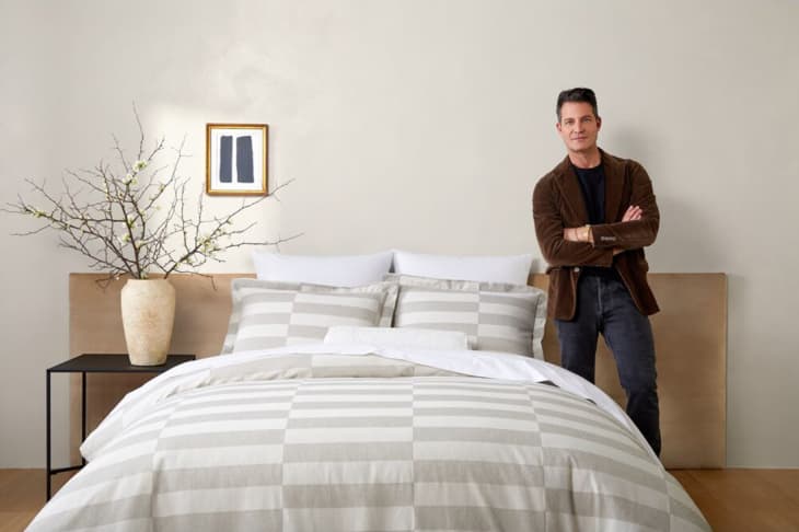
Nate Berkus’ Go-To Neutral Paint Colors Work Everywhere

Nate Berkus has finally answered your paint prayers. The famous designer took to Instagram recently and shared what his go-to neutral paint colors are. Both he and his husband, Jeremiah Brent (a fellow designer), are the kings of layering neutral hues to create a cozy space that’s cohesive, sophisticated, and understated, so it’s no surprise that Berkus has been getting the “what paint colors do you use?” question over and over again.
“I’m very flattered that a lot of you have been reaching out and asking me what are my go-to paint colors when I’m painting a room neutral,” he said in an Instagram video. “So, [are] you guys ready? Because here they are, once and for all, I am sharing the swatches that I use most often.”
“So for Benjamin Moore, it’s Alabaster, Swiss Coffee, Smokey Taupe, and Snowfall White,” he said.
All hues are within the beige and cream categories and all have warm undertones, which help create that cozy feel Berkus’ spaces always have. None of them are stark or sterile, and each acts as a perfect base for layering collections and textures.
“Portola is another paint company that I use all the time,” Berkus continued. “They have two colors that I absolutely love — Saint Sauvant and the second is called Lisbon, which is sort of a greeny-gray. It’s a beautiful kind of historic color. We used it in the kids’ bathroom.”
And Berkus also added Clare Paint’s Fresh Kicks and Flatiron to the list in his caption, both of which are fresh whites with Flatiron leaning more into green territory.
With all of Berkus’ favorite neutral hues at your disposal, you can finally DIY your way to a Berkus-inspired room.
