
This Blah “Bowling Alley” of a Great Room Became 3 Cozy Spaces — No Renovation Needed!
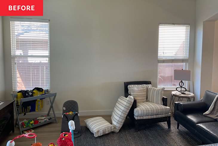
Sometimes even the most striking home transformations don’t require adding walls or undertaking any major construction. That’s the lesson San Diego-based designer Diane Luna taught her clients, a young family, as they looked to lay out a great room that felt like a “bowling alley” — simply too big and airy to furnish successfully on their own. “The room was a vast, open corridor from front door to back patio with decorative arches throughout and everything painted white,” says Luna. “The effect was confusing, as the eye could not distinguish between living areas. It looked like a jumble of furniture piled under a white sky.”
When Luna took on the project, the couple didn’t know how to address the front zone — they figured they’d just make it a playroom, which introduced a little too much chaos from the jump when entering the home. But Luna had other ideas. “I suggested we start with a formal living room as the home’s first impression,” she says. “We then worked by zone to define the remaining spaces.” And the result? Three totally functional and cozy rooms with their own identities that took shape through the creative use of paint, wallpaper, millwork, ceiling treatments, strategic furnishings, and textiles. Here’s how she created zones that feel defined but also aesthetically in sync.


The Home’s Existing Architecture Helped Define Three Distinct Zones
First, Luna hatched a plan that would utilize the home’s unique architecture to reinforce the spaces she’d carve out and decorate: living room, dining room, family room. “We were lucky, as the builder had placed arches in the space to try to create zones, which helped our no-reno strategy,” says Luna. “Plus, [there was] a dated pony wall, which we all agreed to keep. I loved the delineation the home’s arches provided, and the pony wall turned out to be quite practical. Some things are worth keeping.”
Using these visual cues, she began to make decisions about each of the unique spaces. Her clients’ inspiration gave her a fair amount of creative latitude. “This young couple had an eye for design and a love of entertaining,” says Luna. “The wife’s concept photos boasted traditional-meets-modern living rooms, with white upholstery and dashes of vivid blues. The husband’s desire was to have a great-looking home that would also be practical and functional. The twist: They would soon have two toddler boys.” So Luna would be mixing form and function in each of these spaces, allowing them to hang together visually but for there still to be some variety and clear delineation between the three.


Ivory Paneling and a Light Blue Ceiling Set the Living Room Apart
Beautiful paneling set the stage in the formal living area, which greets guests as they come in. “The paneling was painted a custom ivory color and trimmed with crown, baseboard, and casings contrast-painted in a beautiful charcoal color called Dunn Edwards’ Sheet Metal (DE 6346),” says Luna. “This two-toned effect created the classic style the client desired, and the dark trim acted like a frame around the living room. This charcoal trim was then repeated throughout the home to tie the zones together.” Dunn Edwards’ Veiled Spotlight (DE6324), a soft blue shade, was used on the ceiling to play up the walls. “The combination of ivory paneling with powder blue ceiling set the living room apart from the other zones,” says Luna.
A U-shaped furniture arrangement was chosen to section this area off, creating a “cozy cocoon without the use of any walls.” The family kept their original black leather sofa here, and Luna designed around it. The living room lighting got an update for extra ambiance (think: decorative fixtures in place of ceiling cans, wall sconces with linen lampshades for “a hotel-glam vibe,” a picture light to set off the gorgeous statement artwork, and table lamps for a little bit of reading/task lighting when needed).


A Bold Teal Dining Room Gets Its Own Identity
Sandwiched between the front and rear living zones, the dining room was “practically begging for high-impact definition,” in Luna’s words. Color became the focal feature here. “I used a dark teal wall paint to define the space called Dunn Edwards’ Taliesin Blue (DE 798),” says Luna. “Its intense color reads almost the opposite of the ivory paneling [in the formal living room].” Timorous Beasties black-and-white Thistle Wallpaper was hung on the ceiling as an unexpected touch, and it was finished off with charcoal crown molding.
Luna brought in a large dining table for entertaining guests and dinner parties galore. “Dramatic, two-toned cane chairs established the personality, and the linear chandelier became a beacon over the dining table,” says Luna. “Full-length drapery panels in a modern print frame the dining table and soften the lines. When viewed in the open plan, there’s no mistaking which zone this is.”


A Luxe, Family-Friendly Sectional Anchors the Family Room
Last but not least, Luna turned her attention to the family room. “We purposely kept the family area walls and ceiling neutral to show off the incredible view of the canyon from the windows facing the back patio,” says Luna. “The lovely ivory walls are similar in color to the paneling in the living room. Our charcoal trim color worked perfectly on the fireplace mantel, offsetting its marble tiles, and was the right finishing touch for the baseboard and windowsills.”
The goal in this area was “lighthearted family hangout zone,” so the furnishings weren’t going to be too fussy. The major request? An oversized, luxe sectional in white, of all colors. “We used an off white crypton fabric, which is practically indestructible,” says Luna. “The sectional takes over the whole room on purpose — it’s one big family hangout. I placed a square coffee table in the center. Its upholstered top invites feet to linger from all directions.” The coffee table also has built-in oversized trays on the bottom shelf, which allows these pieces to double as convenient snack tables that can be pulled right up to the sofa. A range of lamps was added in this area for comfort and extra ambiance, too.

Soft Furnishings Helped Solve the Home’s Echo Problem
Sound-dampening was the family’s final request, as the tunnel-like shape of the room created echoing. Luna made sure to furnish each room with an oversized fabric item to absorb noise: two large linen chairs with matching ottomans in the living room, double-layered drapes with sheers in the dining room, and that extra-large sectional in the family room. “These soft furnishings soak up the sound nicely,” says Luna.
Luna also addressed a few other challenges the family was experiencing spatially, starting with the lack of a true breakfast nook. With carefully planning, she was able to squeeze a defined area for informal meals into the somewhat narrow footprint of this large room. “It’s one of the sweetest items I added to the design, and truly one of the reasons you should definitely hire a designer; we see opportunities others don’t,” says Luna. “I suggested a marble-topped tulip table by the family room sectional and promised they’d use it all the time. The clients were a tad skeptical, so we decided to trial a table that could easily be returned. The table was never returned, and it gets used every day.”

Smart Design Details Make Every Inch of the Open Plan Work Harder
She also solved problems in a few other areas, starting with the entry right off this newfound trio of spaces. “The builder had created a little room for the front door — it was essentially a closet in the corner of the open plan,” says Luna. “I actually liked it, as it provided character rather than just having the front door dump you right into the living room.” The team echoed the dining room’s deep teal wall paint in this closet. “This also hid the strange drywall ledge, which was hard to furnish,” says Luna. “Enter the ‘urn-with-twig’ solution. [We] painted the front door in our charcoal color, added a rattan mirror and two wall sconces, and the strange white closet became a darling little entryway.”
Finally, she addressed the fact that “right smack in the middle of the family area, there sat a TV niche with the most awkward gaping TV hole,” since the home is of the era of tube TVs and DVD players. “The client desperately wanted a new built-in cabinet, but it would have put her over budget for this phase,” says Luna. “The solution? I measured each opening and sourced lovely baskets and trays that exactly fit each space. Aren’t they cute? These are chock-full of toys at the moment, which is perfect.”

The Family Uses These “Rooms” All the Time Now
Thanks to key color choices, well-utilized existing architectural features, and strategic furnishings, the large expanse of space truly feels like three different rooms. And Luna’s clients couldn’t be happier. “Each zone is used constantly, and functions as it should,” she says. “Everything looks fabulous, pleasing to the eye, and perfect for the soul.”