
Orange? For Fall? Groundbreaking — Here’s How to Do It Right, According to Designers
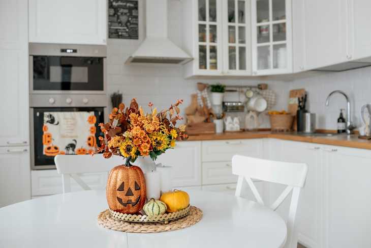
Every fall, I struggle to find cozy fall decor that actually jibes with my home’s aesthetic. It’s hard to find pieces that feel festive and seasonal without making my living room look like a pop-up Halloween shop. But I couldn’t pinpoint exactly what was making my space look tacky instead of cozy.
So this year, with just a few days left until the season officially starts, I turned to my designer friends for advice on how to nail fall decorating. According to the experts, crafting a warm, elevated autumn ambiance comes down to avoiding one major (and unexpected) trap: the color orange.

The Pros Say Bright Orange Accents Can Make Your Fall Decor Look “Tacky”
According to designers, leaning too heavily into bright orange accents can make a space look stark and disjointed. Chris Collins, interior designer and founder of The Analog Room, says bright orange accents often clash with neutral furnishings and demand too much visual attention. “The idea with bright, signaling colors [like orange] is that they show up before anything else,” he says. Instead, he says, seasonal decor “should set an accent, not dominate the room.”
In other words, decorating for autumn shouldn’t disrupt your home’s overall design. “For me, fall decorating is less about introducing obvious seasonal colors and more about shifting the mood of the room,” says Ariene Bethea, founder and creative director of Dressing Rooms Interiors Studio. “I want it to feel warmer, richer, and more layered while still feeling like the home you live in year-round.”

Try Pairing Earthy Orange Tones with Rich Neutrals for a Luxe Look
This isn’t to say you can’t use orange decor — just consider a different kind of orange. To get that layered, cozy look, designers suggest swapping harsh orange tones for muted, earthy variations. “The better version of orange is softened, browned, or deepened: ochre, marigold, rust, terracotta, saffron,” notes John Maloney McNamara, interior designer at Coosa. “Those shades capture the warmth of autumn without screaming ‘fall decor.’ They feel sophisticated because they’re nuanced. You’re getting the color without getting the cliché.”
You can create an even richer visual story by pairing those softened oranges with complementary autumnal hues. “Along with richer versions of orange, I also have been loving burgundy, chocolate brown, olive green, and cream in my fall decor,” adds interior design content creator Emily Paloma Sanchez.“These richer, earthy colors can help make your space feel cozy and seasonal.”
5 Subtle and Chic Fall Accents We Love
Armed with my designer friends’ advice, I set out in search of some fall decor pieces that fit their criteria, and I found plenty. Check out a few of my favorite fall accents below.


Design Defined
Never miss the style inspo and recommendations you crave with Design Defined. Follow along each week as our Home Director Danielle shares the best style advice, latest trends, and popular decor finds you just can't miss.