I’ve Painted My Walls Countless Times, And I Swear by this Paint Trick for Total Color Confidence

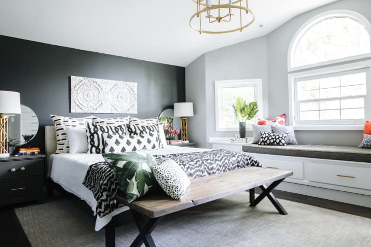
When I refreshed my bedroom paint color last spring, I stared at what felt like millions of paint swatches. The room had been painted in Silver Song (1557), one of Benjamin Moore’s slightly greige grays, for nearly 10 years, and it was time for a change. Naturally, I turned to medium-tone grays with blue undertones. My painter laughed at my adventurousness, too.
Then, I spotted Sherwin-Williams’ Homburg Gray (SW 7622). It’s an intensely dark gray with sophisticated green undertones that reveal themselves in the right natural light. It was definitely not the color I had in mind, but the unique shade caught my eye, so I figured I’d paint a wild card swatch on the wall. It was beautiful and different, and even though my design gut told me it was what the room needed, I still felt a ping of hesitation. Would the room feel too dark late at night? What about in the winter? Was there enough light from the windows to keep the color from looking like charcoal?
When I started wishing the color was just a tad less dark, I remembered a Sherwin-Williams, to explain this trick so you can decide if it’s worth trying, too.
How this paint trick works
By adjusting the white and black pigments in the formula, according to Wadden, you can create a lighter or darker variety of a color you love. “Don’t mess with the colorants,” she warns though. Each color you’ll find at a paint store or home center is nuanced, so you’ll lose the integrity of the shade if you start changing key color components. Instead, ask the paint store to simply decrease the formula by 20 to 30 percent, which means it’s at 80 to 70 percent strength, respectively. “That should be enough to make a visual difference,” Wadden says. “Go higher, and it may look like another color altogether. Go lower, and you may not even notice the shift.”
When this paint trick’s worth trying
You have a darker room
If your room doesn’t get a lot of light because windows are sparse or it’s north-facing, reducing the formula by about 25 percent decreases the pigment and therefore increases the Light Reflectance Value (LRV), which, Wadden explains, makes a color look brighter to the eye.
You want less intensity
If a color you love is just a little too rich or vibrant, Wadden suggests reducing the formula by 15 to 25 percent instead. “This allows you to keep the undertone and look without the extreme saturation,” she adds.
You have an open-concept plan
If you want room-to-room harmony without resorting to just a singular color, adjusting the tint formula for each room can help you confidently but subtly expand your palette.
You prefer a coordinating look
If you are painting a kitchen and want the cabinets and walls to coordinate versus match, or you want to try a monochromatic color scheme with your walls and trim, Wadden says the same formula reduction rules apply.
What to know before you paint
“It’s not a trick for everyone,” warns Wadden of this tinting tip. “You need some color confidence or be willing to take a risk.” Before you commit to any color, you should always plan ahead by getting samples, but when you’re creating something custom, it’s even more important to put a swatch on the wall and live with it in different lights before you commit to it. If you decide to choose a custom shade this way, Wadden suggests writing down the exact formula you settled on and keeping extra paint on hand for touch ups, too, because custom shades can be hard to recreate.
