You Can’t Go Wrong With This Classic Kitchen Color
Here at Apartment Therapy, we love a colorful kitchen. But we also recognize that painting your kitchen is a little different from say, painting your living room or bedroom. It feels a little more scary, a little more permanent. It can also affect your home’s resale value. If you love color, but these things have you feeling a little trepidatious, why not consider blue? In pale or navy shades, blue is quite seemly—and if you’re thinking about selling your home, while we can’t make any guarantees, you can rest a little easier knowing that your kitchen is painted in the world’s most popular color.
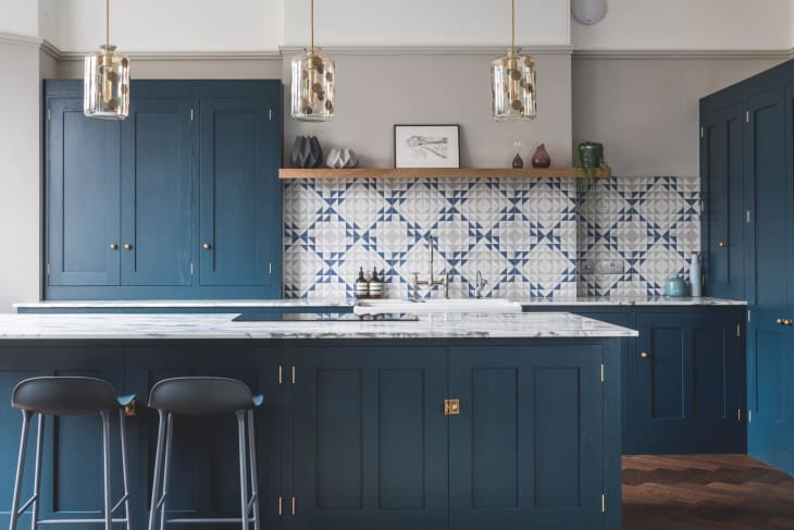
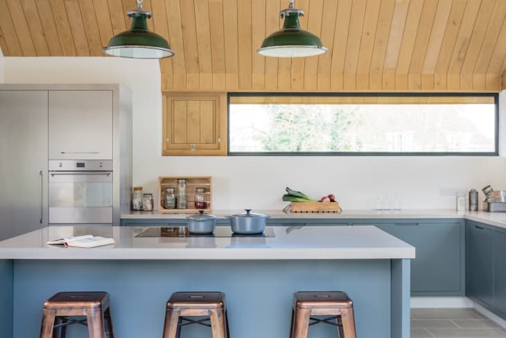
The color in the space above, a design of Sustainable Kitchens, is one I like to call ‘marine blue’—a medium blue with certain hints of green. It’s very of the moment, and very nice for a kitchen, especially with coordinating tile. This kitchen features Farrow & Ball‘s Hague Blue.
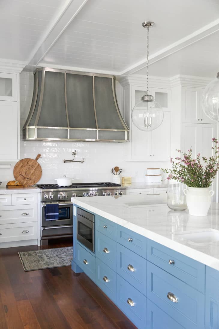
If painting your whole kitchen seems like a bridge too far, here’s a great tip: paint just the island. In this kitchen by Studio McGee, an island painted in Benjamin Moore’s Normandy adds just the right touch of character.

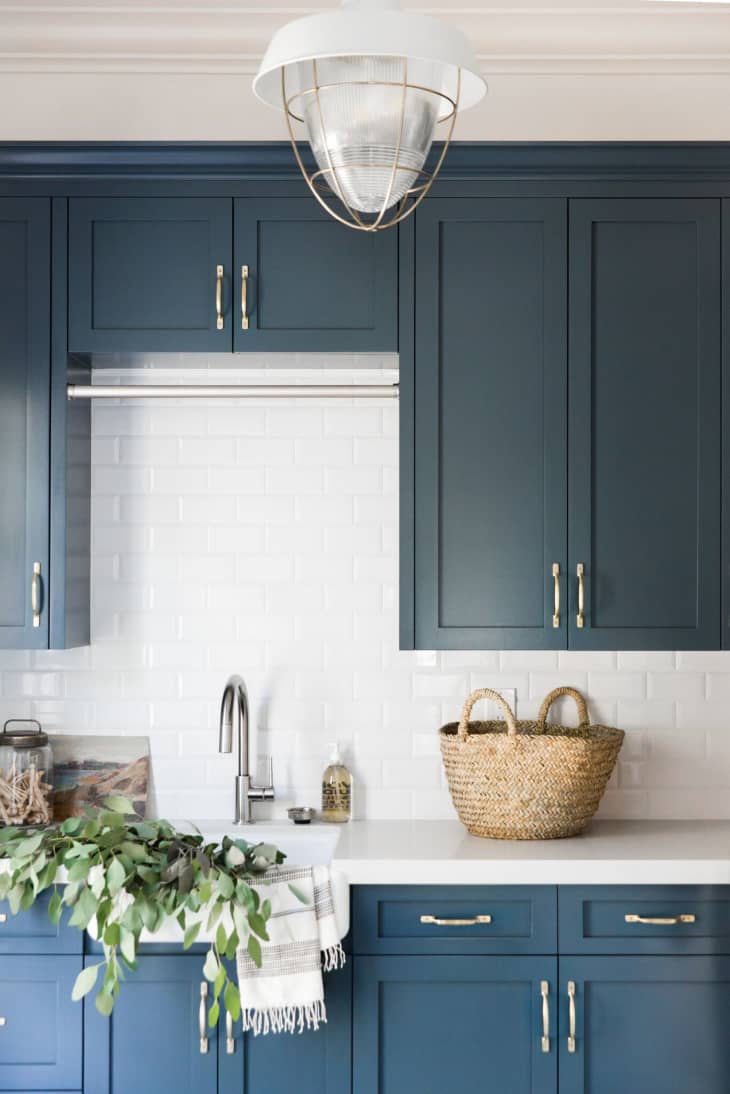
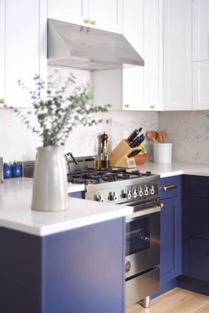
Another option, spotted here in Ryan’s San Francisco kitchen: painting just the lower cabinets, while leaving the uppers white. Here, the subway tile backsplash and marble countertop coordinate with the upper cabinets, for a cohesive, minimal look. The blue cabinets are painted in Peppercorn, by Sherwin-Williams.
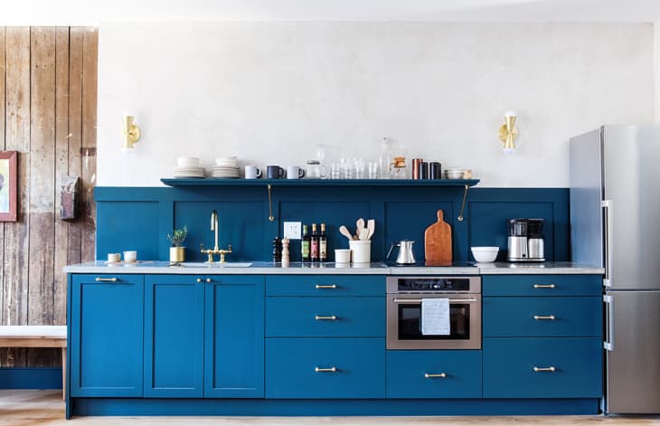
This is a brighter, more saturated version of marine blue, in a kitchen by Jersey Ice Cream Co. This color is Seaworthy, by Sherwin Williams.
This kitchen by Studio McGee features another set of cabinets in an aqua-tinged blue, but this color is significantly more subdued than the last. Look to less saturated colors to achieve a subtler effect. This one is Note, by Benjamin Moore.
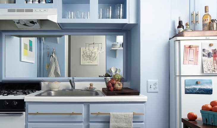
Another way to get a subtler effect while still incorporating color is to go for a lighter color, like the pale blue in this transformed rental kitchen from One Kings Lane. Notice how even the outlet covers are painted to match—these little details can make a big difference. This color is Benjamin Moore‘s Blue Ice.
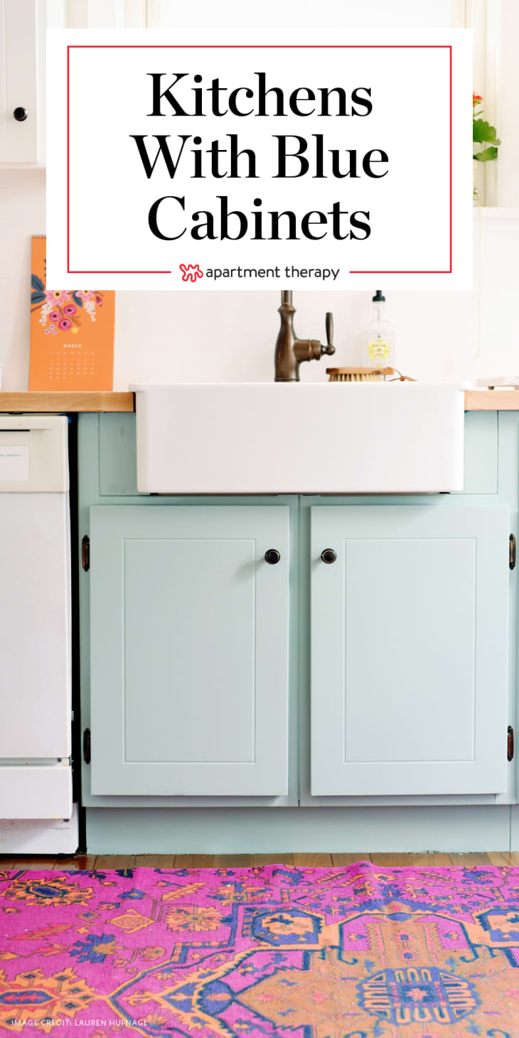
While the kitchen above is more of a light ice blue, blogger Lauren from A Lovely Lark (photo via
Apartment Therapy
Here’s another example of blue lower cabinets paired with white upper cabinets, from Turntable Kitchen. In this case, the lower cabinets are painted in Secret Society, by Behr.
I like this lighter teal, in a space from Sustainable Kitchens. In fact, it is called Grey Teal, by Little Greene—a somewhat subdued aqua blue that’s perfect for modern spaces.