
Pantone Just Announced What Colors We’ll Crave For Interiors in 2019
The color experts at Pantone are always looking ahead to what will be on trend in the future. While 2018’s Color of the Year, Ultra Violet, still holds its reign, that hasn’t stopped the institute from predicting what we’ll see more of in 2019 already. Check out what’s on the horizon for next year, according to Pantone.
PANTONEVIEW home + interiors 2019 includes two color palettes specifically chosen for housewares and interior design, and they’re a return to the classics with some crave-worthy hues thrown in.
“With more choices than ever before, it is essential for home furnishings and interiors brands and designers to connect with their consumers and deliver the themes, palettes and colors that engage and stimulate beyond the surface,” says Laurie Pressman, Vice President of the Pantone Color Institute.
“Inspired by the idea of focus — because of the infinite choices of our time and the need to hone in on those that capture roving eyes — PANTONEVIEW home + interiors 2019 is a color roadmap that is focused on the colors that are leading the way towards a diverse, imaginative future.”
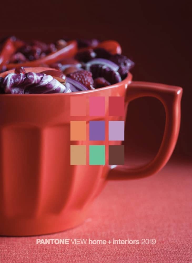
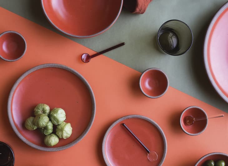
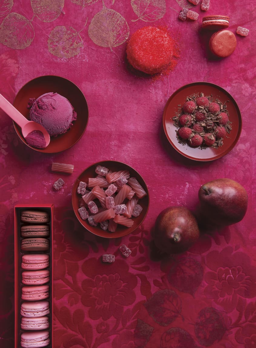
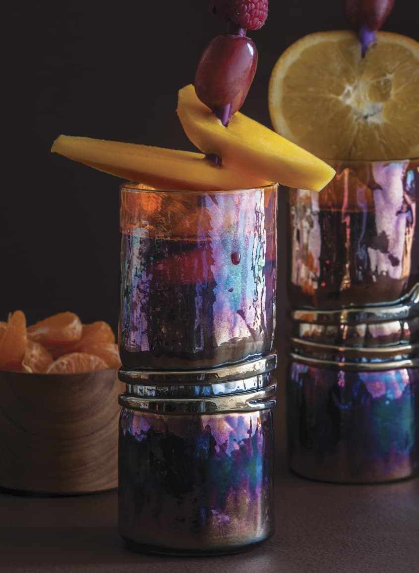
According to PANTONE, the first palette draws inspiration from the plate.
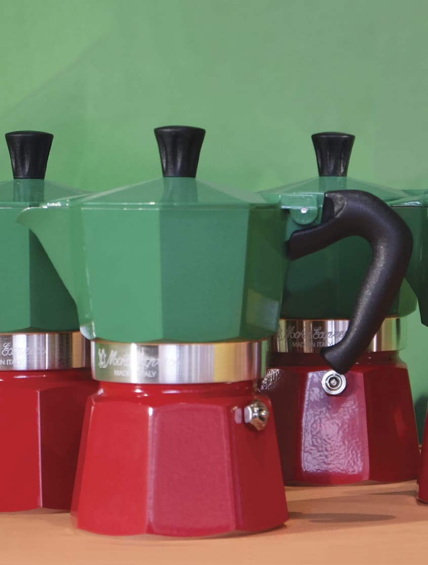
CRAVINGS will tempt the eye as well as the taste buds with spicy reds, sweet flamingo orange and rich purples. Seductive allusions to “fetish foods” deepen the irresistible message of the palette. The neutrals of tasty Butterum and Cappuccino serve up a delectable warming presence, while grassy green promises a cooling respite from the heat of the surrounding shades. These exceptional flavors will draw upon memorable sensory experiences to inspire new ones that will be just as pleasing.
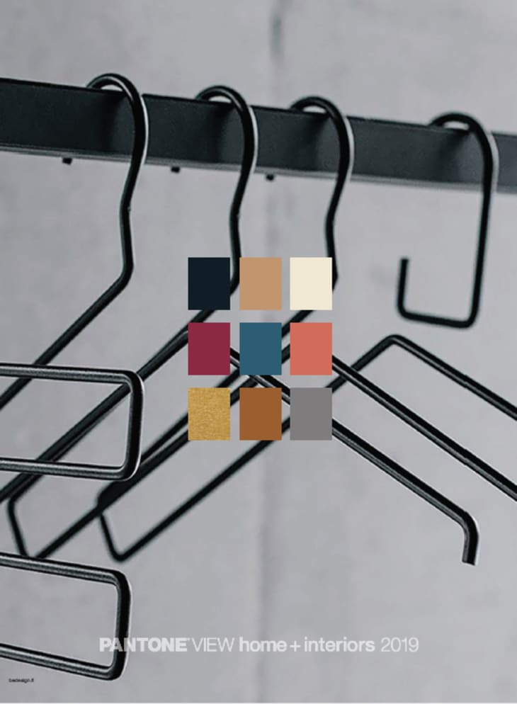
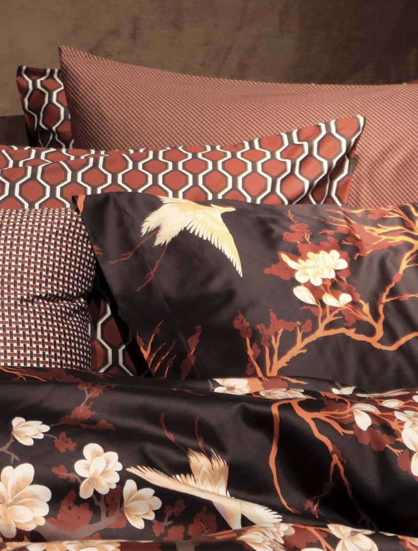
And Classico “opens to the door to a more warm, enduring style,” says Pressman.
Just as the name implies, the hues of CLASSICO are fundamental, basic, and everlasting, while at the same time, elegant and forever fashionable. This is the palette where a graceful swan white and camel-colored tan co-exist effortlessly with deep teal, chic gray flannel, burgundy red, and caviar black. Rich gold and apricot brandy provide finishing elements to a color language spoken worldwide, across product categories and throughout all levels of the marketplace.
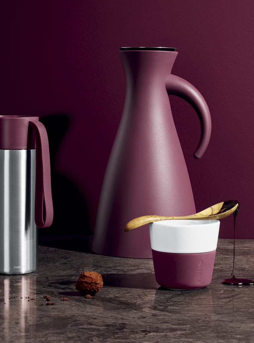
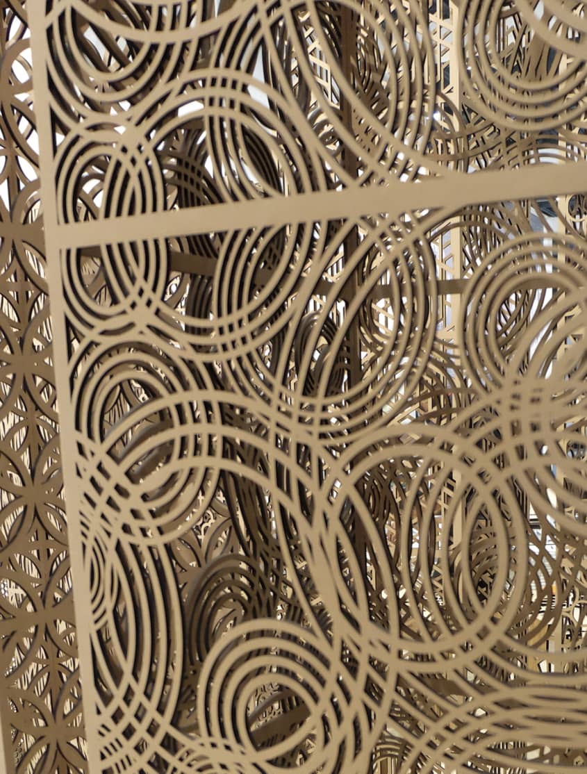
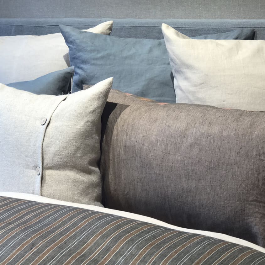
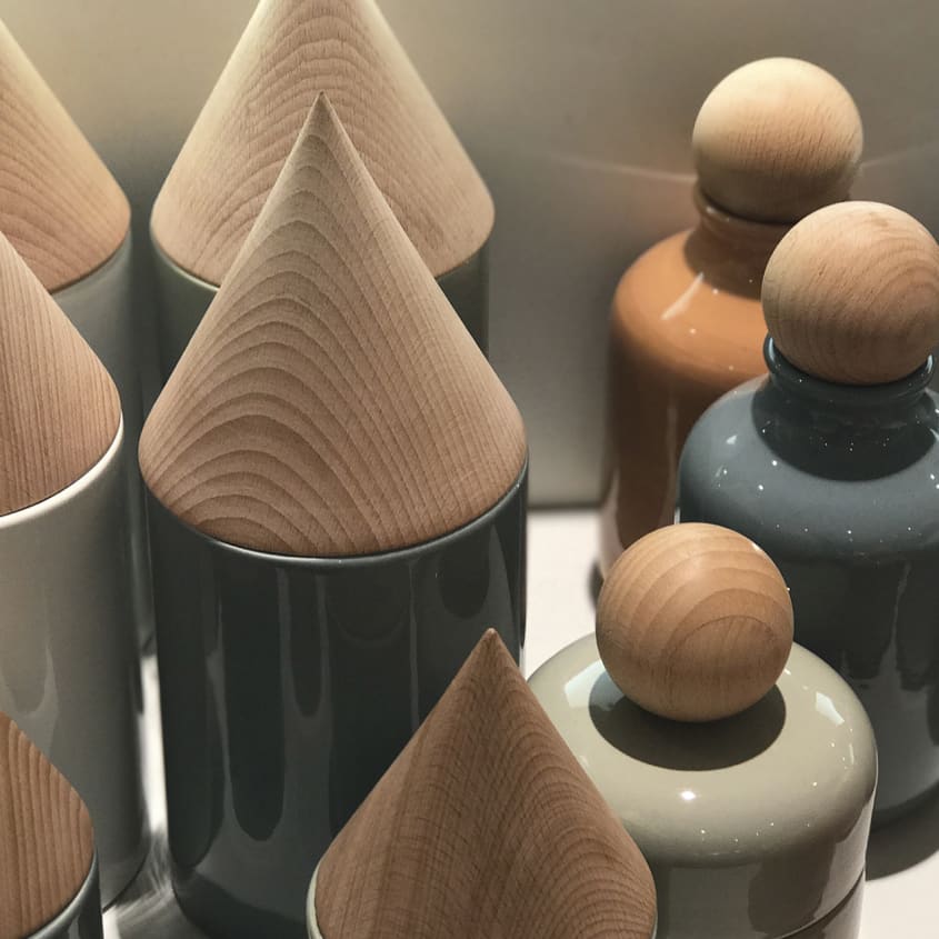
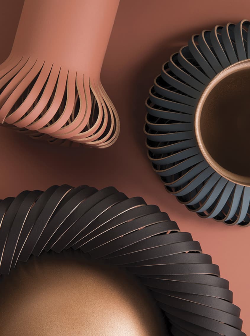
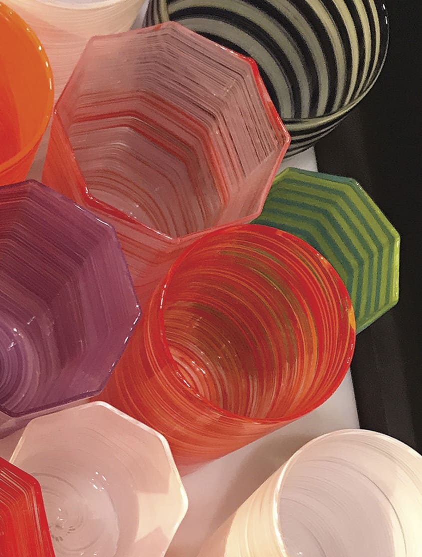
Check out some of the inspiration for the two palettes below:
What do you think about the 2019 palettes? Tell us in the comments.