Pantone Released Its Color Trend Report For Spring/Summer 2021

Marigold and burnt coral and mint, oh my: Pantone has released its color trend report for Spring/Summer 2021. The experts from the Pantone Color Institute debuted 10 shades that are “illustrative of nature—hues “coupled with new core classics” that “come together to create a palette inspiring ingenuity and inventiveness.” While released to predict fashion design trends during New York Fashion Week, Pantone’s vibrant and bold offerings can also be incorporated into the home design space.
The colors and their dreamy descriptors are as follows: PANTONE 14-1050 Marigold, a “comforting golden-orange infused yellow that lends a warming presence;” PANTONE 15-4020 Cerulean, the “color of the sky on a serene, crystal clear day;” PANTONE 18-1248 Rust, an “earth-inspired brown emblematic of autumn leaves uncharacteristic of a spring palette;” PANTONE 13-0647 Illuminating, a “friendly and joyful yellow that offers the promise of a sunny day;” PANTONE 18-4140 French Blue, a “stirring blue hue that awakens a vision of Paris in the springtime.”
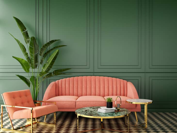
PANTONE 13-0117 Green Ash, a “mentholated green that cools and soothes;” PANTONE 16-1529 Burnt Coral, an “inviting burnt coral that expresses conviviality;” PANTONE 16-5938 Mint, a “mint that refreshes and restores;” PANTONE 17-3628 Amethyst Orchid, a “floral shaded amethyst orchid that introduces a unique touch;” and PANTONE 18-2043 Raspberry Sorbet, a “vivifying raspberry sorbet that tantalizes.” Swipe through for the palette swatches above—and let the decor inspiration overtake you.
“Offering a range of shades illustrative of nature, colors for Spring/Summer 2021 underscores our desire for flexible color that works year-round,” Leatrice Eiseman, executive director of the Pantone Color Institute, said in a press release. “Infused with a genuine authenticity that continues to be increasingly important, colors for Spring/Summer 2021 combine a level of comfort and relaxation with sparks of energy that encourage and uplift our moods.”
Pantone expects these vibrant and bold hues to be big on the runway come the spring and summer season of next year, but we’ll be taking these color cues for our home design mood boards, for sure. Burnt coral arm chair, anyone?
