
These Are the All-Time Best White Paint Colors, According to Designers
Choosing a white paint color should be a straightforward process, right? Not necessarily. Because of white’s classic, timeless nature (it’s designers’ favorite color for living rooms, after all), several iterations — including finishes and tones — of the stock color have developed over the years. But there are benefits to this shade that many don’t consider when it comes to the holistic design of their space.
“White is a color that waits to tell a story. Like a fresh canvas, it holds the potential for everything that comes after. I often turn to white when I want a space to breathe, to glow, or to create a pause between stronger materials or colors,” says Ayten Nadeau, founder and owner of I-Ten Designs LLC. “It sharpens contrast, reflects light, and creates a natural rhythm within a room. White is a chameleon. It adapts to its environment, quietly transforming with the light and the tones around it.”
What’s the Difference Between Warm and Cool Whites?
As I mentioned earlier, there are several nuances between popular shades of white. However, one of the most commonly asked questions is about the difference between warm and cool whites, which appear very different.
“Warm whites have yellow or red undertones — they’re creamy, like frosting,” explains Isabella Patrick, founder and lead designer at Isabella Patrick Interiors. “Cool whites will have a blue, gray, or green undertone. You can really see the difference when you sample many whites, side by side. The undertones will pop.”

Best White Paint Colors
If you’re heading to the paint store, you’re going to want to take this list of designers’ favorite white paints with you. Keep reading to learn their go-tos and why they appreciate them.

1. Benjamin Moore’s Pure White (OC-64)
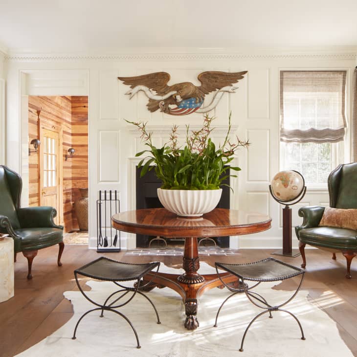
“Benjamin Moore’s Pure White (OC-64) performs beautifully in sculptural or contemporary interiors, where it provides a crisp contrast,” explains Nadeau. You can see how the white shade adds vibrancy while complementing the darker accent wall in Bianca Sotelo and Craig King’s moody, glam California home. (It’s paired with Benjamin Moore’s Nightfall (1596).)

2. Farrow & Ball’s Strong White (No. 2001)
“We use Farrow & Ball’s Strong White because it literally is the most neutral white, but has a milk quality to it. It does not have pink or yellow undertones but has a softness that is needed in a true white,” says Caroline Grant and Dolores Suarez, co-founders of Dekar Design. “When people think of white, they think of that sterile, hospital white, but Strong White is one that is soft and has depth.”
Meanwhile, interior designer Katharine Pooley prefers the same color but in a different finish. “Farrow & Ball’s Strong White is my go-to for period properties because it adds a fresh, subtle urban feel to heavily detailed plaster moldings. I always use Estate Emulsion over Modern Emulsion as it has a gorgeous soft patina that only improves with age.”
3. Benjamin Moore’s White Dove (OC-17)
It’s no surprise that designers love this white, as it’s one of the brand’s best-selling colors. “Benjamin Moore’s White Dove (OC-17) is my go-to workhorse white paint that never lets me down. It is white with a subtle hint of gray that keeps it from being too cold and stark,” Patrick Sutton, an interior designer, shares. “At first glance, it appears to be pure white, but it’s not. Other off-whites can tend to render drab yellow or green in waning light, and pure ‘super white’ can feel almost blue. This color gets us that crisp, bright, and happy backdrop without skewing cold or drab.”
Isabella Patrick is another designer who appreciates this color. “White Dove is warm, but reads with more of a taupe undertone when compared — on its own, it’s a great choice too,” she notes.
4. Sherwin-Williams’s Extra White (SW 7006)
“Typically, when I am using white paint, I want a true white: crisp, clean, and devoid of tints or hints of other shades,” explains interior designer Anthony Carrino. “This allows the additional colors in the room to work as they are intended and not color-cast a piece of furniture, wallpaper, or other design elements within the space.” The color Carrino chooses is Sherwin-Williams’s Extra White (SW 7006).

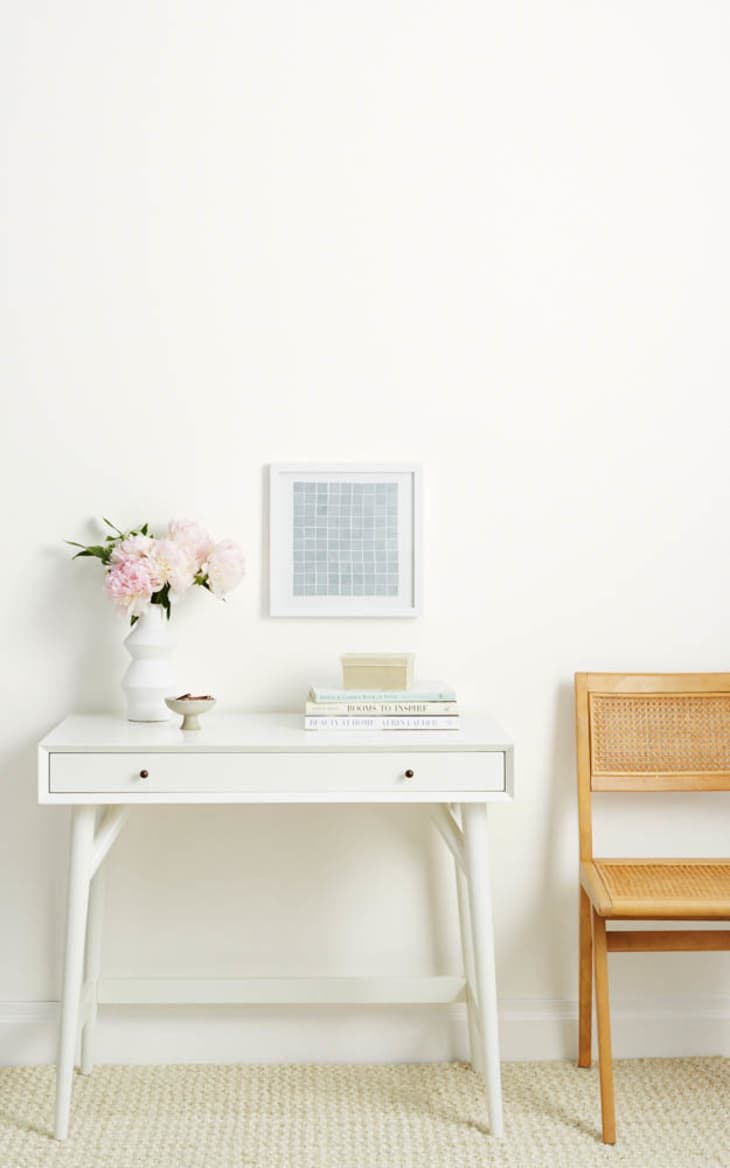
5. Benjamin Moore’s Simply White (OC-117)
Designers seem to gravitate towards Benjamin Moore’s Simply White (OC-117). “Benjamin Moore’s Simply White is always a great choice,” says Kristen Peña, owner of K Interiors. “A warm, inviting white that still feels crisp and like a true ‘white’ white. It is especially nice on cabinetry and walls, but mixed with color as a nice trim and ceiling color as well!”
Jessia Shaw, interior design at Turett Collaborative, adds: “Simply White has been our go-to for years, even before Benjamin Moore called it out as color of the year in 2016.”
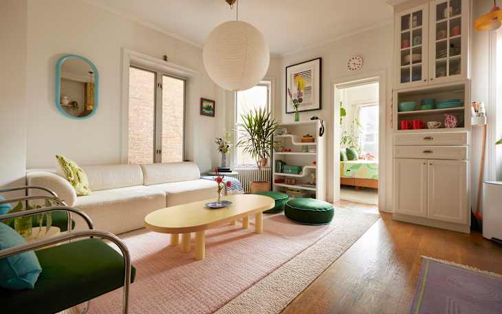
Peña and Shaw aren’t the only designers who adore this color; Nadeau uses it in several projects, including the one featured above. She uses it because it looks warm (but not too buttery!) in all types of light. “I rely on it when I want the room to feel fresh, unified, and quietly elevated,” she explains. “It holds everything together without drawing too much attention to itself.”
Nadeau loves the color so much that she even claims it’s her favorite — the trusty shade that she returns to time and time again. “I have tested countless white paints over the years, and this is the one I always return to. It brings balance, elegance, and consistency to every space it touches. It is a true example of how white remains one of the most universally expressive colors in design,” she explains.
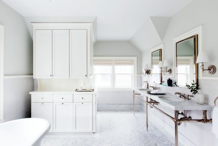
Unsurprisingly, Patrick says this is one of the colors her firm uses the most. “This is our go-to for a warm white in a light-filled space that can handle it,” Patrick explains. (Patrick used this color in the kitchen above.) Unlike Nadeau, she’s noticed a yellow cast in some of her projects, so it’s important to test it in all lights before committing.
6. Benjamin Moore’s Chantilly Lace (OC-65)
You may be familiar with Benjamin Moore’s Chantilly Lace (OC-65). It’s a household name and beloved by interior designers, likely because it plays well with others. Patrick also appreciates this color because it’s “super crisp without reading too cold.”
“It’s a bright and cheery white that’s still graceful (not pasty) and in this case suits the first floor of our client’s Jackson Heights home perfectly,” interior designer Rajni Alex explains. “We used it along with Benjamin Moore’s Intense White on the moldings and trims in a high-gloss finish, and additional accents on the stairwell in Benjamin Moore’s Decorator’s White. The combination of these different shades of white feels very modern and uplifting without becoming too stark.”

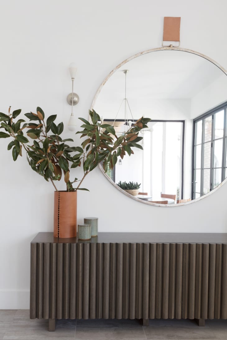
7. Benjamin Moore’s Decorator’s White (CC-20)
“I love Benjamin Moore’s Decorator’s White (CC-20). The shade reads as white when you walk into a room, but has a subtle cool undertone that creates a nuanced look,” Alessandra Wood, director of style at Modsy and interior design expert, says. “It’s white without feeling like a stark hospital.”
Nadeau uses this white shade on furniture, like in the photo above, and even on millwork when she wants a “quiet contrast against taupe walls.”
8. Clare’s Whipped
If you’re looking for a warm white, consider Clare’s Whipped — Nicole Gibbons, the founder of Clare and an interior designer, loves it. “I love using warmer whites in spaces because they keep a room from feeling too sterile. Whipped is my favorite! With dreamy and whisked-to-perfection vibes, this warm white has a soft, delicate feel. Our best white for north-facing rooms, but versatile enough to work in any space.”
9. Benjamin Moore’s Oxford White (CC-30)
“I love Benjamin Moore’s Oxford White (CC-30) because it doesn’t read too yellow or gray and works with a variety of neutral colors,” Michele Dopp, textile designer and founder of Fabric & Steel, explains. “It complements warm and cool neutral tones.”
10. Benjamin Moore’s Paper White (OC-55)
Benjamin Moore’s Paper White (OC-55) leans a little on the gray side, which is helpful if you’re torn between the two colors. “It’s a soft, neutral off-white, which reflects a range of tones as the day passes,” interior designer Joe Robbins shares. “[It’s] warm in the morning, cool midday, and in the evening has a soft atmospheric glow in incandescent light.”
11. Farrow & Ball’s All White (No. 2005)
“Our favorite white is Farrow & Ball’s All White (No. 2005) in the Estate Emulsion finish — Farrow & Ball’s version of a matte finish,” Shannon Wollack, the founder and partner of Studio Life/Style, writes. “It’s a timeless white that looks great in anything from an ultra-contemporary space to a traditional space. A lot of whites can lean bluer or more yellow, but Farrow & Ball’s All White is truly a perfectly balanced white.”
12. Benjamin Moore’s Silver Satin (OC-26)
Benjamin Moore’s Silver Satin (OC-26) is one of those paint colors designers repeatedly go back to. “It’s an incredibly versatile white that we find ourselves using again and again. It has a touch more pigment than other whites, which results in a subtle depth and chameleon-like quality that allows it to change quite dramatically in different environments, depending on light conditions and surrounding materials,” Melissa Benham, co-founder of Studio Gild, shares. “Even with a bit more punch than whiter shades of white, it still provides a beautiful blank canvas to showcase colorful decorative layers.”
What Types of Finishes Should I Consider for White Walls?
There isn’t a right or wrong choice when selecting a finish for white walls. It’s all a matter of personal preference, but the designers I spoke with have their own biases. “I tend to use eggshell on walls because it reflects light in a soft, elegant way, while also offering durability,” shares Nadeau. “Matte is ideal for ceilings or for rooms where I want minimal reflection and easy touch-ups for busy families. I use satin or semi-gloss for trim and baseboards to give those elements a polished look and added resilience.”
Alternatively, Patrick uses matte finishes on her white walls. “But, if we are doing a decorative wall trim, we may paint the interior of a trim box eggshell, and the trim itself in satin,” she says. “A shiny white wall in your living room will feel like a bathroom or make the space less homey.”
If you’re planning to add multiple white accents in a room, Nadeau recommends choosing unique finishes for each distinct feature. “When a space is fully layered in white, shifting the sheen between surfaces adds subtle dimension without changing the color,” she says. “Those variations make a room feel complete and intentional.”
What Colors or Materials Work Best with White Paint?
Once you’ve chosen your favorite shade (or shades!) of white to paint a room, it’s good to know which colors pair best in your decor choices. Both Nadeau and Patrick say that the real charm of decorating with white is that it’s so versatile.
“Natural stones with soft veining and texture also work beautifully against white,” says Nadeau. “Brushed brass, blackened steel, and polished nickel each bring a different kind of energy, and white allows those materials to speak. A cooler white will clarify, while a warmer white will soften. Either way, white becomes the frame that holds and enhances everything around it.”
Patrick agrees with Nadeau that white complements most colors, but there are special instances to pay attention to and mistakes to avoid. For example, Patrick says that if you’re painting walls black, consider a more taupe white to avoid a “tuxedo effect.”
“Warm wood tones plus warm white work well, but I would opt for a lighter white with less undertone when working with oak, and oak (especially a lighter finish) could handle a white with a cooler or gray undertone,” Patrick adds.
Design Defined
Never miss the style inspo and recommendations you crave with Design Defined. Follow along each week as our Home Director Danielle shares the best style advice, latest trends, and popular decor finds you just can't miss.