8 Colors Interior Designers Say Their Clients Can’t Get Enough Of

Interior designers probably have the best insider knowledge on what the hottest, most popular colors are inside homes. Given that, there’s pretty much no one better to consult if you want to know the colors that people are asking to incorporate into their design schemes most consistently. As it turns out, a wide variety of hues are having a major moment, according to the pros.
Below, nine designers from across the country share the colors — or families of hues — they say their clients always request to use, as well as what makes these shades so special.
Mustards and Ochres
Designer Susie Novak of Susie Novak Interiors in Oakland, California, says her clients just can’t get enough of mellow yellows with brown undertones. Most recently, she’s used these earthy shades in kids’ rooms and a primary bedroom. “I love the warm and natural feel of the color,” Novak says. “It cascades as a neutral, but pops like the vibrant color that it is.”
Pinks
From millennial pink to Barbiecore neon, this shade’s definitely having a moment, according to designer Bailey Ward of Bailey Ward Interiors. “It’s inherently warm and a fresh alternative to a white or beige room,” the Atlanta-based designer says. And it isn’t just for nurseries or kid spaces either, she adds.
In fact, she’s seeing pinks popping up in living rooms, bedrooms, and even on porches. “Go for a muted pink to keep it from feeling too feminine,” Ward suggests. “A shade like Sherwin-Williams’ Nearly Peach (6336) gives a warm, sophisticated, and playful feel to the space.”
Neutrals
According to designer Chrissy Jones of Twenty-Eighth Design Studio in Riverside, California, neutral hues, such as creams and browns, are here to stay. “Neutral tones are, of course, everyone’s go-to if they’re playing it safe and are the type of person to switch out accents for each season,” she says. She attributes the recent resurgence in neutrals to the trending vintage and old-world styles. “People are looking for experiences, and in most spas and high-end hotels, you’ll find warm and inviting neutral tones with rich textures,” says Jones. “My clients want to experience this daily — not just on vacation.”
Crisp and Warm Whites
White walls, sofas, and other furnishings will never go out of style. Designer Kelly Walsh of Novel Abode Interiors in Rye, New York, often receives requests for a white that is timeless and calming. “I always, without question, go to Benjamin Moore’s White Dove (OC-17),” the designer says, adding that Benjamin Moore’s Chantilly Lace (OC-65) makes for an excellent bright white trim to finish off the look.
All Types of Greens
Designer Aleem Kassam of Kalu Interiors in Vancouver, British Columbia, says he’s seen an increased desire among clients to use “color tones reflected in nature.” Green, in particular, has been a major winner. “In terms of accessories, artwork, or even greenery itself, hues of emerald, moss, pine, olive, and sage have found their way into many of our interiors,” he shares. “Taking it a step further, we’ve also been incorporating these hues in wallpaper features, special stone installs, or even accent tiles.” Kassam doesn’t anticipate that this trend will die down anytime soon, either. “Colors, tones, and hues found in nature will never go out of style if used in the right way,” he says.
Beiges
Brace yourself: Beige is back in a big way, but this time around it’s richer in tone. Designer Kevin Billings of Dexter & Plaid in Leesburg, Virginia, says he has noticed his clients veering more towards “putty” paint colors. “I think this is because those tones allow for the use of color but in a less saturated way that still adds depth,” he says. He recently painted nursery paneling in Benjamin Moore’s Revere Pewter (HC-172) to achieve this effect. “The paneling became a focal point without being too noisy amongst the other elements within, and it also added an overall warmth to the nursery,” he reflects.
Blues
Designer Antoinette Allande Anderson of Hoboken, New Jersey’s Antoinette Allande Interiors says the color blue is always popular with clients, no matter what. “Blue is everyone’s favorite color,” Anderson says. “There’s a calming effect that this color has on us all.” Blue can be especially versatile, too, from a design standpoint, especially if you pick a grayish blue or shade of navy. “I typically like to incorporate it into upholstery or/and artwork,” Anderson says. “It looks great in just about any interior!”
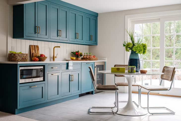
Designer Joy Williams of Joyful Designs Studio in Chicago also receives many requests for the color blue. “A deep blue hue can be calming and mysterious,” she says. “Go for shades with just a hint of teal if you want to keep people guessing about the color.”
Peacock
Along those same lines, designer Fiona Leonard of Fiona Leonard Interiors says that while generally her Darien, Connecticut, clients are drawn to blues and whites, she’s lately seen an influx of requests for peacock in particular. “Like blue, it’s soothing on the eye but it adds a bit of a twist to the traditional blue and white aesthetic,” she comments. “It can be deep and moody or cheery and playful depending on its tone and application. Bonus: It plays well with all colors.”
