
The Surprising “It” Paint Color of Small/Cool 2021

The Small/Cool Experience is a shoppable online home design showcase and social event full of decorating tips and tricks from your favorite designers. Thank you to our sponsors BEHR® Paint, Genesis G70, LUMAS, Overstock, Tuft & Needle, Chasing Paper, and Interior Define for making this experience possible.
After the tumult and devastation that 2020 brought on, it’s no surprise that calming, nature-inspired colors and “warm minimalist” decor have become some of the biggest home design trends this year. And while terracotta tones and meditation rooms are still reigning supreme, a surprisingly non-minimalist wall color was practically everywhere during this year’s Small/Cool Experience: red!
Two designers splashed the walls of their rooms with deep crimson shades, but thanks to their unique design perspectives and spot-on decor choices, they show how completely versatile the wall color can feel.
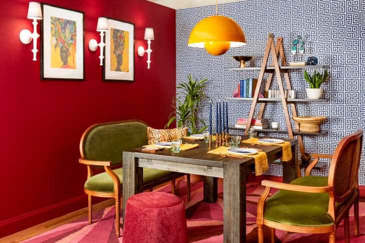
Michelle Fahmy’s “The New Kitsch” room, seen above, paired BEHR’s Dark Crimson paint with a blue-and-white Greek key-patterned wallpaper, which really helped drive home the theme of her room. The Haus of Meeshie leaned into the resurgence of ’80s design in her room, which, unlike the muted neutrals of warm minimalism, is all about bold colors like that red.
“It’s loud and colorful, but that’s a good thing,” Fahmy told Apartment Therapy. “The 80’s are still going strong in design, but it’s all the best parts this time around: bold primaries, neon accents, curves, and maybe even a structured ruffle or two.”
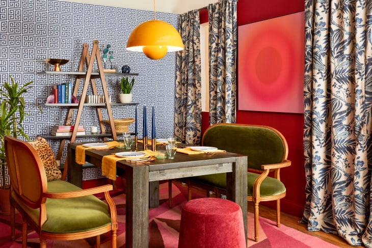
Though red on its own makes a striking statement, Fahmy shows how to make it even more maximalist by adding some patterned curtains and sunburst wall art that echoes the deep red of the paint. Even in a small room like this one, the layered bold looks feel inviting, not overwhelming. Fans of color, take note!
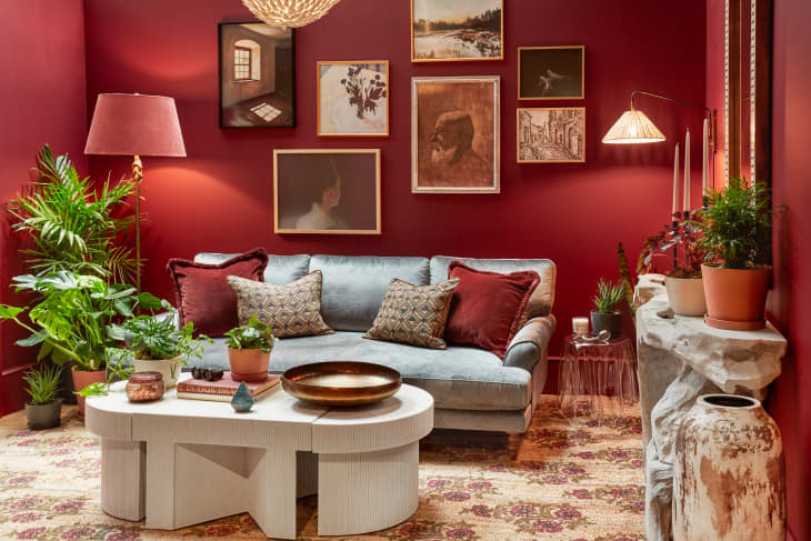
Over in Jaclyn Journey and Amanda Jacobs’ “Moody Musings-themed room, the red walls still feel maximalist, but somehow way more subdued. The duo, who run the design firm Journey + Jacobs, used BEHR’s Cherry Cola paint to create an atmospheric, almost art salon-like feel.
“This moody sitting room is a microcosm of our shared style: rich colors, vintage pieces, and a collected, timeless look,” they tell Apartment Therapy.
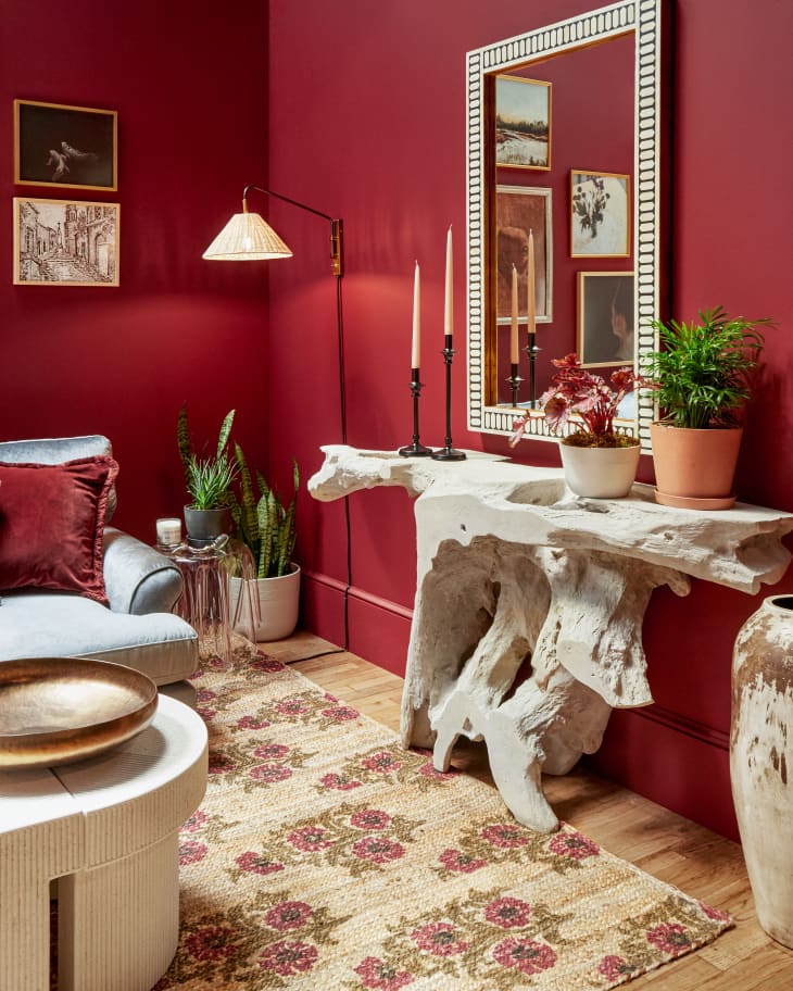
The contrast of the red walls with lots of white and cream-colored accents, like the rustic console table and inlay accent mirror helps brighten the room without losing the cozy vibe. The overall look is extremely sophisticated, while still feeling like the type of place where you could curl up on the couch with a book and, a few pages into said book, take a luxurious little cat nap.