
5 Surprising Paint Ideas That’ll Brighten Up Your Home, According to Designers
Move over, white and beige! There’s a whole world of possibility out there when it comes to choosing the perfect paint color to brighten up your space, and turns out there’s nothing wrong with thinking a bit outside the box when it comes to what shade you select and where you place it. We spoke with three interior designers for advice on the best unexpected shades to incorporate into your home—you’ll wish you had enough wall space to feature each and every one of these surprisingly delightful hues!
Don’t Be Afraid of the Dark
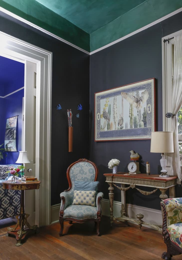
Decorating a small space? You can still totally opt for a dark shade of paint if you find one that’s calling your name. “People are often afraid to use dark colors in small spaces as they think that they will make a space feel smaller, but in reality dark colors can open up small spaces and make them feel larger,” says Kati Curtis, principal at Kati Curtis Design. One of her favorite hues? Benjamin Moore Nightfall, pictured above in a space she designed. “It’s a deep charcoal gray that’s almost black, which adds depth and mood to any room,” Curtis explains. “I love to use this color in small spaces to give them a deep, sexy feel.” One thing to note is natural light—to use a dark color and get this airy effect, make sure you have ample windows in your room.

With Bold Hues, Less Can Be More
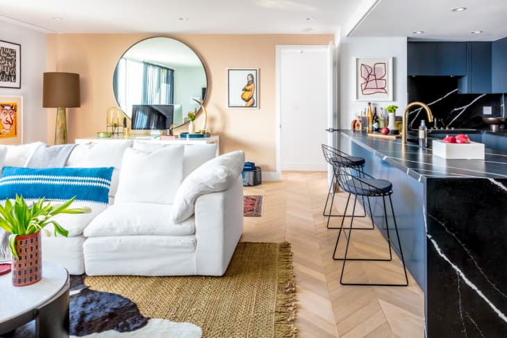
If you do opt for a brighter shade, less is often more. “We recommend painting only portions of a room for maximum effect without the overload,” says Laura Umansky of Laura U Interior Design. “Stopping around a wainscoting height—at half or two-thirds of a wall—is a great option.” In the room above, Sherwin Williams Brittlebrush makes a sunny statement. “With the landscape and culture of Santa Fe so essential to the interior design of this home, incorporating a paint color named after a native plant was intentional and brought provenance to the interior,” says Umansky. There’s also a rising sun reference here, too. “We wanted to bring in vibrant, cheerful color without overwhelming the room,” says Umansky. “So this color—and shape—were spot on.”

Make Some Modifications
If you love a particular color but aren’t ready to go all in, take a look at paint colors within the same family to find a hue that matches your vision but is maybe a little less, well, intense. In general, the shades at the top of a paint chip will be a little easier for a DIYer to work with, sans designer. So keep that in mind when you’re shopping and swatching.
“Our client loved purple, but it can get really girlie or too grape-y,” says Curtis of a past project. “Benjamin Moore Mulberry has just the right amount of gray in it, so it feels like almost a neutral, while still giving some warmth and interest. It provides a perfect backdrop for their special art collection.” Also know that you can have a color tinted to a lower intensity—say with 20 percent less pigment or 20 percent more white, as examples—to get the shade you want in a slightly lighter tone. Ask for guidance at the paint store or home center on the exact ratio that would work best for your room.
Always Look Up!
It’s not just about what color paint you choose—placement is equally important for making a small space appear brighter and bigger. If you really want to do something unexpected, go ahead and paint the ceiling, advises Isabella Patrick of Isabella Patrick Interior Design. “Colors to consider for this approach can range from deeper tones to very light ones,” Patrick says. “It depends on the room size and shape as well as the amount of natural light it gets.” For very long and narrow rooms or hallways that don’t get a lot of sunlight, Patrick would stick to a lighter, warmer shade. But if light just pools in from all of your windows (lucky!), then daring to go dark is totally fine.

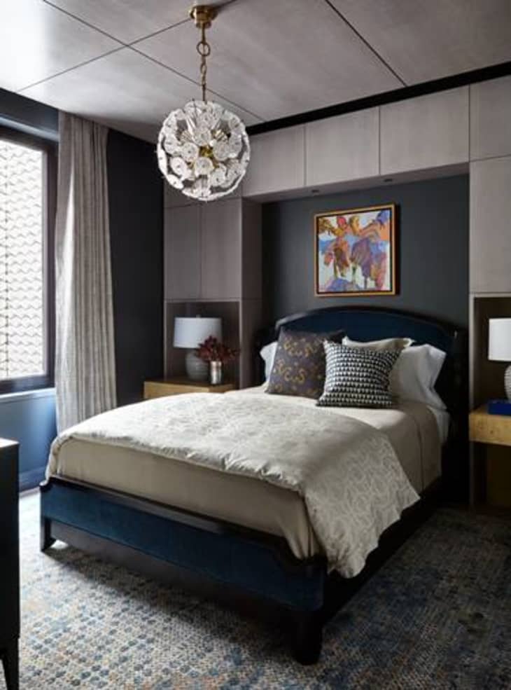
Play Match Maker
Patrick took what she calls a “ribbon or red carpet approach” in the boy’s room above and created a stepped effect with one shade of paint, which is another way of opening up a space with ceiling color. “We chose a deep and chalky blue and carried that color down the wall behind his bed,” say Patrick. Other alternative approaches include painting just trim work or creating an accent wall behind the bed.