4 Tonal Color Combos from Small/Cool That Are Soothing

The Small/Cool Experience is a shoppable online home design showcase and social event full of decorating tips and tricks from your favorite designers. Thank you to our sponsors BEHR® Paint, Genesis G70, LUMAS, Overstock, Tuft & Needle, Chasing Paper, and Interior Define for making this experience possible.
When figuring out a color palette scheme for an interior, the seemingly endless swatches and inspiration out there can make things overwhelming. And on top of all that, you want to make sure the colors you choose can exist harmoniously in one space, too. But there’s power in taking a step back and thinking about one color that you want to focus on, and then, the calming magic of a monochromatic palette can unfold.
The first step is picking the color that speaks to you, and then choosing hues in the same family to create a room that feels intentional — and often relaxing. At the Small/Cool Experience, several of the designers who brought trends to life in 120-square-foot rooms executed designs that speak to the popularity of tonal schemes and how soothing they can be.
See below for the rooms at the Small/Cool Experience that showcase tonal color palettes. By the end, you might find yourself inspired to go for the same look.
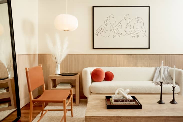
“Warm Minimalist” by Bobby Berk
The “Queer Eye” designer really leaned into minimalism with the natural palette he selected. The room consists of beiges, creams, and a White Cedar wood stain for the lower half of the wall. All of that ties into the furnishings, too, that follow the same simplistic, earthy color combo.
“Flexible Spaces” by Natalie Papier
Natalie Papier designed this room for artists “to inspire, to dream, to jam,” and a large focus of the room is the palette. The top-to-bottom layering of color — Seaside Villa pinky-beige, Ultra Pure White, Saffron Strands gold yellow, and Maple Glaze dark orange — creates a contrast that is energizing and, at the same time, grounding.
“Comfort Is King” by Adnan Anwar
The room that Adnan Anwar designed is similar to Berk’s in the sense that it focuses on natural textiles and a warm, mostly neutral palette. The grasscloth wallpaper and the baseboard painted in Polar Bear off-white brings a comforting energy (hence the name of the trend), and the drawer dresser, meditation cushion, and embroidered pillow provide pops of blue that still blend in with the rest of the room.
Anyone else feel want to put their feet up after looking at these rooms? And Ayesha Curry’s bedroom, painted with Frost, would be the perfect place to do that in. “The goal for creating this bedroom retreat was to showcase how neutral, calming tones can still translate into interesting design,” Curry explained. “One technique we used was symmetry to evoke a sense of serenity. We mainly focused on infusing texture rather than bold color, creating contrast through natural elements like wood and metal instead.”
