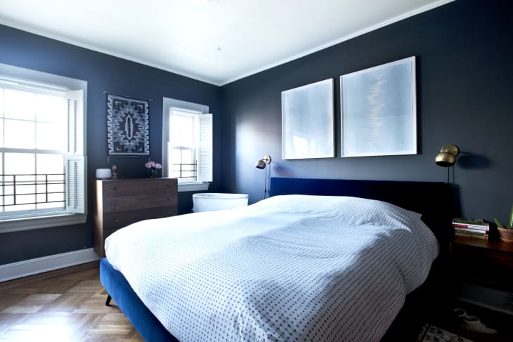
5 Rooms That Nail Tone-on-Tone Decorating

Is it just us, or are pops of color officially played out? Make no mistake, we love a good use of color as much as the next design lover. But when every single room has a pop of color, the styling tactic feels, well, dull.
If you’re looking for an alternative, you may want to consider tone-on-tone decorating. Turns out, using one color throughout your space is unexpected, impactful, and totally Instagrammable.
Let’s make one thing clear: This trend isn’t for design amateurs—or wallflowers, for that matter. It requires guts, commitment, and, of course, a good eye for design. The seven rooms below serve up a masterclass in tonal design:
1. A+ in Asymmetry
Nervous your room will look too matchy-matchy? Take a page out of Hôtel Bienvenue‘s book and play around with symmetry. The off-balanced lights look quirky, but not sloppy.
2. Ultra-Violet
Forget looking at life through rose-colored glasses. After seeing Jack Milenkovic’s ‘gram, we’re craving la vie en purple.
3. Pattern Play
Warning: This design move isn’t for novices. A patterned rug—like this option from The Rug Company and Paul Smith—can give your tone-on-tone room an extra jolt of energy.
4. Tangled Up In Blues
An easy way to achieve tonal greatness is by painting your walls and door. This navy room, courtesy of Farrow & Ball, looks sophisticated, not gothic.
Welcome to the dark side—of the color wheel, that is.
5. Wonderful In White
As Carmen Deklerk proves, white-on-white rooms aren’t boring. In fact, they’re pretty chic and serene.
